Table of Contents
- What Are the YouTube Thumbnail Styles Driving Clicks Now?
- How to Optimize Text on Your YouTube Thumbnail Styles
- Why Do Emotional YouTube Thumbnail Styles Work Best?
- Which YouTube Thumbnail Styles Work for Educational Content?
- How to Get Started with AI for YouTube Thumbnail Styles
- What Common Mistakes Kill Your YouTube Thumbnail Styles?
- YouTube Thumbnail Styles vs. Traditional Design – Which Is Better?
- Listen to This Article
All right, so you’ve spent ten hours editing a video, the content is solid, the audio is crisp, but you upload it and… nothing. Think of content as the engine. Crickets. It’s like trying to start a car with a dead battery—it doesn’t matter how good the engine is if you can’t get it to turn over.
You know, I see this all the time. A creator comes in, customer states: “I’m getting impressions, but nobody’s clicking.” And honestly? Nine times out of ten, it’s the packaging. It’s the thumbnail.
Here’s the thing about YouTube in 2026. The algorithm has changed. It’s mobile-first now. People are scrolling so fast on their phones that if you don’t grab them by the eyeballs in under two seconds, you’re gone. You’re just noise.
I’ve been looking at the data and we’re seeing some wild numbers, so I mean, we’re talking about specific design choices that are pulling in 40% more clicks. So today, we’re going under the hood. We’re gonna look at the exact YouTube thumbnail styles that are working right now, and we’re going to fix that click-through rate.
What Are the YouTube Thumbnail Styles Driving Clicks Now?
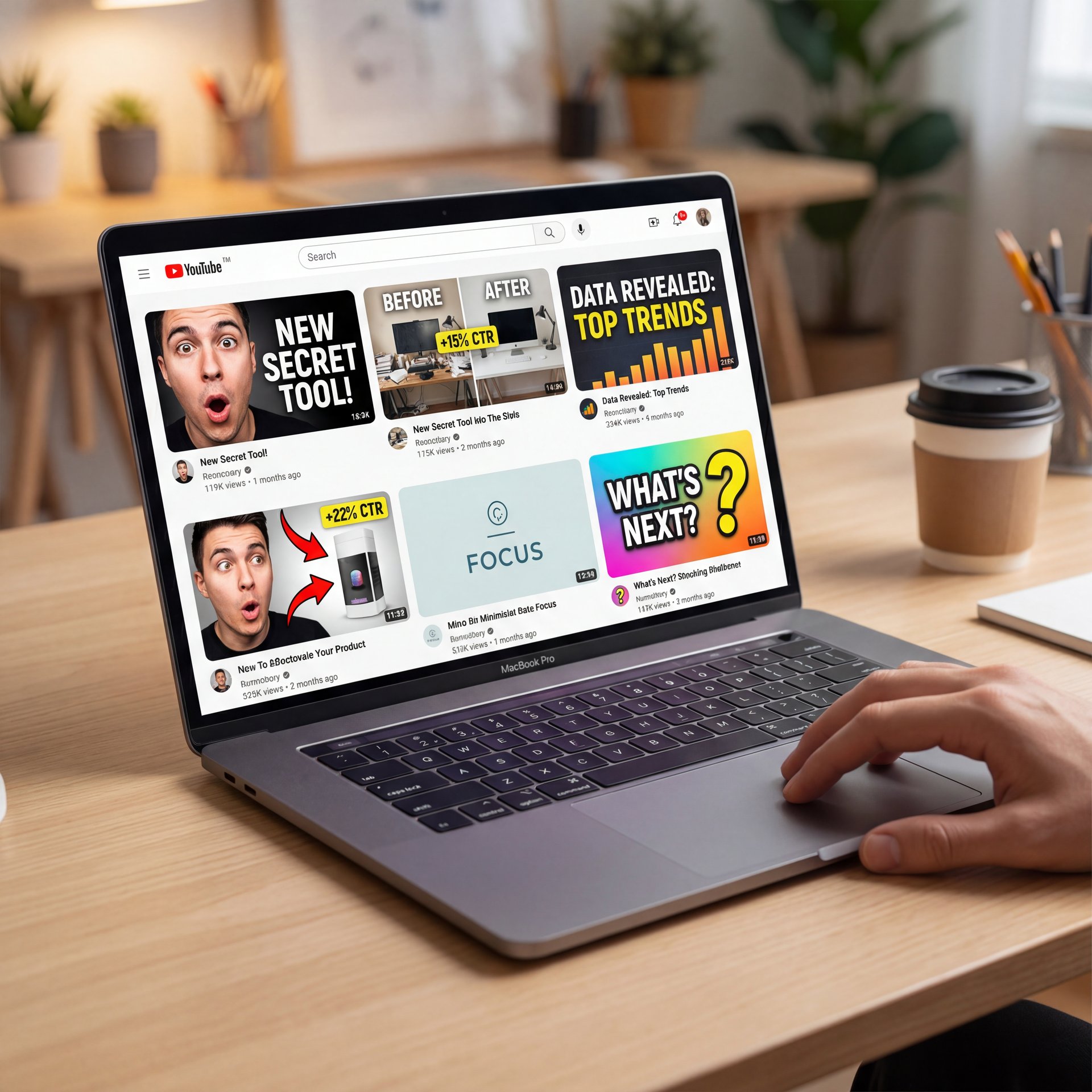
So let’s cover the basics before we start tearing things apart. You might think a thumbnail is just a picture, but it’s really a signal. Game changer. It’s telling the viewer—and the algorithm, what to expect.
In my experience, the biggest issue is that people try to be too clever. They treat the thumbnail like art instead of a billboard. But here’s what you wanna do. You want to look at what the top mechanics… I mean, top creators… are doing.
We’re seeing a massive shift towards that really pops, emotion-heavy designs. Trust me on this. Why? Because screens are getting better, but attention spans are getting shorter.
If you’re not hitting them with a clear style instantly, you’re losing the room. I found that when you switch from a cluttered, “summary-style” image to one of these specific high-performing styles, the engine just purrs.
I remember looking at some data from How YouTube Thumbnails Boost Your Click-Through Rate (Proven Tips), and it really backs this up. It’s thumbnail that gets results. The style isn’t just aesthetic; it’s function. It’s the difference between a car that looks fast and one that actually wins the race.
🤔 Did You Know?
According to 2026 testing data, the “Anger” emotion trigger in thumbnails drives a close to 6% CTR, outperforming all other emotional approaches by 0.37 percentage points. It seems people can’t resist clicking on something that looks a little heated.
How to Optimize Text on Your YouTube Thumbnail Styles
I see thumbnails that look like a novel. You got ten words on there, bite-sized font, blending into the background. That’s not going to work.
Here’s the rule of thumb I use: if you can’t read it while squinting at your phone at arm’s length, it’s trash. it helps to cut it down.
The data is pretty clear on this. We found that thumbnails with 3 to five words achieve ideal CTR. That’s it. Once you hit 6 words, the performance drops to 4.3% CTR. the lowest tested across all categories in 2026.
And you don’t just want to repeat your title. That’s redundant. It’s like wearing a belt and suspenders. If your title says “How to Fix a Leaky Pipe,” don’t put “Fix Leaky Pipe” on the thumbnail. Simple as that. Put “STOP THE LEAK” or “DON’T DO THIS.”
“Videos with thumbnails creating tension vs clarity see 51% higher watch time share, indirectly boosting long-term CTR via algorithm promotion.” 2026 Algorithm Analysis
You want to create a “Curiosity Gap.” that’s where the text on the image and the title work together to create a question in the viewer’s mind that they have to click to answer. Gap-based title-thumbnail pairing yields five.83% CTR, outperforming direct title repeats at under five% CTR.
So, swap out that heavy text. Keep it punchy.
Why Do Emotional YouTube Thumbnail Styles Work Best?
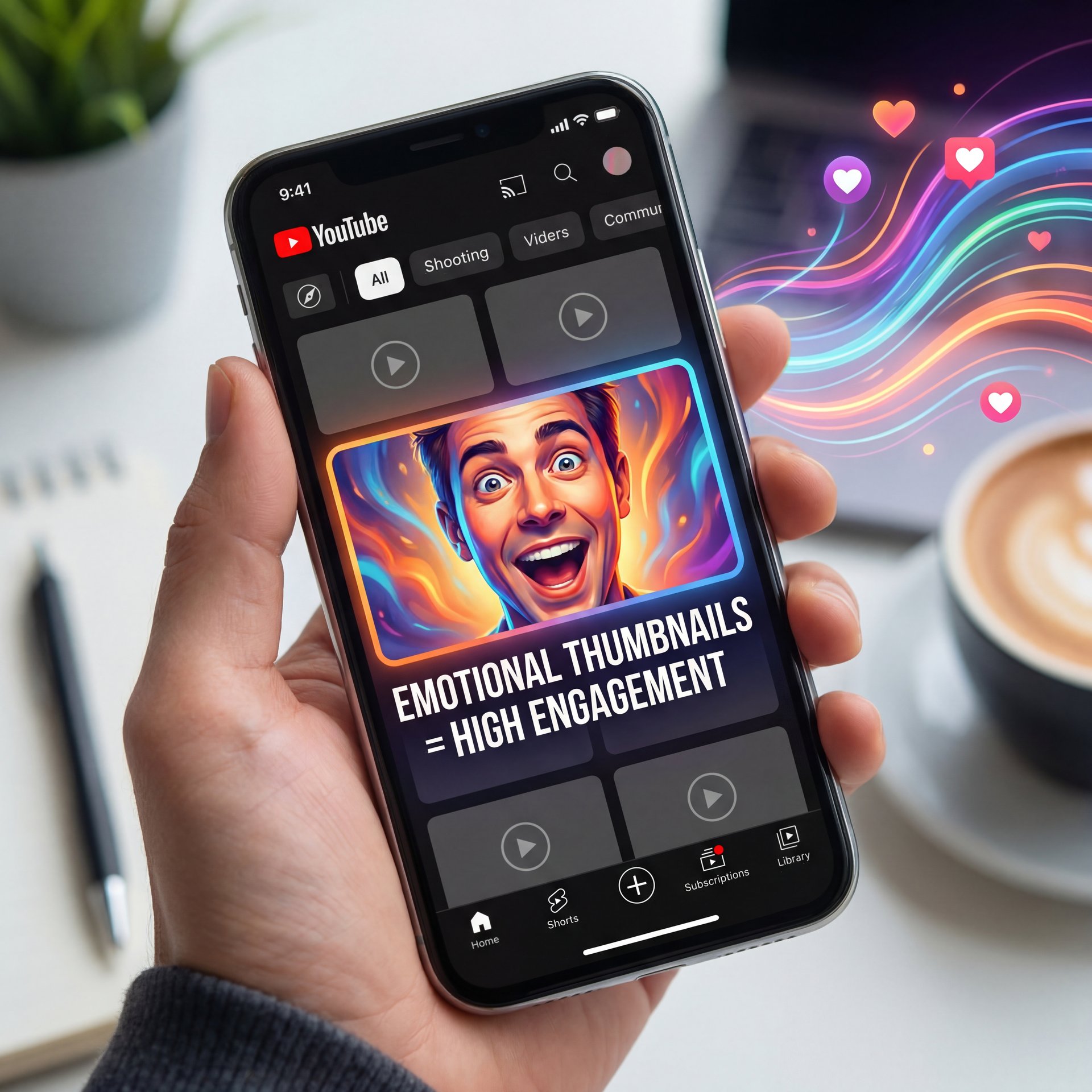
Let’s talk about faces. Humans are wired to look at faces. It’s biological. But not just any face, we look for emotion.
I’ve tested this on my own stuff and with clients. You put a neutral face, maybe a little smile? It’s okay. It runs. But you put a face that shows Shock or Anger? The numbers go through the roof.
Specifically, the “Shocked Reaction” style is pulling about 6% CTR when it leans into frustration or anger, using anger emotion triggers that outperform all other emotional approaches. Trust me on this. Meanwhile, shock and fear combinations hit 5.77% CTR.
Now, I know 😤 what you’re thinking. “I don’t want to look silly.” I get it. Consider 7 the foundation. Period. But honestly, do you want to – seriously want to look cool, or do you want views?
Also, think about the eyes. You want the eyes visible. If you’re wearing sunglasses or looking away, you’re breaking that connection. It’s like talking to someone who’s looking at their phone (it’s rude, and people scroll past it).
⚠️ Common Mistake
Don’t use low-contrast colors like dark blue or grey for your background. High-contrast color palettes average five.8%+ CTR compared to low-contrast blue thumbnails failing under around 4%. You want high contrast (yellows, bright reds or greens that pop against YouTube’s white or dark mode interface.
Which YouTube Thumbnail Styles Work for Educational Content?
Okay, so maybe you’re not doing reaction videos. Maybe you’re teaching people how to code or how to trade stocks, or, I don’t know. how to fix a transmission.
You might think, “I can’t do the shocked face, that’s wierd.” and you’re right. For tutorials, we’re seeing a huge spike in what we call the Analytics Dashboard Style.
This is where you use graphs, charts, or “proof” elements right in the thumbnail, which means what surprised me was how well this works with search traffic. Period. we’re talking close to 85% intent match for search-driven tutorial videos.
Let’s look at the numbers. The Analytics Dashboard Style yields a 3.1x CTR boost for tutorial videos, particularily effective with pastel graph designs against dark backgrounds. It signals value. It tells the viewer, “This isn’t just talk; here is the data.”
If you’re doing educational stuff, try this:
**Show the Result**
Don’t just show the process. Show the finished product or the graph going up and to the right.
**Use Pastel Graphs**
For some reason, 2026 trends are loving pastel graph designs against dark backgrounds. It looks premium.
**Add a Trust Marker**
Put a green checkmark or a specific number (like “$five,400”) to make it concrete.
⭐ Creator Spotlight
Channels A/B testing thumbnails report 40% CTR uplift from emotion-contrast styles vs summary-style thumbnails. It works because it promises a specific, tangible outcome before the viewer even clicks. Check out how our video generation tools can help you visualize these concepts.
How to Get Started with AI for YouTube Thumbnail Styles
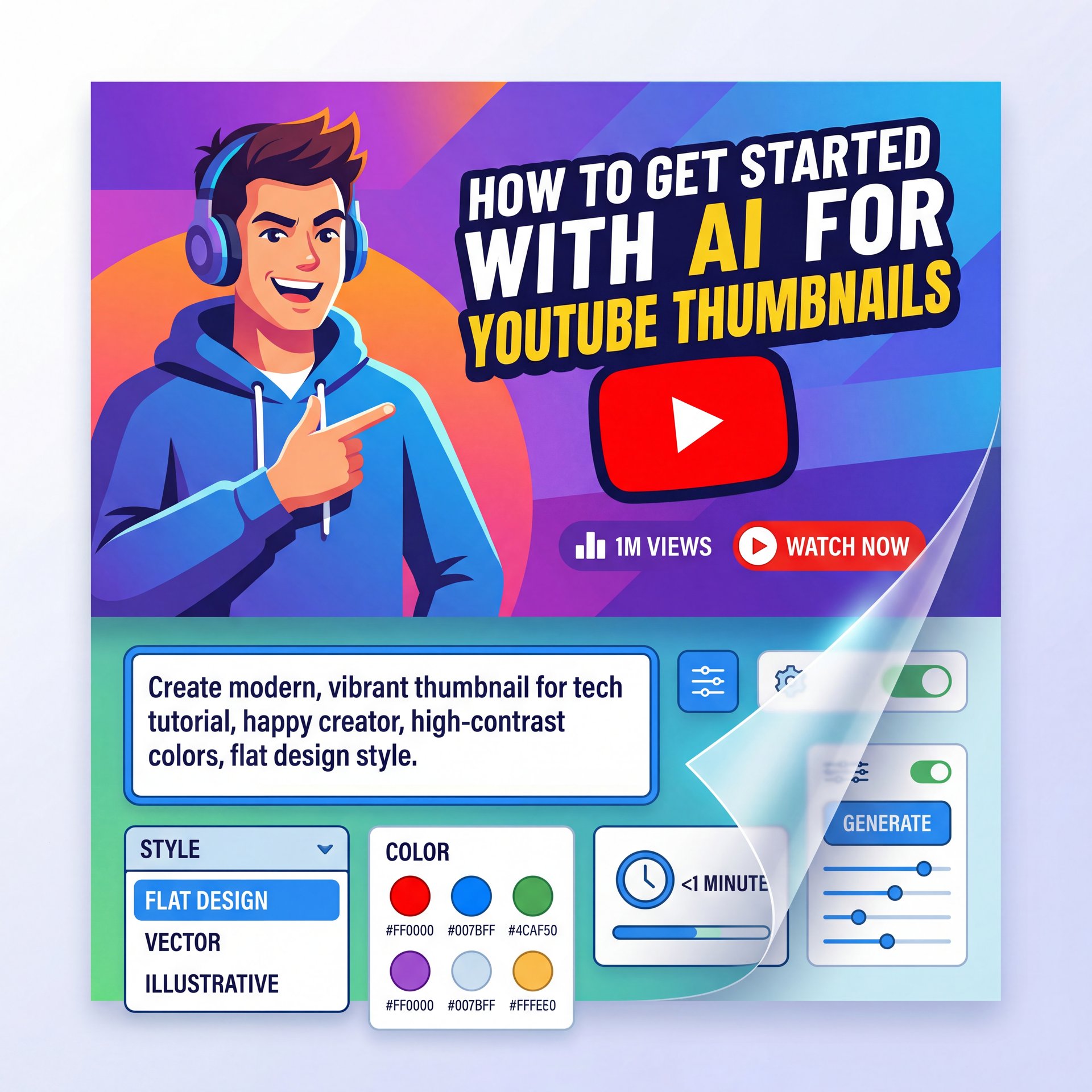
Look, I whipped up this thumbnail in less than a minute using this new secret AI tool I’m about to show you. I’ll also reveal the exact prompt technique. But before that, let me ask you one honest question. Have you ever uploaded a really good YouTube video, but it didn’t get views?, and not because the content was bad, but because nobody clicked it. Here’s the truth. On YouTube, title and thumbnail decide everything. And today I’m going to show you the easiest & fastest way to create highclick YouTube thumbnails using AI. Even if you have zero design skills, no Photoshop, no Canva headache, no designer, just one AI tool and a simple process. Let’s get started. Before we jump into the tutorial, understand this. YouTube is not about who makes the best video. It’s about who gets clicked first. Your thumbnail has one job. Stop the scroll. If people don’t click, YouTube won’t push your video, no matter how good it is. That’s why smart creators don’t design thumbnails anymore. They engineer thumbnails. And this AI tool helps you do exactly that. First, open your browser, and go to pixels or I’ve left the link in the description below.
This is where the new tools come in. In 2026, AI isn’t just a gimmick anymore; it’s a shop tool. It’s like having an impact wrench instead of a hand ratchet.
Click it and the AI automatically enhances the emotion, improves focus and makes the thumbnail more eye-catching. This feature alone is a gamecher for beginners. Now, let’s say you like the thumbnail, but want changes. Maybe the face is too serious, the colors are dull, the emotion isn’t strong enough. You don’t need editing skills. Just click edit and type something like make the expression more intense. Brighter colors, stronger contrast. Keep everything else the same. Generate again. That’s it. No layers, no brushes, no confusion. If you want your own face on thumbnails, this is huge. You can train the AI using your photos, upload multiple images of yourself, different angles, different lighting, different expressions. Once trained, the AI can put you into thumbnails, replace faces automatically and keep your channel branding consistent. This is extremely useful if you want your audience to recognize you quickly. This is where smart creators win. Instead of guessing what works, you can take a YouTube video that already has millions of views, paste the video link and let AI recreate the format, not the copy. Fair enough. You’re not stealing. You’re using a proven structure and making it original.. No, really.
Dr. Morgan Taylor, our lead on the tech side, always says that the AI doesn’t just make images; it analyzes what’s working. It knows that a about 6% CTR style needs a certain color balance, and it just… does it.
You can feed it your title, and it generates the image WITH the right curiosity gap, the right contrast, and the right emotional triggers.
That’s exactly how top YouTubers grow faster. Before you upload your video, do one last thing. Analyze your thumbnail. The AI will tell you what’s weak, what’s confusing and what’s missing. Fix it before posting, not after views are lost. This alone can massively increase your CTR. This is perfect if you’re, a beginner YouTuber, a faceless channel creator, an affiliate marketer, or someone tired of Photoshop and Canva. You don’t need design talent. You need honestly impressive ideas plus AI assistance. Your videos don’t fail because of content. They fail because no one clicks. If you want faster thumbnails, better CTR, and less guesswork, then this AI workflow can completely change how you grow on YouTube. Test it, experiment, improve, and let AI handle the hard part. So, once again, the link is in the description. Make sure you take a look. And if this video helped you, don’t forget to like, subscribe, and let me know in the comments what type of videos you create. Thanks for watching and I’ll see you in the next
🔧 Tool Recommendation
Stop guessing with your designs. Banana Thumbnail uses the latest 2026 data to generate high-CTR styles automatically. It’s the fastest way to get professional results without the learning curve. Try it here.
If you’re not using AI to at least draft your thumbnails, you’re working too hard. You can see some great examples of this in 7 Viral Gemini Image Prompts to Boost YouTube CTR.
What Common Mistakes Kill Your YouTube Thumbnail Styles?
So, we’ve covered what to do. Let’s talk about what not to do. Because sometimes, fixing the problem is just about removing the rust.
First off, inconsistency. I see channels that look like five different people are running them. One video has a red border, the next has a blue background, the next is just a screenshot. You got to pick a lane.
Second, clutter. We talked about text, but this applies to images too. If you have a face, a car, a logo, a text box, an arrow, and an explosion… nobody knows where to look.
Here’s a test I do. I call it the “Blur Test.” Squint your eyes until the image is blurry. Can you still tell what the main subject is? If not, simplify it.
And finally, ignoring mobile. I mentioned this earlier, but it’s critical. Mobile-first composition means big faces, big text. If it looks good on your 27-inch monitor, it probably looks too small on, an iPhone.
💡 Quick Tip
Always zoom out to ten% size when designing. This mimics the size of a thumbnail on a mobile feed. If your text isn’t readable at that size, it won’t get the click. You can find more workflow tips on our workflows page.
YouTube Thumbnail Styles vs. Traditional Design – Which Is Better?
Look, I’m not gonna tell you that traditional design is dead. If you have a skilled designer who understands YouTube, they can absolutely create winning thumbnails.
But if we’re talking about performance? The data is showing that these specific, optimized styles (whether generated by AI or made by hand following these rules) are winning.
Traditional design often focuses on “beauty.” Optimized design focuses on “tension.”
I prefer the optimized approach because I want my videos to be seen. I want the engine to run at peak performance.
If you create a thumbnail that creates “tension”, like a before/after shot that doesn’t show the middle or a question that isn’t answered. you get the click. Traditional design might try to make it look “balanced,” which can actually be boring.
So, don’t be afraid to break some design rules. Use the neon green. Make the face a little too massive. Use the curiosity gap.
Because ultimately, we’re here to get views, right?
Frequently Asked Questions
What are the most effective thumbnail styles for increasing CTR in 2026?
High-contrast designs featuring “shocked” or “angry” emotional triggers combined with 3-5 word curiosity gaps are currently the top performers, with anger emotion triggers driving 6.14% CTR.
How do AI-generated thumbnails compare to traditional ones about CTR?
AI-generated thumbnails that use data-backed templates (like those from Miraflow or Banana Thumbnail) are achieving roughly 6% CTR, often outperforming manual designs due to optimized composition.
What are the common mistakes to avoid when creating YouTube thumbnails?
Avoid using 6 words or more (which drops to 4.3% CTR), low-contrast color palettes (like dark blue failing under 4%), and repeating the video title verbatim, as gap-based pairing outperforms direct repeats significantly.
How does the color palette of a thumbnail impact click-through rates?
High-contrast palettes (yellows, reds, bright greens) average five.8%+ CTR, while low-contrast or monochromatic blue designs often fail to reach around 4% because they blend into the interface.
Should I use emotion-based designs for educational content?
For educational content, the Analytics Dashboard Style with pastel graphs on dark backgrounds performs better, yielding a 3.1x CTR boost. Emotion-based designs work best for entertainment, reaction, and commentary content.
Quick Tips:
- **Audit your last ten videos:** If the CTR is under 4%, swap the thumbnail for a high-contrast style.
- **Test your text:** Ask a friend to guess the video topic just by reading the thumbnail text (without the title).
- **Use the 3-word rule:** Try to rewrite your thumbnail text using only three solid words.
All right, that’s the diagnostic. You got the parts, you got the tools. Now go fix that CTR. Thanks for reading, guys.
Related Videos
Related Content
For more on this topic, check out: thumbnail
Listen to This Article


