Table of Contents
Here’s a reality check: well-designed thumbnails can increase initial click-through rates by up to 300 percent, yet fewer than 26 percent of TikTok marketers actively use thumbnail optimization strategies. If you’ve been overlooking TikTok thumbnail hacks, you’re leaving reach and revenue on the table.
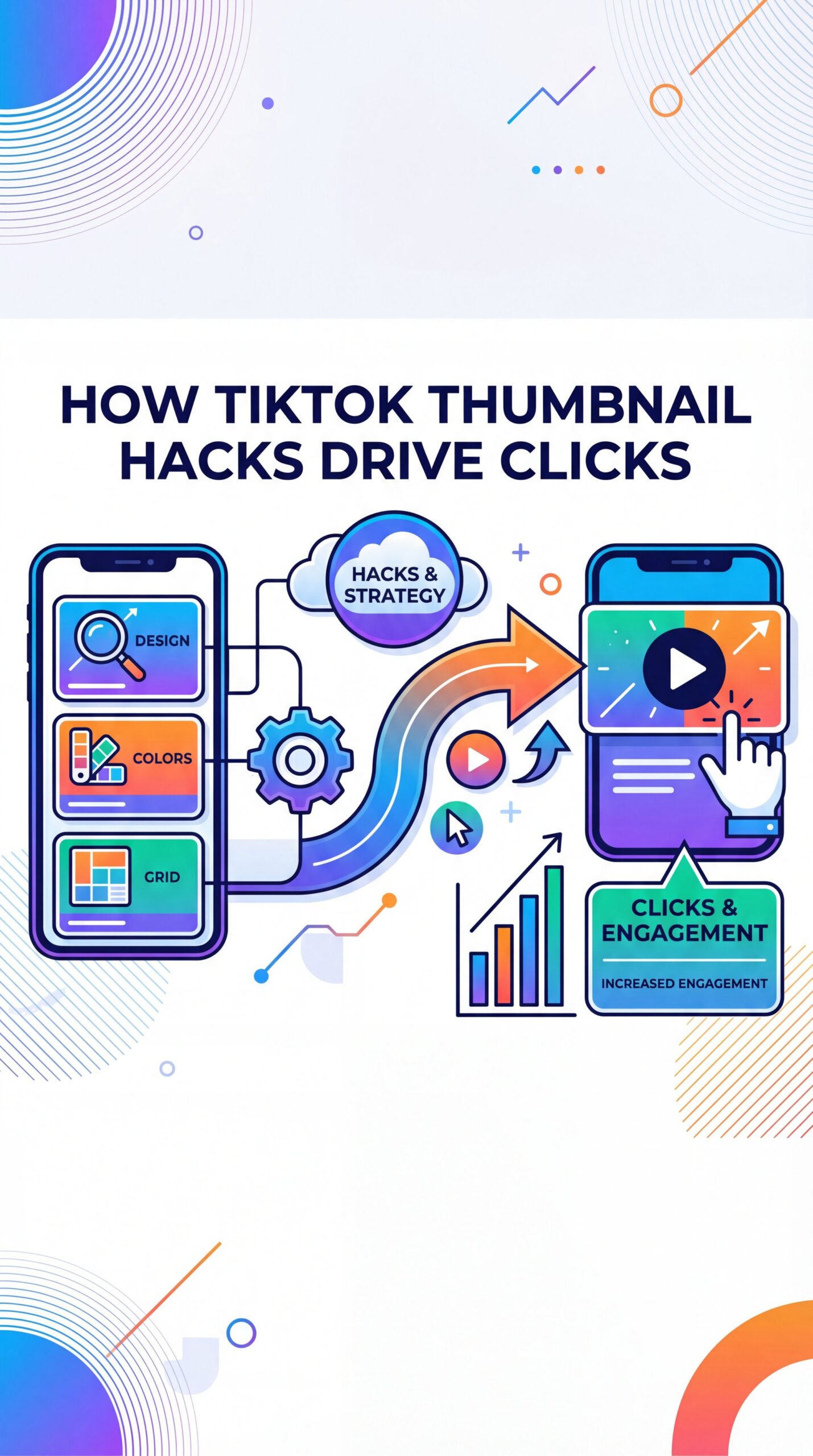
How do TikTok thumbnail hacks drive clicks?
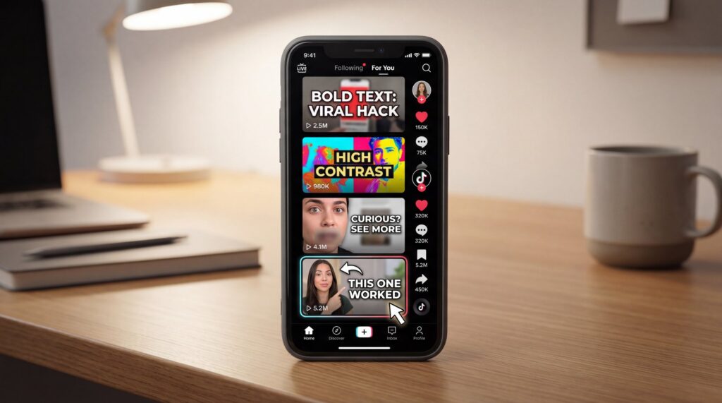
Thumbnails serve as your video’s first impression, appearing in the profile grid and signaling to TikTok’s algorithm who might enjoy your content. With over 1.04 billion monthly active users worldwide and 82.2 million daily active users in the U.S., the platform is incredibly competitive, so every element of your thumbnail needs to work hard to grab attention on the For You Page. Micro-influencers on TikTok often achieve engagement rates around 18 percent, which outpaces Instagram’s 3.86 percent and YouTube’s 1.63 percent, showing how a strong start can lead to rapid growth. You might also find YouTube Thumbnail Design 2025: Boost CTR 200% with AI helpful.
Technical specifications matter
TikTok recommends a 1080 x 1920 (9:16) aspect ratio for optimal mobile display, along with high-contrast colors and minimal text. Your cover image often shrinks down to postage-stamp size on the profile grid, leaving no room for messy design. For most videos, therefore, a single clear focal point—such as a human face expressing strong emotion—consistently outperforms abstract imagery. We covered this in more detail in How to Create YouTube Thumbnails That Get Clicks (2025).
That 3-second rule you hear for hooks applies to thumbnails, too. Your cover needs to communicate the value **Proposition:** What’s in it for me, right now? If you can’t convey the promise in three seconds, your audience won’t understand it either. Think about concise comparisons like “$12 dupe vs. $60,” “Get clients with this email,” or “Make your room look bigger.”
What actually moves CTR on mobile?
- Clear face with genuine emotion beats abstract or product-only shots
- High-contrast color pairings (one pop color vs. neutral background)
- 2–five words max in big, readable type
- Crisp edges around the subject to avoid muddy mid-tones
- Negative space around text and face eliminates clutter
People in the U.S. spend around 52 minutes per day on the app and globally it’s about 95 minutes daily, meaning your content pops up repeatedly across different contexts. Having a consistent, easy-to-read thumbnail system turns casual scrollers into engaged viewers who recognize your style.
A killer thumbnail won’t fix a video with weak retention, but it will earn your content the chance to be seen. TikTok’s Creator Rewards Program now pays roughly $0.40–$1.00+ per 1,000 qualified views—a significant jump from the old fund’s $0.02–$0.04—so even small CTR lifts can snowball into meaningful revenue.
TikTok thumbnail hacks for the For You Page
The For You Page is ruthless. You’ve got milliseconds to signal “this is for you.” TikTok’s November 2025 algorithm update emphasizes that thumbnails must align cohesively with video metadata, descriptions, and hashtags to signal content relevance to the recommendation system. Think of it like keyword alignment for visuals.
When incorporating keywords, keep things straightforward. The main idea promised in your thumbnail should appear in the title, description, and a primary hashtag, and then be delivered within the first 2–3 seconds of the video. Mismatches lead to quick bounces, hurting watch time and making the algorithm less likely to promote your content.
Why the profile grid still matters
The profile grid is your storefront. A batch of consistent, clean covers increases follow rates and repeat taps, especially when your audience is browsing to see what else you do. Brands that treat the grid like a product shelf, with clear product and benefit cues, do especially well in the TikTok Shop.
Posting two to five times weekly yields up to 17 percent more views per video compared to just once a week, highlighting the need for scalable thumbnail processes. Perfection isn’t required, but having a quick, repeatable method ensures consistency without sacrificing quality.
💡 Quick Tip
Build one master 9:16 template 🤷 with safe zones for face, 2–5 word headline, and brand color strip. Then swap background, headline, and expression in minutes. When you’re ready to scale, adapt this into our step-by-step workflow guide.
Design rules that boost CTR on mobile
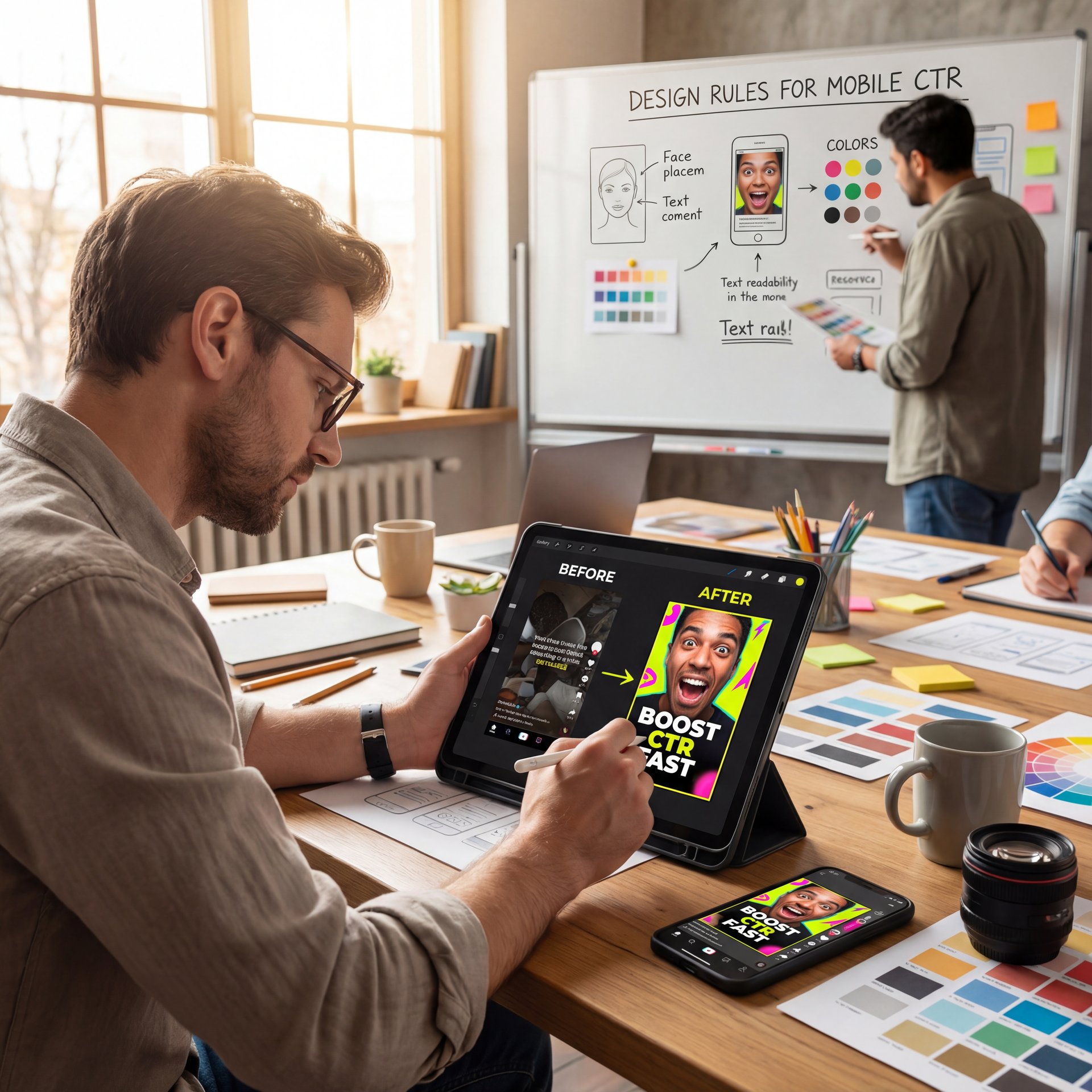
The same issues keep popping up: tiny type, low contrast, and faces that don’t emote. Solve those three problems first. A great starting palette often includes one punchy accent color—yellow, neon green, or hot pink—combined with a dark or muted background. This helps your subject’s face and headline pop.
Composition and focal hierarchy
Push your subject off-center slightly to leave room for a short headline. If your category is product-led (beauty, gadgets, kitchen), still try to include a human face holding or using the product. Product-only covers can work, but human connection usually wins in the feed.
Try the 3-second rule for your thumbnails: if a friend can’t tell you what your video promises within three seconds of seeing it on their phone at arm’s length, it needs work. Use the squint test—if you blur your eyes and the face and headline don’t stand out, add more separation through rim light, a cleaner backdrop, or a soft vignette.
Text that reads at thumbnail scale
- 2–five words, never more than 6
- Thick, high-contrast font (avoid thin display faces)
- Add a subtle shadow or 1–2 px outline for legibility
- Make one word the “hero” using color or size (e.g., “FREE,” “DUPE,” “TUTORIAL”)
Faces and authenticity
TikTok prefers authenticity. Hyper-polished, corporate-sterile thumbnails often underperform. Keep it clean but not overly glossy. The expression on the face matters more than any heavy filter. Don’t fake a reaction in your thumbnail that you can’t genuinely sustain in the first few seconds of video.
Pick the hook
Write the 2–5 word promise first (“Instant curl hack,” “$15 mic that slaps,” “Fix your posture”). If you can’t write it short, the idea isn’t sharp yet.
Shoot or pull the face
Snap 5–ten expressive stills after filming or scrub the timeline for a crisp frame with clean eyes and mouth. Avoid motion blur.
Drop into your template
Paste the face, add headline, check legibility at 20–25% zoom (phone scale), then export and upload. Track CTR and watch time per cover style.
🤔 Did You Know?
Creators often see 2–3x more taps by switching from abstract images to expressive faces with 2–five word overlays. Test one variable at a time and log results. Explore AI-assisted headline ideas in our features for faster iterations.
Workflow: create, test, and scale covers fast
If you’re posting daily, you know, or more, you can’t spend 30 minutes on every cover. Use native TikTok frame selection when sprinting—it’s free and surprisingly decent for simple videos. When you need more control, Canva Pro ($13/month) gives you template speed with brand kits, while CapCut Pro (roughly $4.99–$47.99/year) brings AI-powered cleanup and cutout tools that reduce decision fatigue (for real).
Tool choices by skill level
- **Casual**: Use TikTok’s free cover frame selection, you know, and one Canva template you tweak each time
- **Creators**: Create 3 brand templates in Canva or CapCut and cycle them based on content type; batch expressions to save time
- **Professionals**: Build a detailed thumbnail style guide with safe zones, a five-word headline maximum, and specific color usage; use a QA checklist before uploading
(Bear with me here.)
Name files clearly (YYYY-MM-DD_topic_v1-v3) and keep a swipe file of your best performers. This protects quality when posting 2–five times weekly and prevents decision fatigue.
📊 Before/After
Before: random frames and tiny text led to flat CTR. After: a simple face + 3-word headline template doubled taps in two weeks. Want templated swaps and AI text suggestions? See AI thumbnail generation tools.
How to align thumbnails with metadata, you know, and hashtags
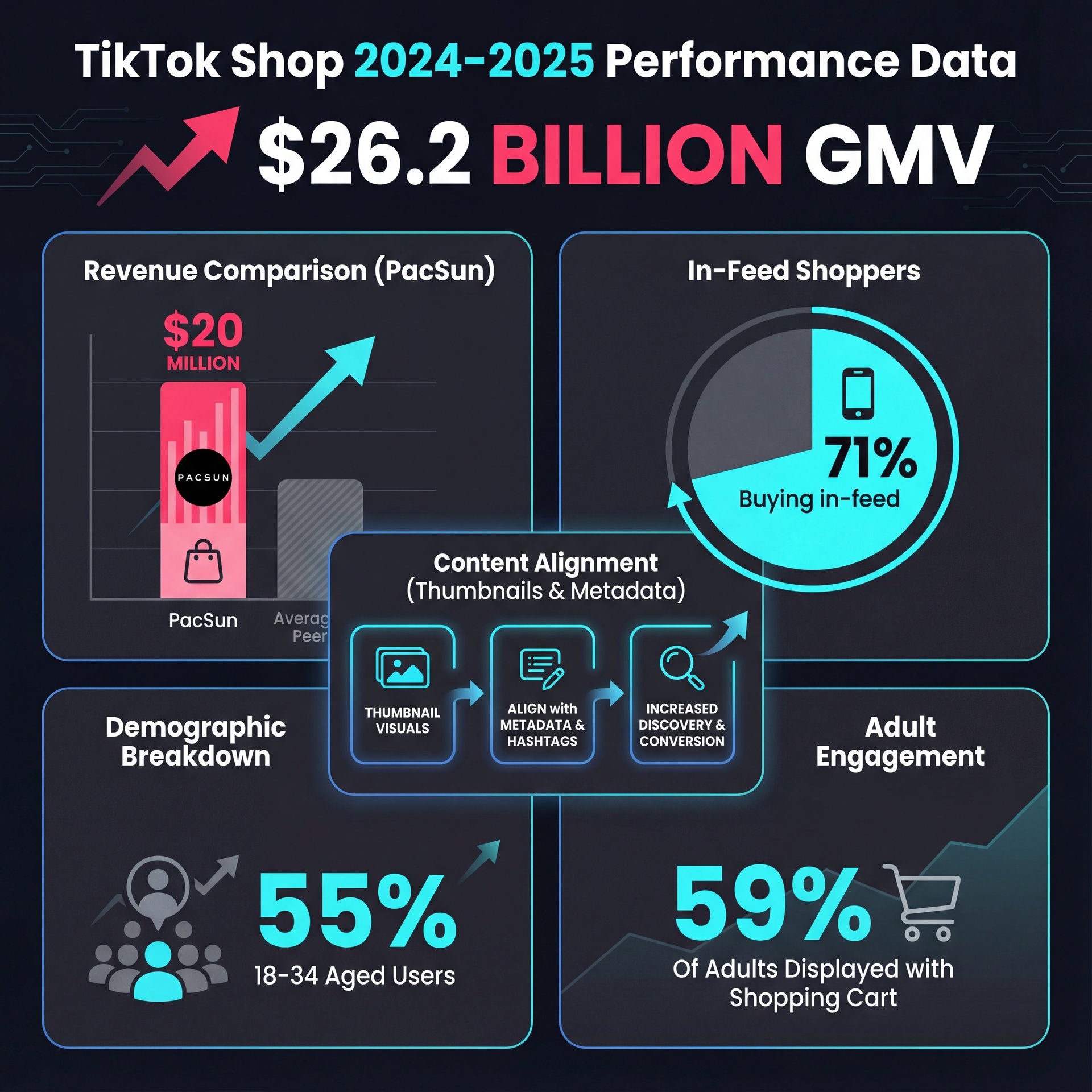
PacSun generated over $20 million in TikTok Shop revenue in 2024 by using compelling thumbnails. A visual presentation that clearly highlights product value propositions is essential. With TikTok Shop reaching $26.2 billion in GMV in the first half of 2025 and 71 percent of shoppers purchasing items they discover in-feed, conversion-focused covers are vital for commerce videos.
Hashtag strategy that supports your thumbnail
- Use 1–3 specific, intent-rich hashtags that match your cover headline
- Add 1–2 broader category tags (e.g., #tiktokmademebuyit) for commerce content
- Avoid stuffing; clarity matters more than volume
The demographic makeup favors direct visual cues: 55 percent of weekly U.S. users are aged 18–34, and 59 percent of adults aged 18–29 use the platform. Young, quick, visually literate audiences prefer thumbnails that communicate directly and efficiently.
⚠️ Common Mistake
Misleading thumbnails might spike initial taps but crush watch time—and the algorithm will notice. Keep the cover promise aligned with your first 3 seconds and hashtags. For a repeatable upload checklist, see our workflows.
FAQ
What are the best practices for creating engaging TikTok thumbnails?
Use clear faces with genuine emotion, 2–5 word headlines in high-contrast fonts, and stick to 1080 x 1920 pixels at 9:16 ratio. Align your thumbnail promise with the opening seconds of your video and its metadata.
How can I leverage TikTok’s algorithm to increase my video’s visibility?
Align your thumbnail promise with metadata and deliver it in the first 2–3 seconds to reinforce watch time and relevance. The algorithm prioritizes cohesive signals across visuals, descriptions, and hashtags.
How can I measure the success of my TikTok marketing campaigns?
Track CTR by thumbnail style, watch time completion rates, and engagement metrics. Document that covers formulas that drive the strongest performance and repeat those patterns while testing one variable at a time.
According to Buffer’s algorithm deep dive and the November 2025 alignment update, these TikTok thumbnail hacks work best when your visuals, keywords, and early video moments all convey the same message. That unity gets you tapped and recommended repeatedly.
Related Content
For more on this topic, check out: hack
Listen to This Article
