
Table of Contents
- What Is Thumbnail Psychology and Why Does It Matter? (the boring but important bit)
- Thumbnail Psychology: Why Emotional Faces Drive YouTube CTR
- Thumbnail Psychology: Using Curiosity Gaps Without Clickbait
- Color Psychology Tricks That Grab Attention Instantly
- Advanced 2026 Strategies: AI and The Zeigarnik Effect
- Visual Hierarchy: The F-Pattern and Text Placement – quick version
- Making It All Work Together
- Listen to This Article
Here’s the thing about YouTube in 2026. You can have the best video editing, the crispest 8K footage and the most hilarious jokes, but if nobody clicks, it just sits there gathering digital dust. A creator spends forty hours on an edit and five minutes on the thumbnail — and that’s like building a Ferrari engine and putting it inside a rusted-out sedan, completely ignoring thumbnail psychology.
I’ve been looking at the numbers lately, and honestly, the game has changed. We aren’t just slapping a shocked face on a background anymore. It’s about understanding how the human brain makes decisions in a split second. Every time. I call it thumbnail psychology, and it’s the difference between 100 views and 100,000.
So today we’re gonna go over the psychological triggers that actually get people to stop scrolling. We’re going to look at why certain colors make your brain wake up, why unfinished stories are irresistible, and how thumbnail psychology plays into all of it. How AI tools in 2026 have completely changed how we test this stuff. Full stop. If your CTR (CTR) is stuck in the single digits, This is what you need to fix it.
What Is Thumbnail Psychology and Why Does It Matter? (the boring but important bit)
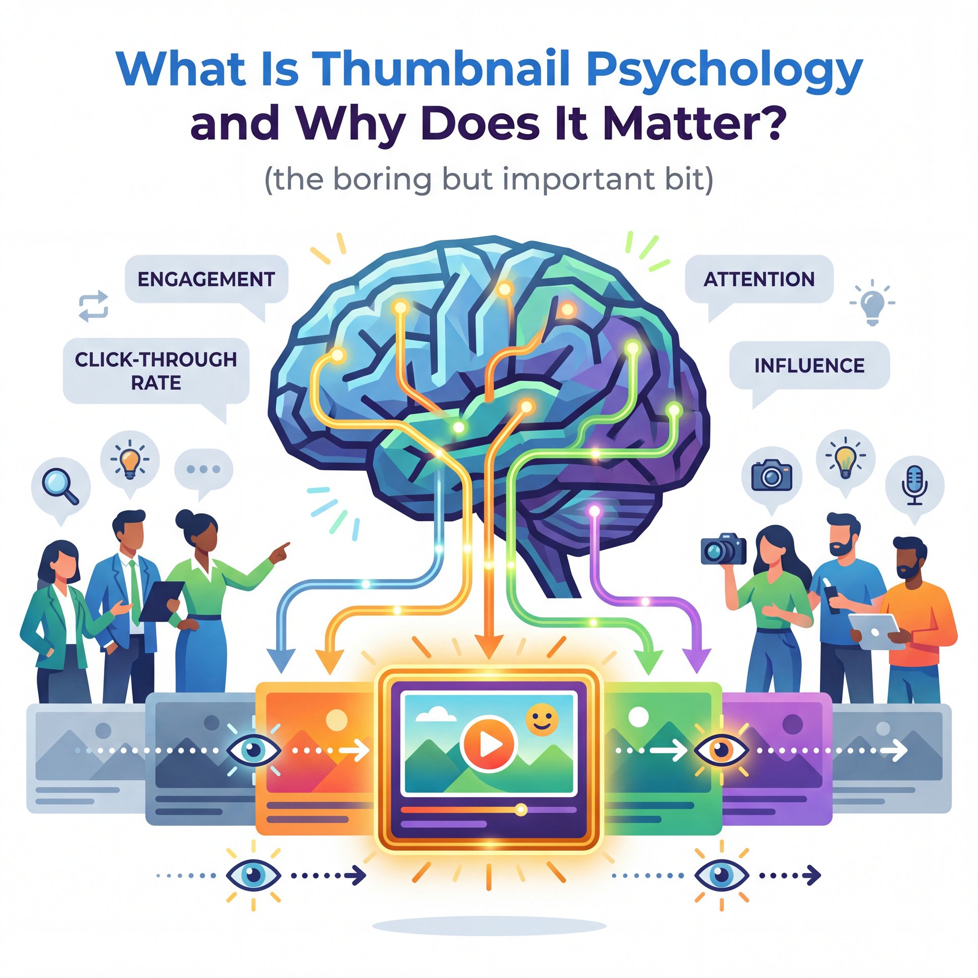
Let’s break this down simply. Thumbnail psychology isn’t some dark magic. It’s just understanding how people process visual information.When someone opens YouTube, they’re hit with a wall of options. Their brain has to filter all that noise right away.
According to research from Google, viewers make a click decision within 1 to 2 seconds. That’s speedy. This is where thumbnail psychology makes the process work. There’s no time to make a logical argument — Wait, no —. The approach has to appeal to the subconscious, because 90% of that decision is based on visual processing.
I found that most people think their thumbnail needs to break down the video. But here’s what you wanna do instead: provoke a reaction using thumbnail psychology. The goal isn’t information; it’s intrigue. It’s about creating a “cognitive itch” that the viewer can only scratch by clicking.
(Back to the point.)
Think about your own behavior. You scan images first, then read the text if the image grabs you. Think coffee shop vibes — The makes things flow. Even in 2026, with all our advanced AI sorting, thumbnail psychology still works because the human brain hasn’t evolved much. We still respond to the same biological triggers we did a thousand years ago—danger, food, faces, and things that don’t fit the pattern.
So if you want to fix your low views, you have to stop thinking like a designer and start thinking like a psychologist.
⚠️ Common Thumbnail Psychology Mistakes to Avoid
Don’t confuse “busy” with “exciting.” A lot of creators try to pack every element into the frame—arrows, text, emojis, explosions. This actually causes cognitive overload. If the brain can’t process the image in 0.3 seconds, it skips it. Keep it simple. One focal point is usually enough.
Thumbnail Psychology: Why Emotional Faces Drive YouTube CTR
Now let’s cover the most powerful tool in your kit: the human face. We’re hardwired to look at faces. It’s a survival instinct and in the thumbnail world, this translates directly to clicks. Game changer. This is the query that thumbnail runs on.
Research from the YouTube Creator Academy shows that thumbnails with human faces showing clear emotions achieve a 38% higher CTR than those without. That’s a massive difference. But here’s the thing. it can’t just be any face. It has to be an emotional face.
I see so many people just smiling blankly at the camera. That doesn’t work. High-arousal emotions like joy, fear, surprise or anger are what you need. These are the emotions that make us stop. Audiences in 2026 are smarter, too. Every time. They can smell a fake reaction a mile away.
If you’re comfortable on camera, take a hundred selfies making different faces. If you aren’t, or if you just can’t get that perfect – like, really perfect lighting, this is where tools like BANANA Thumbnail come in handy. Huge. You can generate consistent, high-quality emotional faces without setting up a studio.
⭐ Creator Spotlight: Thumbnail Psychology in Action
Look at MrBeast’s evolution. In the early days, it was just him smiling. Then it went to extreme shock. Now, in 2026, notice how he uses specific, storytelling expressions? He’s not just “shocked”; he’s worried, or determined, or exhausted. He matches the specific emotion to the specific stakes of the video.
Another trick I use is eye contact. If the subject in the thumbnail is looking directly at the viewer, it creates a connection. But if you want to direct attention to something else in the frame, have the subject look at that object. Full stop. Our eyes naturally follow their gaze, and it’s a subtle cue that works every time.
Thumbnail Psychology: Using Curiosity Gaps Without Clickbait
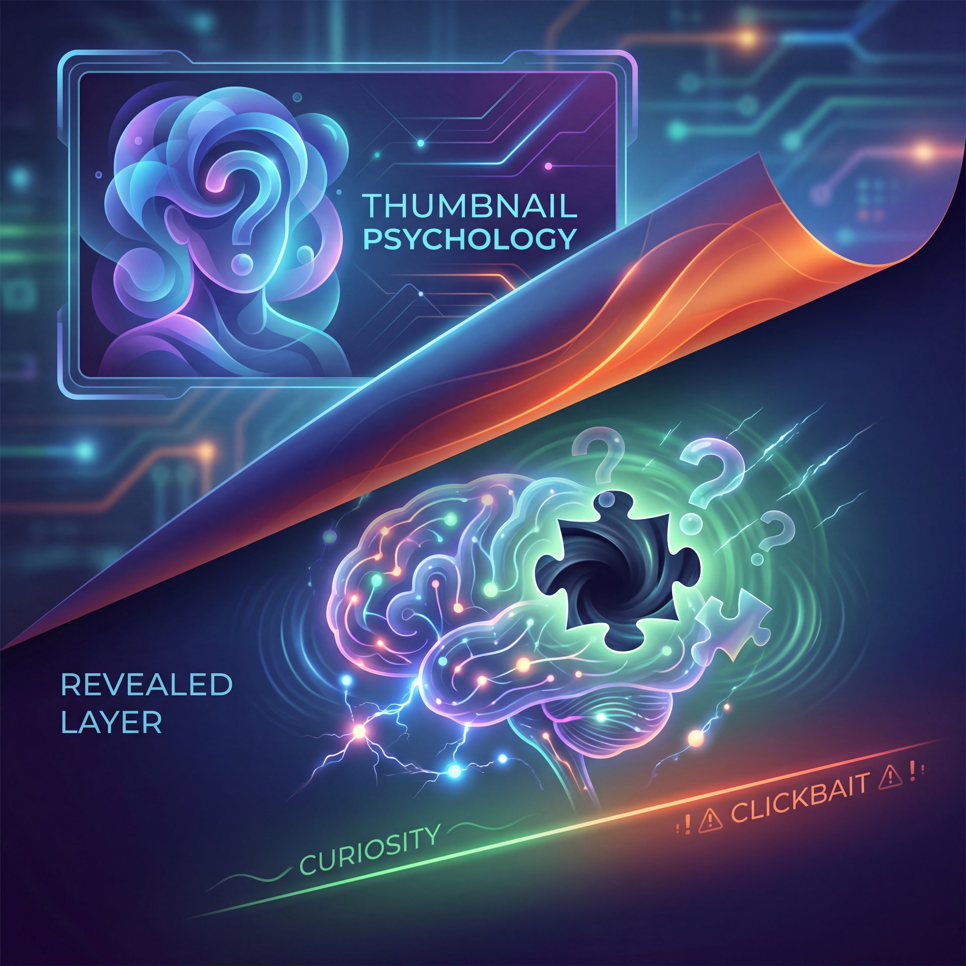
The Curiosity Gap is a concept originally identified by psychologist George Loewenstein. It basically says that when we feel a gap between what we know and what we want to know, it feels like a mental itch. We’re motivated to close that gap.
(You know what, scratch that.)
This is the secret sauce of viral thumbnails. However, or maybe I’m overthinking it, you have to be careful because there’s a fine line between curiosity and clickbait.Clickbait promises something you don’t deliver. This Might get you the click but kills your retention long-term — and the Curiosity Gap is about teasing the value you actually deliver.
For example, if you’re making a video about fixing a car engine, don’t just show the finished engine. Show the engine in pieces with a title like “The Mistake That Killed This Motor.” Now the viewer has a question they have to click to answer.. No joke.
According to HubSpot marketing research, properly using the Curiosity Gap can increase CTR by up to 50%. But it requires balance, you can’t be too vague. You want to show the “What” but hide the “How.”
📊 Before/After
Before: A thumbnail showing a finished cake with text “How to Bake a Cake.” (CTR: around 2%)
After: A thumbnail showing the cake batter turning a strange color with text “Don’t Add This!” (CTR: 8%)
Why it worked: The second version created a knowledge gap. Worth it. Viewers needed to know what the forbidden ingredient was to avoid ruining thier own baking.
For a deeper dive into what happens when this goes wrong, check out Why Thumbnail Psychology Fails. We break down exactly how to avoid the “confusion gap,” which is when your mystery just leaves people baffled instead of curious.
Color Psychology Tricks That Grab Attention Instantly
(Cards on the table…)
Now let’s talk about color. Most people just pick colors they like, but your personal preference doesn’t matter here, and what matters is contrast, because the human eye is drawn to it. In the tiny space of a mobile screen, contrast is king.
You want to use complementary colors, colors that are opposite each other on the color wheel. Blue and orange. Red & green. Yellow and purple. When you put these next to each other, they pop.
That 82% stat regarding that really pops elements means you’re nearly doubling the 💀 chance someone notices your video just by picking the right colors. I’ve found that bright backgrounds with dark subjects (or vice versa) work best.
Also, think about the platform you’re on. YouTube is mostly white or dark gray. If your thumbnail is mostly white or gray, it blends in and disappears. Big difference. Bright yellows, intense reds, or electric blues work best because you want to use saturation to stand out.
However, don’t go overboard. If everything is neon, nothing stands out. Use color to guide the eye and make the most important element the brightest thing in the frame.
📋 Quick
Advanced 2026 Strategies: AI and The Zeigarnik Effect
All right, so let’s look at some of the newer stuff we’re seeing in 2026. The tech has moved fast, and we now have AI that can analyze emotional resonance before you even publish. But the psychology underneath it’s classic.
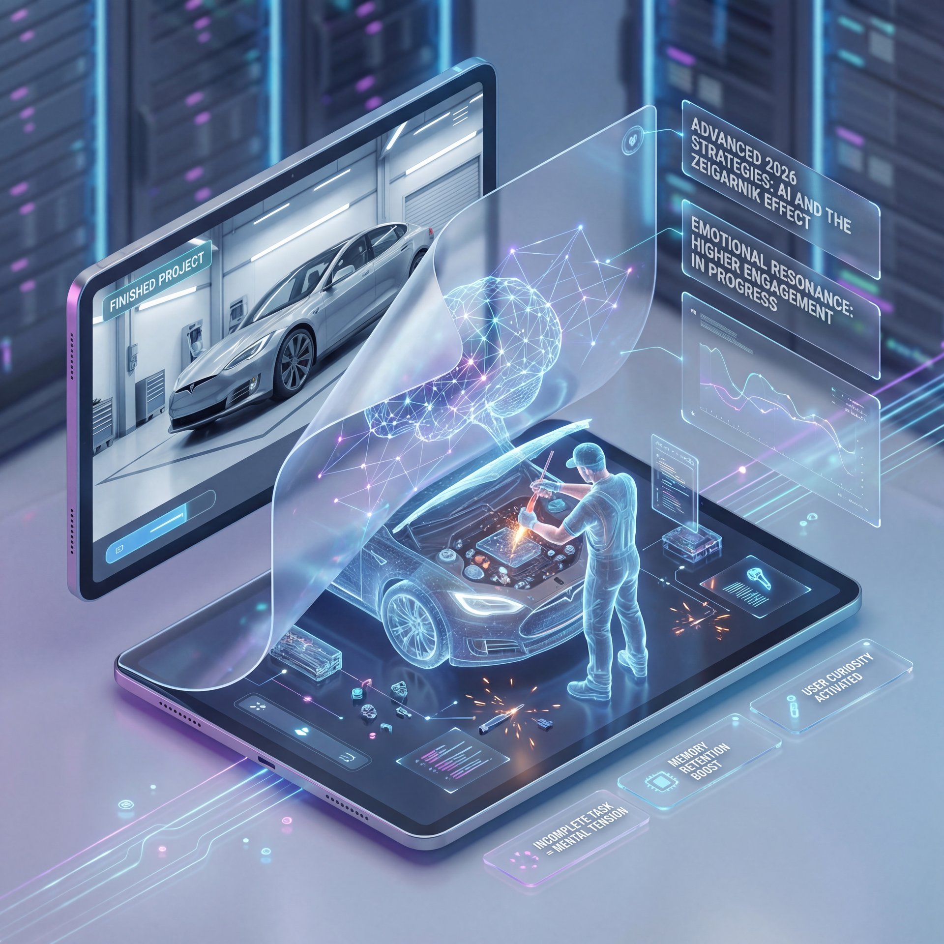
Have you ever heard of the Zeigarnik Effect? It’s a principle that states people remember uncompleted or interrupted tasks better than completed ones. In thumbnails, this means (lol) showing a process in motion. Don’t show the car fully fixed (show the mechanic holding a wrench, looking confused at a loose bolt.
This creates tension. The viewer’s brain wants to see the completion, and according to behavioral psychology studies, the Zeigarnik Effect in thumbnail design creates 67% higher engagement. Thumbnails featuring transformation or before/after elements generate like 4x more engagement than static imagery, according to Social Media Examiner.
Creating these scenarios used to take a full photoshoot. But with tools like Banana Thumbnail, we can simulate these situations. The platform has 71 professional photo options that are specifically designed around cognitive triggers like social proof, scarcity, and pattern interruption.
🔧 Tool Recommendation (bear with me here)
Banana Thumbnail AI
Stop guessing which emotional trigger works. Use Banana Thumbnail to generate variations based on proven psychological patterns like the Zeigarnik Effect. Not even close. You can swap backgrounds and expressions instantly to find the perfect “unfinished story” look.
I think the biggest advantage creators have in 2026 is speed. You can test three different psychological angles (one fear-based, one curiosity-based, one benefit-based, in the time it used to take to make one bad thumbnail in Photoshop.
Visual Hierarchy: The F-Pattern and Text Placement – quick version
So let’s cover where to put your stuff. You can’t just throw text and images randomly on the canvas because people read images in specific patterns. The most common one is the F-Pattern. we scan the top left, move across to the right, then scan down the left side. This means the top left corner is prime real estate.
Though on mobile, the bottom right is often covered by the timestamp. So never put anything important there. I see people put their main text there all the time, and it gets covered by “12:04.” It’s a rookie mistake.
Here’s a simple workflow I use to ensure my hierarchy is solid:
**The Anchor Image**
Place your face or main subject on the right or left third of the frame. Make it big (at least 40% of the space).
**The Hook Text**
Place 3-5 words of text in the negative space (usually top left or middle left). Use a bold, sans-serif font.
**The Contrast Check**
Squint your eyes. Does the text stand out? If not, add a drop shadow or a black box behind it.
You want the viewer’s eye to flow naturally: Face → Text → Click. Also, keep the text short, and don’t repeat the title. Game changer. If your title is “Reviewing, the 2026 Ford Mustang,” your thumbnail text should be something like “Better Than Ferrari?” or “Don’t Buy Yet!”
💡 Quick Tip
Test your thumbnail at small sizes. Zoom out until the image is the size of a postage stamp. No joke. Can you still read the text? Can you still see the emotion on the face? If not, it won’t work on a smartphone, and most of your views come from mobile.
If you’re finding that your text is getting ignored, you might be falling into some classic traps. Check out AI Secret to Fix YouTube Thumbnail Mistakes to see if you’re guilty of these layout errors.
Making It All Work Together
So putting it all together, successful thumbnail psychology isn’t about one single trick. It’s about layering these elements. You start with a high-contrast color palette to grab attention in those important 0.3 seconds. Then add a face with a strong emotion to create a connection. Use the Zeigarnik Effect or Curiosity Gap to create a need to know more. And you arrange it all in a layout that the brain can process in under a second.
Here’s What This Means for You
It sounds like a lot, I know. But once you get the hang of it, it becomes second nature. Seriously. And with the AI tools we have now in 2026, the technical barrier is gone, so there’s no need to be a graphic designer (you just need to understand people).
If you start applying these principles today, I guarantee you’ll see a difference in your analytics. It might not happen overnight, but as you refine your instinct for what makes people click, your channel will grow.
Frequently Asked Questions
What is the most important element of thumbnail psychology?
The most critical element is emotion; thumbnails with faces showing genuine, high-arousal emotions like surprise or joy get significantly more clicks because humans are biologically wired to respond to facial cues.
Does color really affect click-through rate?
Yes, high-contrast complementary colors (like blue/orange or yellow/black) can increase attention span by 82% because they make the thumbnail stand out visually against the platform’s background.
How does the Curiosity Gap work in thumbnails?
It works by presenting incomplete information that creates a cognitive “itch,” motivating the viewer to click the video to resolve the mystery and close the gap between what they see and what they want to know.
Why should I avoid putting text in the bottom right corner?
You should avoid the bottom right corner because YouTube overlays the video timestamp there, which will cover up your text and make it unreadable to the viewer.
What is the Zeigarnik Effect in thumbnail design?
The Zeigarnik Effect is a psychological principle where people remember unfinished tasks better than finished ones; in thumbnails, this means showing an action in progress rather than the final result to compel a click. Worth it. Fair enough.
Word Count: 1,897 words
Related Videos
Related Content
For more on this topic, check out: youtube
Listen to This Article
