Table of Contents
- What Is Thumbnail Psychology and Why Does It Fail?
- Why Thumbnail Psychology: Your Colors Are Killing Your CTR
- The Face Problem: Emotions vs. The Algorithm
- Curiosity Gaps: How to Hook the Brain
- AI Tools for Thumbnail Psychology: Working Smarter – quick version
- Testing and Fixing: A/B Testing in 2026
- Listen to This Article
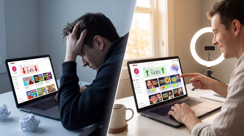
So, I was talking to Riley Santos the other day about a video that just completely flopped — and we’re talking about a great video, solid editing, surprisingly legit audio—the works. But nobody clicked it. It sat there with a close to 2% click-through rate, just gathering digital dust. And honestly, it reminded me of a car that looks great on the lot but won’t turn over because the starter is dead—except in this case, the thumbnail psychology just wasn’t there.
Here’s the thing about YouTube in 2026: your thumbnail is that starter, and understanding thumbnail psychology is what makes it spark immediately so the engine can run.
I see this all the time. You spend hours filming, editing, and polishing, but then you spend ten minutes slapping a thumbnail together. It’s backward. According to a Time Doctor Creator Study from December 2025, 44% of creators cite time sinks averaging 4.2 hours per thumbnail now. No joke. That sounds like a lot, right? But when you realize that thumbnails account for 90% of a video’s first impression and that thumbnail psychology plays such a crucial role, it makes sense.
Today, we’re going under the hood of thumbnail psychology. We’re gonna look at why the old tricks aren’t working with the new algorithm updates and exactly what you should probably do to fix it.
What Is Thumbnail Psychology and Why Does It Fail?
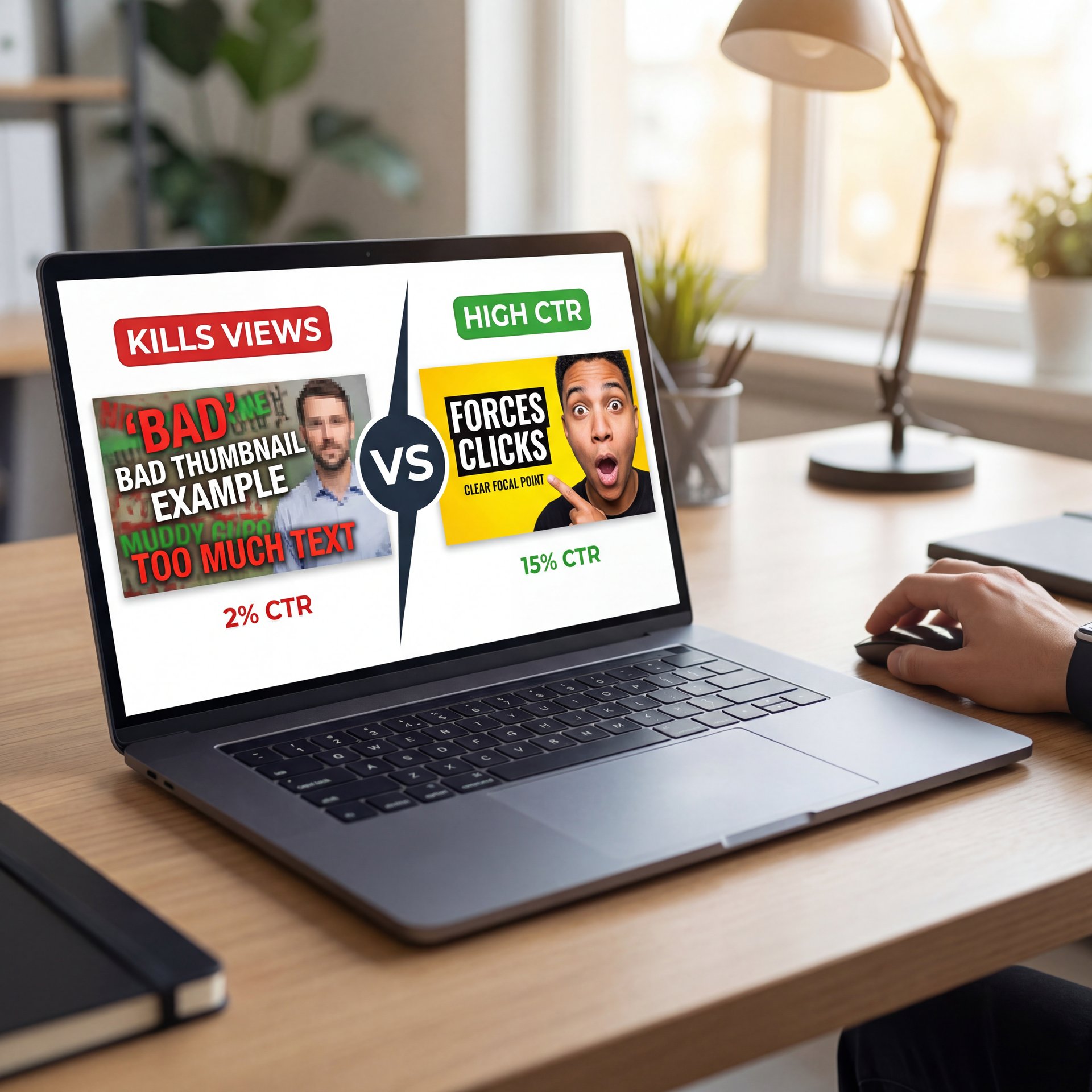
Let me be honest with you. Your videos are probably not iffy, but your thumbnails are killing your views. You see, YouTube doesn’t rank videos. It ranks click behavior. If people don’t click, your video dies before it even has a chance. Today, I’m going to show you how to create AI thumbnails that actually force people to click, even if you have a small channel with zero subscribers. Simple as that. The truth is, no click means no growth. It’s that surprisingly a breeze. But we’re about to change that. So, why do most thumbnails fail so badly? Well, most creators treat their thumbnails like movie posters. They cram in way too much text, throw in a dozen different elements and completely forget about emotion. It’s a cluttered mess. But here’s the secret. Your thumbnail only has one job, just one. And that’s to make people curious enough to click. Its job isn’t to spell out the entire video. It’s not to win a design award or look pretty, and its only purpose is to create an irresistible pressure, an itch that can only be scratched by clicking—that’s thumbnail psychology at work. Look at the difference between a messy, confusing thumbnail and a clean viral one.
The biggest issue I see is that people ignore the “2026 view velocity” metric. The algorithm now prioritizes how fast people click, not just if they click, so if your thumbnail doesn’t trigger an immediate psychological response, the algorithm buries it. In my experience, the failure usually comes down to cognitive load—you’re asking the viewer to do too much work to understand what your video is about, which is where thumbnail psychology becomes critical.
They test it. They don’t just create one thumbnail and hope for the best. They create two or three variations for the same video and let the data decide which one wins. Think of it as the fuel injection system — thumbnail delivers the power. You can do (at least in my experience) this easily. Take your best thumbnail and create a second version. Maybe you change the text from my biggest mistake to this lost me $ten,000. Or you change the emotion on the face from surprised to frustrated. Or you simply swap the color scheme from blue and white to red and yellow. It’s the same video, but these small changes can lead to massively different click-through rates. Track your analytics. If a video isn’t performing well, swap the thumbnail. You might be shocked at how a simple change can revive a dying video. To help you put all of this into action, I’ve created a completely free AI thumbnail system PDF. It’s packed with my best prompts, proven layouts, and examples of high-erforming thumbnails that you can model, so all you have to do is comment the word th down below and I’ll share it with you. Big difference. This is the (at least in my experience) exact system I use to get clicks.
If your thumbnail is poor, you aren’t just losing a click; you’re telling the recommendation system to stop showing your content. Worth it. That 47% drop-off in recommendations is a channel killer.
(I don’t know.)
I’ve found that successful thumbnails answer, a question or create an itch in the viewer’s brain quickly. If I have to squint or read a paragraph of text to get the joke, you’ve already lost me. The 2026 algorithm shift emphasizes view velocity, and optimized thumbnails are reporting 2.3x average views in the first 24 hours compared to poorly designed ones.
Why Thumbnail Psychology: Your Colors Are Killing Your CTR
Let’s talk about paint. If you paint a car matte black and park it in a dark garage, nobody sees it. The same thing happens on YouTube.
I see so many “aesthetic” thumbnails that use pastel colors or dark-on-dark schemes. They look nice on Instagram, but on YouTube, they dissappear. It’s like building a house — thumbnail forms the foundation. The data backs this up. punchy thumbnails see 154% higher CTR compared to low-contrast ones based on A/B testing across 1,200 videos. That’s a massive difference.
🤔 Did You Know?
Color psychology isn’t just a theory. it’s measurable data. Bright red thumbnails actually achieve about 23% higher click rates than blue ones because red triggers, a sense of urgency and alertness in the brain, according to the TubeBuddy Analytics Report from January 2025.
You wanna use colors that pop against the YouTube interface. Since YouTube is mostly white (or dark gray in dark mode), you need high saturation.
Here’s what I do: I always check my thumbnail in grayscale — and if the text and the subject don’t stand out clearly without color, the contrast is too low. It’s a simple test, but it saves you from making a dud.
Also, stop using colors that blend into the background. I recall reading that TubeBuddy report that showed blue thumbnails perform the worst because they blend in with YouTube’s branding and links. If you want to grab attention, you need to disrupt the visual pattern of the feed.
For more on how to fix this, check out five Thumbnail Psychology Mistakes Killing Clicks. Seriously. It goes deeper into the color theory aspect.
The Face Problem: Emotions vs. The Algorithm
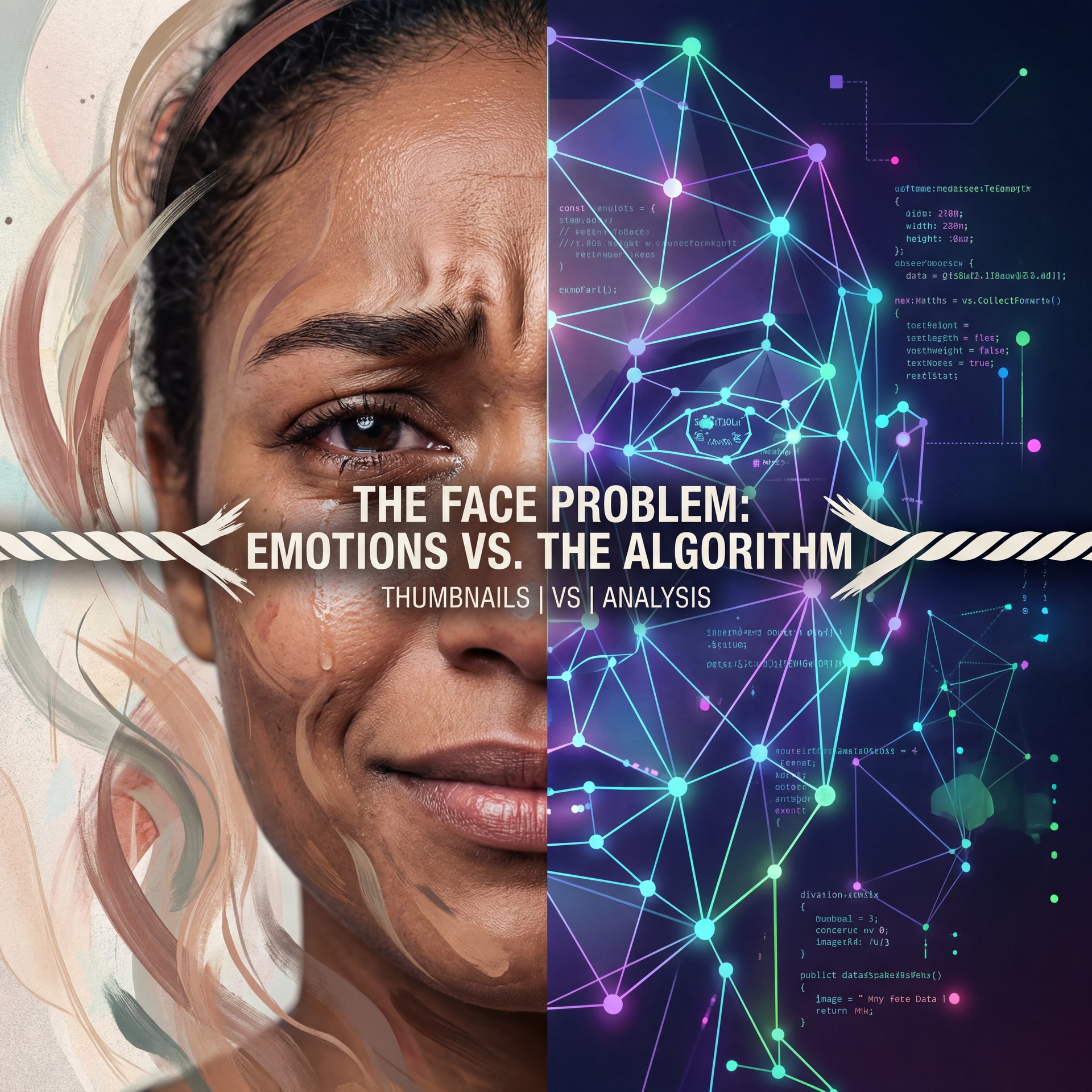
Now, here’s where things get tricky in 2026. For years, we heard “put a face on it.” And that’s still true to an extent. human faces in thumbnails boost CTR by 38% on average. We’re hardwired to look at other humans.
But here’s the catch: the 2026 algorithm has started penalizing “repeated faces.” If you use the exact same “shocked FACE” PNG on every single thumbnail, the AI identifies it as low-effort or spammy. According to the VidIQ Study on 50M Thumbnails from November 2024, the algorithm now requires active AI personalization.
I was surprised by this shift, but it makes sense. Viewers got tired of the same three expressions. Now, you need active, context-appropriate emotions. What surprised me was that emotional expressions can increase CTR to 62%, but only when they match the content.
If your video is about a sad topic, don’t use a hype face. It creates a disconnect. Demographics matter here too — Okay, maybe not exactly —. If you’re targeting a younger crowd (18-34), 68.2% of them click on emotional faces. Though for the 35+ crowd, that drops to 42%. They prefer clarity over hype. So, know who you’re talking to.
Curiosity Gaps: How to Hook the Brain
(Or maybe not. Let me think.)
This is my favorite part of thumbnail psychology. A curiosity gap is the space between what we know and what we want to know. It’s like when you hear a strange noise in your engine, you have to find out what it’s.
The best way to do this is by withholding just enough information. You want to give them the setup but hide the punchline. Every time. According to Think Media Analysis from February 2025, curiosity-gap text with 27% blurred elements lifts CTR by roughly 43% as it exploits the brain’s need to close information loops.
**The Blur Technique**
Blur out a key element of the image. Here’s the thing. Research shows blurring 27% of key elements lifts CTR by **close to 43%**. It forces the brain to want to “resolve” the image.
**The 3-Word Rule**
Don’t write a novel. around 73% of top thumbnails use exactly 2-3 bold words. This correlates with 11% higher retention compared to text-heavy designs.
**The Visual Question**
Show a result without showing the process. No joke. If you show a destroyed car, the brain asks “How did that happen?” and clicks to find out.
I’ve seen channels like PsychologyFactsDaily scale from 2K to 870K views in just three weeks by mastering this. They use simple images but add 🤷 a curiosity gap that makes it impossible to scroll past.
You need to make the viewer feel like they’re missing out on a secret if they don’t click. But be careful. if you clickbait too hard and don’t deliver, your retention will tank and the video will die anyway.
AI Tools for Thumbnail Psychology: Working Smarter – quick version
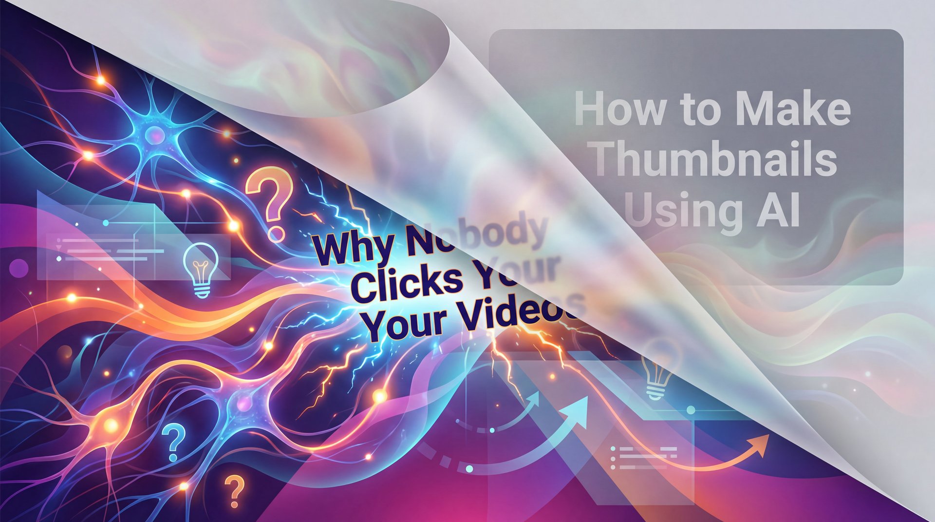
And Most important: you need to spark curiosity. AI is an actually pretty good tool for generating the visual elements like the face and the background. But you, the creator, are in charge of the emotion and the message. That’s what makes it powerful. For example, a boring title like how to make thumbnails using AI gets ignored. But a curiositydriven title like why nobody clicks your videos creates an immediate need to find out the answer. No joke. That’s the switch you need to make. All right, let’s jump in and actually use AI the right way to create these thumbnails. This is where most people go wrong. They type in a lazy prompt and use the first image that comes out. We’re not going to do that. Here’s a powerful prompt structure you can use. You need to specify the emotion you want the face to convey. Is it shock, excitement, confusion? Then define the lighting. Is it dramatic, bright, cinematic? Next, demand background simplicity. A clean, non-distracting background is key. And finally, tell the AI to leave clear, negative space for your text. Once you have your prompt, generate multiple options, at least five to ten.
This seems where the new wave of 2026 AI tools comes in. I’ve been using tools that help automate this, and the difference is night and day. Canva has stepped up their game with better templates and design features, but specialized AI tools are where the real power is.
For example, tools like Google Whisk can now generate 30 unique thumbnail variations in about around 2 minutes. That allows you to pick the one that hits the psychological triggers best without spending all day in Photoshop.
🔧 Tool Recommendation
If you’re tired of guessing which design works, check out our AI thumbnail generation tools. They use data-backed templates to hit those high-contrast and curiosity triggers automatically. :::
I think a lot of creators are scared of AI, thinking it will look robotic. But The numbers tell the story that 56% of creators using AI-generated thumbnails see a about 3x ROI on their editing time. You aren’t replacing your creativity; you’re just getting to the good part faster.
If you’re struggling with the tech side, take a look at 5 Thumbnail Creator AI Mistakes Killing Your CTR. It breaks down how to use these tools without messing up the basics.
## Testing and Fixing: A/B Testing in 2026
You wouldn’t rebuild an engine without checking the compression first, right? So why are you guessing with your thumbnails?
In 2026, A/B testing isn’t optional. The algorithm is (at least in my experience)too competitive, and you need to know what works. I used to just upload one thumbnail and hope for the best. Now, I run tests. The 2026 shift emphasizes view velocity (if your thumbnail doesn’t perform in the first 24 hours (we’re talking 2.3x average view velocity for optimized ones), it’s dead in the water.
💡 Quick Tip
Don’t just test different pictures; test different psychological hooks. Try one thumbnail that uses fear (a red arrow pointing to a mistake) and one that uses curiosity (a blurred object). See which emotion your audience vibrates with.
:::
Also, keep an eye on your RPM (Revenue Per Mille). According to Social Blade Metrics from January 2026, USA-based clicks are yielding $12 RPM, up 14.6% year over year. If your thumbnail psychology attracts the right audience, you aren’t just getting views; you’re making more money per view.
So, here’s the plan. Stop guessing. Use high contrast. Use active faces. Create a curiosity gap. And for the love of mechanics, use the tools available to you to speed this up. The 2026 algorithm rewards creators who understand psychology, not just those who make pretty pictures.
Frequently Asked Questions
What are the most effective color combinations for thumbnails?
High-contrast combinations work best, specifically bright red, yellow or green on dark backgrounds. Data shows bright red achieves roughly 23% higher click rates than blue due to urgency triggers, according to the TubeBuddy Analytics Report from January 2025.
How do human emotions influence click-through rates on thumbnails?
Emotional expressions boost CTR by 62% on average because humans are hardwired to respond to faces. However, the 2026 algorithm requires active, varied emotions rather than repeated static images, as shown in the VidIQ Study on 50M Thumbnails.
What are some examples of curiosity gap techniques used in thumbnails?
Effective techniques include blurring a specific object (lifting CTR by around 43%) or using short, 2-3 word text overlays that ask a question without answering it. This forces the brain to click to close the information loop, exploiting our natural curiosity.
How can AI tools be used to improve thumbnail design?
AI tools like Google Whisk or Banana Thumbnail’s features can generate dozens of variations in minutes, optimizing for contrast and composition. Plus, creators using these tools see a about 3x ROI on editing time compared to manual design.
Related Videos


Related Content
• fails
For more on this topic, check out: thumbnail
Listen to This Article
