Thumbnails make or break your video’s success. They grab attention, drive clicks, and influence YouTube’s algorithm. A great thumbnail is clear, mobile-friendly, and visually striking. This guide outlines 12 key elements to help you create thumbnails that stand out and boost your click-through rates.
Key takeaways:
- Use 1280×720 pixels, with a file size under 2MB.
- Bold, high-contrast colors work best to catch the eye.
- Keep text minimal (0-3 words) and use bold, readable fonts.
- Include human faces with expressive emotions for better engagement.
- Design with mobile users in mind – most YouTube views happen on smaller screens.
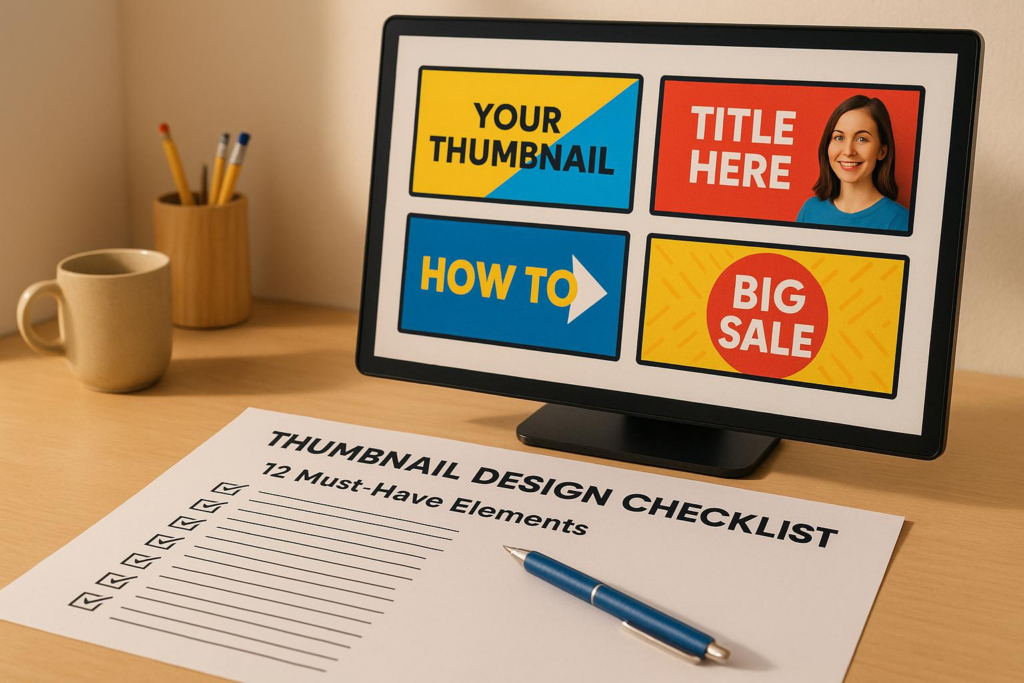
2025 Guide to Making YouTube Thumbnails – 15 Top Questions Answered
Technical Requirements for Thumbnails
Getting the technical details right is crucial to ensure your thumbnail displays properly on all devices and platforms. YouTube has specific guidelines that must be followed before you can upload a custom thumbnail.
Image Dimensions and File Size
YouTube thumbnails should be 1280 x 720 pixels with a 16:9 aspect ratio. This ensures your thumbnail appears consistent across smartphones, desktops, and smart TVs. While the minimum width is 640 pixels, aiming for the full 1280 x 720 resolution delivers the best results.
The file size must remain under 2MB, which helps avoid upload errors and ensures quick loading times.
YouTube accepts formats like:
- JPG for detailed photos
- PNG for images requiring transparency or sharp edges
- Static GIFs
To reduce file sizes without losing quality, tools like TinyPNG can be a lifesaver. Additionally, newer image formats provide better compression.
High-Resolution Image Quality
High-quality thumbnails are a hallmark of successful videos, with 90% of top-performing content featuring customized, clear visuals.
"Blurry or pixelated thumbnails turn viewers away. Always use high-quality images that match the resolution of your video." – Think Branded Media
Even if an image looks fine on a monitor, it can appear blurry on HD mobile screens or TVs. This is especially important since many YouTube viewers use mobile devices.
High-resolution images generally have a resolution of 300 dpi (dots per inch). While YouTube doesn’t require this exact standard, starting with high-quality source images ensures your thumbnail stays sharp after compression and resizing.
To maintain clarity, test your thumbnails on both smartphones and desktops. It’s also a good idea to strip unnecessary metadata – like copyright details or location data – from your image files, as these only add to file size without improving visual quality.
"High-resolution images are critical for grabbing attention. On platforms like YouTube, thumbnails are often the first point of contact between your content and potential viewers. A clear, vibrant thumbnail stands out in a sea of low-quality visuals, making viewers more likely to click on your video." – Luvfromwithin
Visual Design Principles
A strong visual design can make your thumbnails pop and grab attention. Smart design choices not only complement technical precision but also drive clicks. On a crowded platform like YouTube, where countless videos vie for attention, an eye-catching thumbnail can be the difference between standing out and blending in.
High-Contrast Colors
Bold, high-contrast colors are attention magnets. Pairings like red and blue, yellow and black, or blue and orange create striking visuals that naturally draw the eye. These combinations help your thumbnail stand out against YouTube’s busy interface, where viewers are bombarded with options.
Colors also evoke emotions. Red can create a sense of urgency, blue fosters trust, and yellow sparks curiosity. These emotional cues can subtly influence a viewer’s decision to click.
Avoid muted or low-contrast tones. While soft pastels and earth tones might look refined, they often fail to grab attention in YouTube’s fast-paced environment. Viewers scroll quickly, giving your thumbnail only a fraction of a second to make an impression. Bright, bold colors ensure your content doesn’t get overlooked.
Top creators understand this. For instance, MrBeast frequently uses vibrant yellow and blue combinations, making his thumbnails instantly recognizable. Similarly, Kurzgesagt’s bold and contrasting palettes ensure their educational content captures attention immediately.
After choosing your colors, focus on guiding the viewer’s eye with a clear focal point.
Clear Focal Point
A great thumbnail has one job: to grab attention. And a clear focal point is essential for achieving that. Whether it’s a person’s face, a product, or another key element, your thumbnail should direct viewers’ eyes to the most important part of your content.
To create a strong focal point, use techniques like shallow depth of field, which keeps your main subject sharp while subtly blurring the background. Placing the focal point centrally works well for many designs, but you can also use the rule of thirds to position it at visually compelling spots.
Keep your background simple. Busy or cluttered backgrounds compete with your focal point, making it harder for viewers to understand your thumbnail at a glance. A clean, streamlined background ensures the focus remains where it should be – on your main subject.
When viewers can instantly grasp what your video is about, they’re more likely to click. But beyond structure, adding human elements can take your thumbnails to the next level.
Faces and Emotions
Human faces are naturally captivating. We’re wired to notice faces and interpret emotions quickly, making them one of the most effective tools in thumbnail design. Close-ups of expressive faces often outperform thumbnails without any human elements.
Exaggerated expressions work best. Emotions like surprise, excitement, shock, or curiosity are easy to spot, even at small sizes, and they immediately communicate the tone of your video. For example, reaction channels often use wide-eyed amazement, while educational content might showcase thoughtful or curious expressions that hint at discovery.
Placement and size matter, too. Close-ups where the face dominates the thumbnail create stronger emotional connections than distant or small images. Make sure the eyes are clearly visible, as they can either engage the viewer directly or guide attention to other key elements.
Different content types call for different emotions. Tutorials might feature confident, approachable expressions, signaling expertise. On the other hand, entertainment or gaming channels often lean into dramatic or triumphant expressions to promise excitement or skill.
White Space Usage
Clean, uncluttered layouts make thumbnails easier to read – especially on mobile devices, where most YouTube viewing happens. White space, or negative space, refers to the empty areas around your key elements. This breathing room ensures your thumbnail doesn’t feel cramped and helps important components stand out.
White space is especially critical for smaller screens. Thumbnails that look fine on a desktop can become chaotic and hard to read on a smartphone. A spacious design ensures clarity, no matter the screen size.
To use white space effectively, limit the number of visual elements and avoid placing text or graphics too close to the edges. Simple backgrounds naturally create more negative space, while overly busy designs can overwhelm viewers.
Templates with built-in negative space can simplify your workflow. They help maintain consistency across multiple thumbnails and ensure your designs feel intentional and organized.
The goal is to create thumbnails that are easy to process at a glance. When viewers can quickly understand what your video offers without visual clutter, they’re more likely to click and engage.
Text and Typography Guidelines
After nailing your visuals, the next step is crafting effective text and typography to amplify your thumbnail’s impact. The trick is to use text sparingly and purposefully, making sure it complements your design without overwhelming it. Keep the text minimal and choose fonts that pop, even on small mobile screens.
Minimal Text
When it comes to thumbnail text, less is more. Viewers make split-second decisions, so stick to zero to three powerful words that deliver instant clarity.
- Keep it short: Use up to three words max. Single words like "REVEALED", "EXPOSED," or "WINNER" pack a punch. Two-word combos like "GAME CHANGER" or "EPIC FAIL" are easy to process and emotionally engaging. If you go for three words, make sure each one adds real value.
- Trigger curiosity or urgency: Words like "SECRET", "BANNED," or "SHOCKING" tap into natural human curiosity and the fear of missing out. These emotionally charged words make viewers want to click.
Crowded thumbnails with too much text force the brain to work harder, which can turn viewers away. Short, punchy phrases align with our preference for quick, digestible information. This is why successful creators, like gaming channels, often use words like "CLUTCH" or "INSANE" to highlight dramatic moments, while educational content leans on terms like "EXPLAINED" or "SOLVED" to promise clear answers.
Readable Fonts
Your text should match the quality of your visuals – bold, clear, and easy to read, even at thumbnail size.
- Stick to bold, sans-serif fonts: Options like Arial Black, Helvetica Bold, or Impact work well because their thick strokes and simple shapes stay legible, even when scaled down.
- Avoid decorative fonts: Fancy or script fonts might look great in larger designs, but they become unreadable when thumbnails shrink to mobile size. With over 70% of YouTube views happening on mobile, legibility is key.
- Use high-contrast text: Pair colors like white text with a black outline to ensure readability, even on busy or colorful backgrounds.
- Size matters: Text should take up about 10-15% of the thumbnail’s height. Preview it at mobile scale (around 1.5 inches wide) to confirm it’s clear.
- Place text wisely: Position text in clean areas of the thumbnail, avoiding cluttered or visually complex spots. The upper or lower third of the thumbnail often works best.
- Create a hierarchy: If you’re using multiple words, make the most important one larger to grab attention first. This guides the viewer’s eye and emphasizes key information.
Finally, always preview your thumbnails on a mobile device before finalizing them. What looks sharp on a computer screen might not translate well to a smartphone. Double-checking ensures your text remains clear and accessible across all devices.
Content Elements for Engagement
Thumbnails do more than just grab attention – they invite viewers to explore further. The key is finding a balance between sparking curiosity and staying genuine. This balance determines whether viewers stick around or leave feeling misled.
Curiosity-Driven Design
Great thumbnails tap into the curiosity gap, making viewers eager to learn more. This psychological trick works by hinting at a story without giving everything away. Show just enough to intrigue but hold back the full picture.
Partial reveals are especially effective. For instance, if your video showcases a dramatic transformation, clearly show the "before" while teasing the "after" with shadows, silhouettes, or cropped visuals. This leaves viewers wanting to click to see the full outcome.
Use contrasting elements to spark questions. Pair a surprised facial expression with an unexpected object, or place a familiar item in an unusual setting. These visual contradictions make the brain want to resolve the mystery.
Before-and-after layouts are another powerful tool. Split your thumbnail to highlight a stark contrast, like a room makeover or a skill improvement. The tension between the two states naturally draws viewers in to see the transformation.
Mystery elements can also work well – but use them thoughtfully. Blur out details, add question marks, or create visual puzzles that your video resolves. Just make sure these elements align with your content. Misleading thumbnails might get clicks initially, but they can harm your channel’s reputation and viewer retention in the long run.
Once you’ve captured attention, the next step is to build trust and recognition through consistent branding.
Brand Consistency
Beyond engaging visuals, consistent branding helps your thumbnails stand out and build trust over time. A strong, recognizable style ensures viewers can spot your content instantly, even in a crowded feed.
Start with a signature color palette. Choose two or three colors that reflect your channel’s tone. For example, tech channels often use clean blues and whites, while gaming channels might lean on bold reds and yellows for energy. Use these colors consistently in backgrounds, text, and accents.
Include your logo in a way that doesn’t distract from the main design. The bottom-right corner is a great spot – it’s visible but doesn’t compete with key visuals. Keep the logo size modest, around 5-8% of the thumbnail’s area, so it’s clear but unobtrusive.
Templates can save time and keep your branding steady. Create flexible thumbnail templates for different types of content while maintaining a unified look. For example, a tech review channel could have separate templates for unboxings, tutorials, and comparisons – all tied together by shared colors, logo placement, and typography.
Consistency also applies to graphic elements like shadows, borders, and icons. If you use drop shadows on text, stick to the same style and intensity across all thumbnails. Arrows, shapes, and decorative elements should follow a similar pattern, helping viewers instantly recognize your style.
You can introduce seasonal or series-specific tweaks without straying too far from your core branding. For example, adjust colors for holiday-themed content or add unique elements for an ongoing series. These variations should feel like natural extensions of your brand, not complete departures.
sbb-itb-2f70369
Optimization and Testing Methods
Creating eye-catching thumbnails is just the first step. The real challenge lies in fine-tuning and testing them to figure out what actually grabs attention and boosts clicks. Many creators fall into the trap of designing once and never revisiting their work. But successful creators treat thumbnails as ongoing experiments, constantly tweaking them based on actual performance data.
Since most viewers are on mobile devices, it’s crucial to design thumbnails that look sharp and clear on smaller screens.
Mobile-First Design
Start by designing for the smallest screens first, then scale up. This ensures your thumbnails look good everywhere – from a phone’s tiny display to a large desktop monitor. Text readability is especially important for mobile users. If your thumbnail includes text, keep it short – 2 to 4 words max – and use fonts that are bold and easy to read, even at smaller sizes.
To test how your thumbnail will look on a phone, take a screenshot and view it on your device’s photo gallery. Better yet, upload it as an unlisted video on YouTube to see how it appears in the app. This simple step can reveal if any details are too small or unclear.
Facial expressions should be bold and exaggerated since subtle details often get lost on mobile screens. And don’t forget about color contrast. Phones are used in all kinds of lighting – from bright sunlight to dim rooms – so choose high-contrast color combinations to make your thumbnail stand out.
Try a quick "thumb test." Cover part of the thumbnail on your phone to check if the key elements remain visible. Once your design is optimized for mobile, you’re ready to test alternate versions to find what works best.
A/B Testing Process
After making your thumbnail mobile-friendly, take it a step further with A/B testing. Some platforms provide tools to compare different thumbnail designs in real-time, taking the guesswork out of the process.
Focus on testing one element at a time over a 24–48 hour period. For example, compare a bright background with a dark one, or test a surprised facial expression against a confident look. Avoid changing multiple elements at once – like background, text, and colors – because it’ll be harder to pinpoint what made the difference.
While click-through rate (CTR) is the main metric to watch, don’t overlook other indicators like average view duration and audience retention. These can give you a fuller picture of how your thumbnail impacts viewer behavior.
Keep track of your results in a simple spreadsheet. Note which designs perform better and why they might be more effective. Over time, even small improvements – like a 1% increase in CTR – can lead to noticeable growth when applied across thousands of views.
Finally, think about seasonal changes. A thumbnail that performs well during the summer or a specific holiday might not have the same impact year-round. Regular testing and updates will help keep your thumbnails fresh, relevant, and engaging.
AI-Powered Design with Banana Thumbnail

Banana Thumbnail makes creating eye-catching thumbnails faster and easier by combining advanced AI with proven design strategies. Say goodbye to steep learning curves and expensive software subscriptions – this tool does the heavy lifting for you.
Banana Thumbnail Features
Banana Thumbnail isn’t just another template generator. Its AI engine analyzes your channel’s unique style and audience preferences to craft thumbnails that truly fit your content. By studying your channel’s DNA, it ensures every thumbnail aligns with your brand and resonates with your viewers.
One standout feature is its video content recognition. The AI examines your uploaded video to identify key elements, like themes or visuals, and suggests colors, layouts, and design features that match. For example, upload a gaming video, and the AI will recommend vibrant, action-packed designs that appeal to gaming enthusiasts.
Another powerful tool is the viral psychology engine, which taps into five key themes to boost viewer engagement: Shock & Awe, Curiosity Gap, Before/After, Versus Battle, and Breaking News. These themes are rooted in psychological triggers that draw attention and encourage clicks.
Banana Thumbnail ensures all thumbnails are created in 1920×1080 resolution, meeting YouTube’s requirements for both desktop and mobile viewing. No need to create multiple versions – your thumbnails will look sharp and professional across devices.
AI Design Benefits
This AI-powered approach doesn’t just simplify design – it also delivers tangible benefits.
First, it saves you a ton of time. Instead of manually adjusting colors, fonts, or layouts, you can generate multiple variations in seconds. Pick your favorite or combine elements to get the perfect result.
The AI also handles all the technical specs for you. File sizes, dimensions, and resolutions are automatically optimized, so you never have to worry about rejected uploads or blurry thumbnails. Everything is ready for YouTube right out of the box.
Even better, you don’t need to be a design expert. The AI applies tried-and-true design principles to ensure proper contrast, readable text, and a clean visual hierarchy. Whether you’re a beginner or a seasoned creator, your thumbnails will look polished and professional.
For creators looking to monetize their skills, Banana Thumbnail offers commercial-use licensing with its premium tokens. This means you can confidently use AI-generated thumbnails for client projects or monetized content without worrying about legal issues.
The token system is straightforward and flexible. Tokens never expire, so you can buy them when it’s convenient and use them at your own pace. Starting at just $4.99 for 45 tokens, Banana Thumbnail makes professional-quality design accessible – even for creators on a budget.
12-Point Thumbnail Checklist
Here’s a streamlined checklist to help your thumbnails stand out and perform well across all metrics:
- Technical Standards: Make sure your thumbnail is 1280×720 pixels and saved as a JPG, GIF, or PNG file. Keep the file size under 2MB to avoid upload issues.
- Visual Impact: Use bold, high-contrast colors and focus on a single, clear element. If you’re including faces, they should take up at least 30% of the thumbnail for maximum impact.
- Text and Typography: Stick to zero to three words and choose fonts that are easy to read, even on small screens.
- Strategic Design: Keep key elements spaced out with enough white space to avoid clutter. Design thumbnails to spark curiosity – think of them as teasers, not spoilers. Use consistent branding with your colors, fonts, and style to make your content instantly recognizable.
- Mobile Optimization: Confirm your thumbnail looks great on smaller screens.
- Testing and Refinement: Use A/B testing to compare different designs and identify which ones boost your click-through rates.
Double-check these steps before publishing to ensure your thumbnails grab attention and help grow your channel.
Related Content
You might also find this helpful: must
Conclusion: Improve Your Thumbnails
Your thumbnail is your first impression, and on mobile screens – where over 70% of YouTube views happen – you have just 0.3 seconds to grab attention.
The 12-point checklist outlines the elements that make a thumbnail stand out. Creators who consistently follow these principles often experience CTR boosts of 20-50% or more. This leads to more views, increased watch times, and faster subscriber growth. In fact, YouTube reports that over 90% of top-performing videos feature custom thumbnails.
By ditching guesswork and embracing proven design practices, you’re addressing technical needs, creating visual appeal, and tapping into psychological triggers. This approach not only ensures consistency across your thumbnails but also sets the stage for leveraging advanced design tools.
For those looking to streamline the process, Banana Thumbnail simplifies it all. This tool automatically applies best practices, ensuring your thumbnails meet both technical and visual standards every time.
FAQs
How can I test and improve my YouTube thumbnail designs to boost click-through rates?
To boost your YouTube thumbnail click-through rates (CTR), start by experimenting with different thumbnail designs. Platforms like YouTube Studio offer built-in tools to test and compare how various thumbnails perform before you commit to one. Make it a habit to review your CTR data regularly to identify which styles grab your audience’s attention the most.
Pay close attention to elements like contrast, emotional appeal, and the inclusion of faces or bold text. Even small adjustments – such as tweaking colors or rearranging layouts – can have a noticeable impact. By consistently analyzing data and aligning your designs with audience preferences, you’ll create thumbnails that not only stand out but also drive more clicks.
How can I make sure my thumbnails look sharp and clear on all devices?
To make sure your thumbnails look crisp and clear on any device, aim for a resolution of 1280×720 pixels with a 16:9 aspect ratio – this setup ensures they display perfectly. Use high-quality PNG or JPG formats, and keep the file size below 2 MB to prevent any unwanted compression.
Before you wrap up, preview your thumbnail on various devices like smartphones, tablets, and desktops to guarantee it’s sharp and visually appealing everywhere.
Why should YouTube thumbnails use bold colors and minimal text?
Using bold, high-contrast colors in thumbnails can make them instantly eye-catching, helping them stand out in a busy feed. These bright, contrasting hues create a striking effect that grabs attention, even on smaller screens, increasing the chances that viewers will click.
Keeping text minimal ensures the thumbnail stays clean and easy to read, especially on mobile devices where space is tight. This simplicity helps viewers quickly grasp the video’s topic without feeling overloaded. When combined, these elements enhance clarity, capture attention, and encourage clicks by tapping into both visual appeal and psychological cues.