All right, let’s be real for a second. I remember back when I first started creating content, I spent about 20 hours editing a single video. It was a masterpiece—at least, I thought it was. I uploaded it, sat back, and waited for the views to roll in.
Cricket sounds.
It took me a while to realize that while my video was great, my packaging was terrible. I had just grabbed a random blurry frame from the video as the thumbnail. Nobody clicked because nobody knew why they should care. It was a hard lesson, but it changed everything for me.
Here’s the thing: You can make the best video in the history of the internet, but if your thumbnail doesn’t get that click, the algorithm is going to bury it. It’s just that simple.
So, I’m going to dive into exactly how to create YouTube thumbnails that actually stop the scroll. We’re not just talking about making things look “pretty.” We’re talking about the psychology, the strategy, and the actual step-by-step workflow to get those click-through rates (CTR) up. Whether you’re just starting out or you’re trying to break through a plateau, you’re going to want to read this.
Why the “Click” is the Most Important Metric
Let’s look at the numbers. YouTube is a massive search engine, right? But it’s also a visual platform. When a user opens the app, they’re bombarded with options. Your thumbnail is your billboard. It’s your movie poster. It’s the only chance you have to make a first impression.
If your CTR is low, YouTube’s algorithm thinks, “Okay, people aren’t interested in this,” and stops showing it to new potential viewers. But if you have a high CTR combined with good watch time, that’s when videos go viral.
Now, a lot of people think this is just about clickbait. It’s not. It’s about delivering on a promise. Your title and thumbnail set an expectation. If you promise something crazy in the thumbnail and don’t deliver, viewers leave, and that hurts your channel too. So we need to find that sweet spot between “exciting” and “honest.”
According to the YouTube Creator Academy{rel=”nofollow”}, 90% of the best-performing videos on YouTube have custom thumbnails. That means if you’re relying on auto-generated frames, you’re already playing from behind. We need to take control of that image.
The Psychology Behind What Makes People Click
Before we even open an editing program, we need to understand what triggers a human brain to click. It usually boils down to emotion and curiosity.
Humans are hardwired to look at faces. It’s an evolutionary thing. We look for eyes to gauge emotion. That’s why you see so many creators making exaggerated faces—shock, joy, anger. It communicates the emotional stakes of the video instantly. You don’t have to go full “MrBeast open-mouth shock” on every video, but having a clear, visible face with a distinct expression helps massive amounts.
Another factor is color and contrast. YouTube’s background is either stark white or dark grey (if you’re in dark mode). You want colors that pop against those backgrounds. Bright yellows, greens and saturated reds tend to grab attention because they contrast well with the interface.
⚠️ Text Overload Kills Clicks
One of the biggest mistakes I see is trying to put the video title inside the thumbnail. Don’t do this! The thumbnail text should complement the title, not repeat it. If your title is “How to Bake a Cake,” your thumbnail text should be “So Fluffy!” or “Don’t Do This!” Keep it to 3-4 words maximum so it’s readable on mobile. If you’re struggling to simplify your design, check out our workflows page for layout ideas that prioritize readability.
Planning Your Concept Before You Shoot
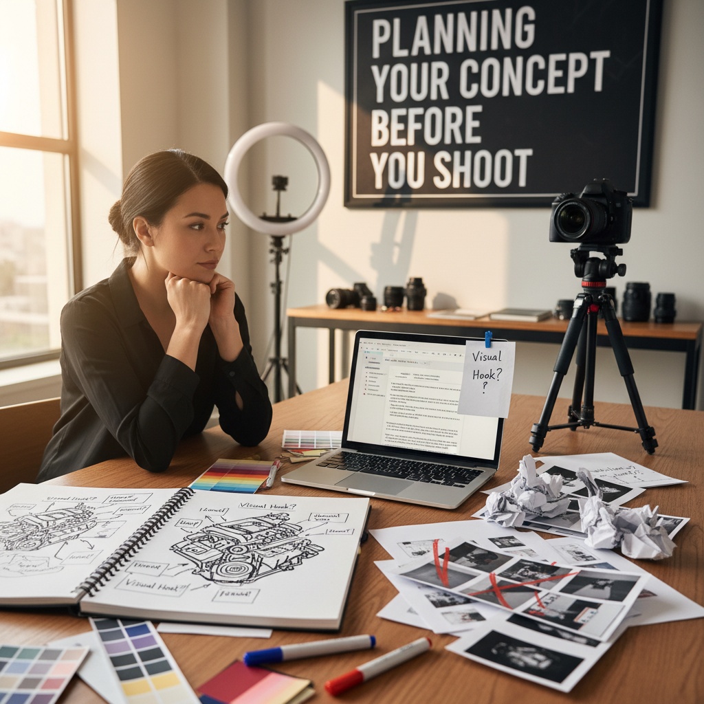
This is where the pros separate themselves from the amateurs. A lot of creators shoot their video, edit it and then at the very end, they think, “Oh shoot, I need a thumbnail.” Then they scramble to find a screenshot.
Don’t do that.
You want to plan your thumbnail before you even hit record on the video. I know, it sounds like extra work, but trust me, it saves time later. When I’m scripting, I’m already thinking, “What’s the visual hook?”
If the video is about fixing a car engine, the hook might be me holding a broken part looking frustrated. If it’s a travel vlog, it might be a wide shot of the landscape with me in the foreground pointing at something.
By planning this, you know exactly what photos you need to take during your shoot. You aren’t hunting for frames later; you’re creating assets intentionally.
Capturing the Right Assets
So, let’s go ahead and talk about the actual photography part. You don’t need a $3,000 camera for this. Your smartphone is totally fine, especially for thumbnails where the image is going to be compressed anyway.
When you’re on location or in your studio, take five minutes specifically for thumbnail photos.
First, lighting. You want the subject (usually you) to be well-lit. Shadows across the face can look moody, but for a thumbnail, they often just look muddy. We want pop. If you can, use a ring light or stand facing a window.
Second, expressions. Take a bunch of them. Smile, look confused, look angry, point to the left, point to the right. I usually snap about 20-30 photos in rapid succession just to make sure I have options. It feels silly while you’re doing it, but you’ll thank yourself when you’re editing.
Third, leave “negative space.” This is crucial. If you’re going to put text on the right side of the image, make sure you frame yourself on the left. Don’t center yourself perfectly unless you plan on having text go right over your chest (which usually looks weird).
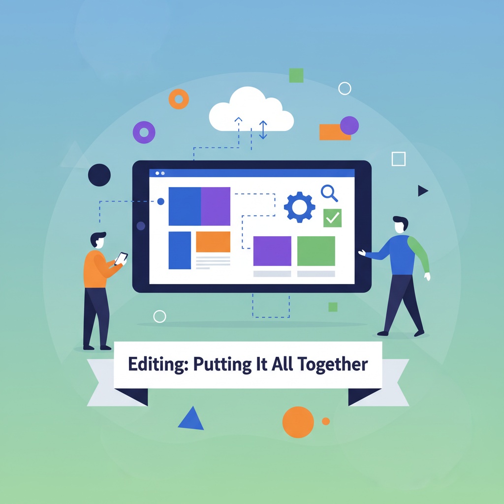
Editing: Putting It All Together
Now we get to the fun part—the edit. This is where we build the composition. In 2025, we have some incredible tools that make this faster than ever, but the principles remain the same.
We want to separate the subject from the background. This creates depth. Back in the day, we had to use the pen tool and manually trace around our hair. It was a nightmare. Now, AI tools handle this in seconds.
Pro Tip: Boost your saturation and contrast slightly more than you think you need to. Remember, most people are viewing this on a small phone screen. What looks “natural” on a 27-inch monitor might look washed out and grey on a smartphone. You want the colors to punch through the screen.
Once your subject is cut out, you can put a stroke or a “glow” behind them. This is a classic YouTuber tactic, but it works because it physically separates the subject from the background environment, making the image easier to read at a glance.
For the background, blur it out a little bit. If the background is sharp and the subject is sharp, the eye doesn’t know where to look. By adding a slight Gaussian blur to the background, you force the viewer’s eye to focus on the subject and the text.
🔧 Speed Up with AI Generation
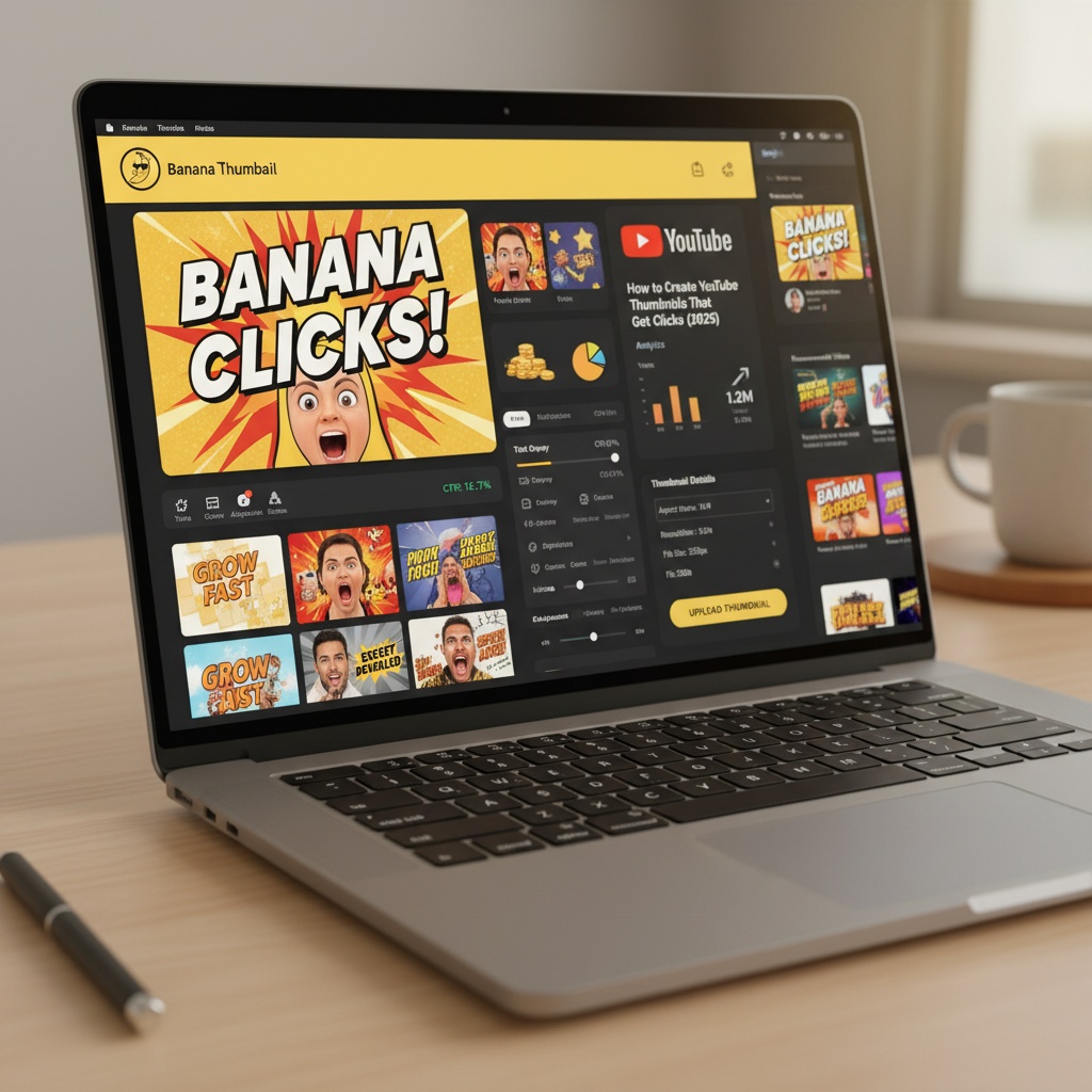
If you’re tired of manually adjusting shadows, strokes and background blurs for every single video, AI can massively speed this up. You can generate high-quality backgrounds or enhance your subject cutouts instantly. Check out the video generation features and image tools at Banana Thumbnail to see how you can automate the tedious parts of design and focus on the creative concept.
The “3-Second Rule” Layout Strategy
Here’s a test I like to use. I call it the 3-second rule. Show your thumbnail to a friend (or just look away and look back) for exactly three seconds. Can they tell you what the video is about?
If they have to squint to read the text, or if they ask “what is that thing in the corner?”, you’ve failed the test.
Keep your layout simple. The Rule of Thirds is your best friend here. Imagine a tic-tac-toe grid over your image. Put your eyes or the main subject on one of those intersection lines.
Related Content
• youtube
For more on this topic, check out: thumbnails