Your thumbnail is your video’s first impression. It’s what gets people to stop scrolling and click. A strong thumbnail can boost your click-through rate (CTR), improve search rankings, and help your videos appear in suggested feeds. But designing one doesn’t have to take hours.
Here’s how to create eye-catching thumbnails quickly:
- Use human faces with strong emotions to connect with viewers.
- Tease curiosity by showing just enough to spark interest.
- Bright, high-contrast colors grab attention in crowded feeds.
- Keep text short and bold for readability, especially on mobile.
- Stick to YouTube’s specs (1,920 x 1,080 pixels, 16:9 ratio).
For faster results, tools like Banana Thumbnail use AI to design thumbnails in minutes. You upload an image, pick a theme (like “Before/After” or “Curiosity Gap”), and customize it. The AI optimizes everything for CTR, making it simple to create professional designs without any expertise.
Spending hours on thumbnails is outdated. With AI tools, you can save time, maintain brand consistency, and test designs to find what works best.
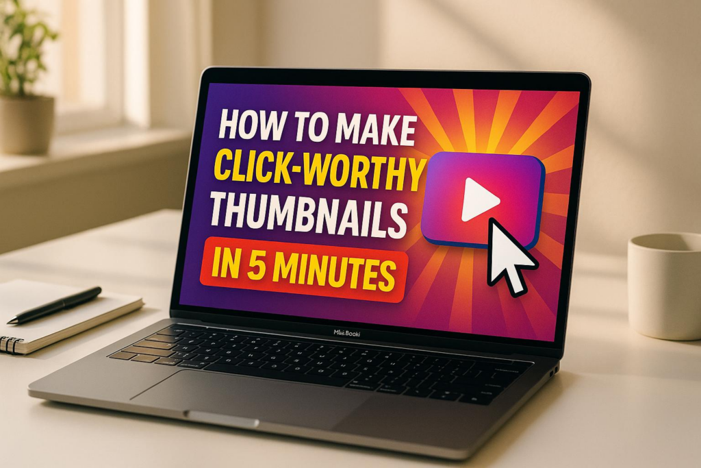
How to Make a YouTube Thumbnail in 5 Minutes
Key Elements of a Click-Worthy Thumbnail
Crafting thumbnails that grab attention in a sea of content requires a mix of psychology and precision. The best thumbnails don’t just catch the eye; they make viewers stop and click. Let’s break down what makes a thumbnail stand out from the rest.
Psychological Triggers That Drive Clicks
Human faces work wonders for connection. Close-up shots showing strong emotions – like surprise, joy, or shock – can instantly draw people in. There’s something about seeing a face that makes content feel personal and relatable.
Tap into curiosity with a visual cliffhanger. The curiosity gap is all about showing just enough to intrigue viewers while leaving them with unanswered questions. A thumbnail that teases the story without giving everything away sparks that irresistible need to click.
Colors matter more than you think. Bright shades like red and yellow grab attention and convey energy, while high-contrast combinations make your design pop, even in a crowded feed.
Storytelling elements seal the deal. Thumbnails that hint at a story – like “before and after” shots – promise a transformation or reveal, which viewers love. Adding arrows, circles, or blurred sections can direct focus and build anticipation, making people eager to see what’s inside.
Once you’ve nailed the psychological appeal, it’s time to ensure your thumbnail meets technical standards.
Technical Requirements and Best Practices
Follow YouTube’s specs for sharp, professional thumbnails. Use 1,920 x 1,080 pixels with a 16:9 aspect ratio, saved as JPG or PNG. This ensures your thumbnail looks great on any screen.
Keep text short and impactful. A concise phrase like “I BUILT THIS!” or “MUST SEE!” delivers your message quickly without overwhelming the design. Aim for 3–5 words max to keep it clean and readable.
High-contrast designs stand out. Use bold fonts, contrasting colors, and layered elements like shadows to create a clear visual hierarchy. This ensures the focal point of your thumbnail remains obvious, even at smaller sizes.
Think mobile-first. With so many viewers watching on their phones, make sure your thumbnail is legible and visually appealing when scaled down. Avoid tiny details that might disappear on smaller screens.
Brand Consistency Guidelines
Once you’ve mastered the art of eye-catching thumbnails, focus on making them unmistakably yours. Stick to a consistent color palette and recurring design elements to help viewers instantly recognize your content. While each thumbnail should have its own flair, maintaining a unified style across your channel builds familiarity.
Place your logo strategically. A logo can reinforce your brand, but it shouldn’t dominate the design. Many creators tuck their logo into a corner, keeping it visible but subtle.
Consistency in design style ties it all together. From fonts to image treatments, your thumbnails should reflect a cohesive aesthetic. Whether your vibe is sleek and minimalist or bold and energetic, sticking to a signature style builds trust and makes your content instantly recognizable. Over time, this consistency helps your audience identify your videos at a glance, which can lead to more clicks and engagement.
How to Create a Thumbnail in 5 Minutes with Banana Thumbnail

Banana Thumbnail’s AI transforms your ideas into attention-grabbing thumbnails in just five minutes. By analyzing your channel’s style and tapping into viral trends, it simplifies the entire process. Here’s how you can create your own thumbnail quickly and effectively.
Step 1: Upload an Image or Start Fresh
To get started, upload an image or begin with a blank canvas. The platform analyzes your content to match its tone and context.
If you’re using a screenshot from your video, pick a frame with clear facial expressions or striking visuals – this gives the AI a strong foundation to work with. If you’re starting from scratch, Banana Thumbnail offers a blank workspace where the AI can generate designs based on your video’s topic or theme.
No matter your device – iOS, Android, or desktop – the interface adjusts smoothly for a hassle-free experience.
Step 2: Pick a Viral Theme
Banana Thumbnail provides five ready-to-use viral themes: Shock & Awe, Curiosity Gap, Before/After, Versus Battle, and Breaking News. Each theme is pre-loaded with design elements and color schemes tailored for maximum impact. The AI will recommend the best fit, but you can always make your own choice.
- Shock & Awe: Great for reaction videos, challenges, or any content with surprising elements.
- Curiosity Gap: Perfect for sparking “what happens next?” intrigue.
- Before/After: Ideal for tutorials, makeovers, or transformation videos.
- Versus Battle: Adds drama to comparisons, debates, or competitions.
- Breaking News: Creates urgency for timely updates or major announcements.
Step 3: Customize Your Thumbnail
Once you’ve selected a theme, the AI generates multiple design options tailored to your content. These designs include optimized text, color contrasts, and focal points. You can tweak the text, colors, or other details to match your brand’s style.
Every thumbnail is automatically optimized for YouTube’s guidelines. You can even fine-tune facial expressions or visual elements, and the AI offers real-time feedback on how your changes might affect click-through rates, helping you make smarter design choices.
Step 4: Preview and Download
Preview your thumbnail on different devices to ensure it looks sharp and readable everywhere. When satisfied, download a high-quality, YouTube-ready file.
Banana Thumbnail offers flexible pricing:
- Pro Pack: $9.99 for 100 tokens.
- Starter Pack: $4.99 for 45 tokens (watermark-free with commercial licensing).
- Free Option: Includes 25 tokens but adds a watermark.
Tokens never expire, so you can create thumbnails at your own pace. And with its mobile-friendly design, you can easily craft thumbnails on the go, making it a perfect tool for creators who manage everything from their phones.
sbb-itb-2f70369
Tips for Optimizing Thumbnails for Higher CTR
Once you’ve created your thumbnail, these strategies can help you refine it for better performance across platforms. By focusing on design and usability, you can ensure your thumbnail grabs attention and encourages clicks, no matter the device.
Use the 3-Second Rule
Your thumbnail has just three seconds to catch a viewer’s eye. Every element needs to deliver your video’s value instantly – no one should have to “decode” the image.
- Stick to 3–5 powerful words. Use short, punchy text that sparks curiosity. Words like “SHOCKING”, “BEFORE”, or “REVEALED” are more effective than longer explanations. Let your thumbnail text act as the hook, while your video title provides the details.
- Choose bold, large fonts. Text that looks fine on a desktop might become unreadable on mobile. Opt for thick, sans-serif fonts that remain legible even when scaled down.
- Ensure strong contrast between text and background. Use solid color blocks or thick outlines to make your text pop. If the contrast is weak, your message might get lost.
To test your design, shrink your thumbnail to mobile size. If the message isn’t immediately clear, simplify it. Your thumbnail should stand out on every screen, from smartphones to desktops.
Prioritize Mobile Visibility
With so much YouTube watch time happening on mobile, your thumbnail must work well on smaller screens. What looks great on a desktop might lose its impact on a phone.
- Design for mobile first. Start with the smallest screen in mind. This forces you to make bold design choices that will also look good on larger devices.
- Focus on one main subject. Whether it’s a face, a product, or another key element, let it dominate the frame. Avoid clutter – secondary elements should support the main focus, not compete with it.
- Use high-contrast colors. Bright shades like red, yellow, and orange tend to stand out on mobile feeds. Just make sure they align with your content and branding.
Preview your thumbnail on different devices to ensure it looks great everywhere. Tools like Banana Thumbnail’s preview feature can help you check how your design appears on various screen sizes and refine it for consistency.
Test for Performance
Even a well-designed thumbnail is just a guess until real viewers interact with it. That’s where A/B testing comes in – it helps you figure out which designs actually drive clicks and engagement.
- Leverage YouTube’s “Test & Compare” feature. As of June 2024, YouTube lets you test up to three thumbnails for long-form videos. Instead of just click-through rate, the platform measures “watch time share” to identify the winner, avoiding clickbait thumbnails that don’t retain viewers.
- Test distinct designs. Upload thumbnails with noticeable differences – such as varying colors, text placements, or visual styles. Subtle changes may not provide clear insights, especially if you’re managing multiple channels or a large audience.
- Analyze patterns in successful thumbnails. Over time, identify what works best for your audience. For instance, you might find that red text outperforms blue, or close-up faces generate more clicks than wide shots. These insights can shape your future designs.
- Revamp older videos. A/B testing isn’t just for new uploads. Updating thumbnails on underperforming videos can give them a second chance at attracting viewers.
Keep in mind that 90% of YouTube’s top-performing videos use custom thumbnails. By investing time in testing and refining your designs, you can boost your video’s visibility and grow your audience.
Manual vs. AI-Powered Thumbnail Creation: Which is Better?
Once you’ve nailed down the basics of thumbnail design and optimization, the next step is figuring out how to create them. Should you go with manual design or lean on AI-powered tools like Banana Thumbnail? The decision really boils down to time, skill level, and consistency. Both methods can produce excellent results, but they cater to different needs and workflows.
With manual design, you have total creative freedom. You can tweak every pixel and craft something truly unique. But here’s the catch: it takes time, requires advanced design skills, and often involves expensive software. Spending 15-30 minutes on a single thumbnail might not seem like much – until you’re managing multiple uploads a week.
On the other hand, AI-powered tools flip the script. These tools analyze your channel’s style and use psychology-backed design principles to create thumbnails in seconds. For example, the built-in viral psychology engine in Banana Thumbnail identifies what grabs attention and applies proven design patterns automatically. The result? Professional-quality thumbnails without the need for design expertise or hours of effort.
AI tools also adapt to your brand’s style, ensuring all your thumbnails maintain a consistent look. You can still add personal touches, but the heavy lifting is done for you. This mix of automation and customization makes AI tools especially appealing for creators juggling tight deadlines or managing multiple channels. Plus, they let you experiment with A/B testing to see which designs perform best – a data-driven approach that often outshines gut instinct.
Here’s a quick side-by-side comparison to help you decide:
Comparison Table: Manual vs. AI-Powered Methods
| Factor | Manual Design | AI-Powered (Banana Thumbnail) |
|---|---|---|
| Time Required | 15-30 minutes per thumbnail | 30 seconds to 2 minutes |
| Design Skills Needed | Advanced Photoshop/design knowledge | None – simple point-and-click |
| Software Cost | $20-50/month for professional tools | $4.99-$9.99 for token packages |
| Consistency | Varies based on designer’s time/mood | Consistent branding via AI |
| Personalization | Full creative control | High, with customizable themes |
| Mobile Optimization | Requires manual testing | Built-in mobile-first design |
| Psychology Integration | Requires marketing expertise | Embedded viral psychology engine |
| Learning Curve | Months to years | Minutes |
| Output Quality | Depends on skill level | Professional 1920×1080 resolution |
| Scalability | Limited by time and energy | Unlimited with token system |
For most content creators, speed and quality are non-negotiable. AI-powered tools shine in this area, blending smart design principles with rapid execution. They don’t just save time – they give you access to marketing strategies and psychological insights that would otherwise take years to master.
That said, manual design still has its advantages. If you’re working on a special project or need something completely one-of-a-kind, the creative control of manual design can’t be beaten. But for everyday content creation, AI-powered tools strike the perfect balance between efficiency, quality, and optimization – key ingredients for boosting click-through rates. The choice ultimately depends on what works best for your workflow and goals.
Related Content
You might also find this helpful: thumbnails
Conclusion: Create Thumbnails That Drive Engagement in Minutes
Designing eye-catching thumbnails doesn’t have to be a time-consuming ordeal. The secret lies in understanding what grabs attention – elements like curiosity gaps, bold contrasts, and text that’s easy to read on mobile devices. These psychological triggers are the foundation for creating thumbnails that stop the scroll.
We’ve explored the key ingredients that separate successful thumbnails from those that fall flat. From maintaining consistent branding to following the 3-second rule for instant recognition, and testing for performance, these strategies are essential for boosting click-through rates. Using the right tools can make this process faster and more efficient.
Banana Thumbnail’s AI-powered tools tackle the biggest challenges content creators face: lack of design expertise, expensive software, and limited time. By tapping into AI-driven strategies, you’re not just designing thumbnails – you’re applying marketing techniques that usually take years to perfect.
Spending 15-30 minutes on a single thumbnail isn’t practical when you’re uploading multiple videos a week. With AI-powered tools, you can create high-quality, high-resolution thumbnails in under 2 minutes, saving time without sacrificing impact.
Banana Thumbnail keeps it simple with flexible pricing, tokens that never expire, and commercial use licensing included. It proves that speed and quality can go hand in hand, helping you boost engagement and improve your click-through rates in just minutes.
FAQs
How do I make sure my thumbnail looks great on mobile devices?
When designing a mobile thumbnail, simplicity is key. Stick to YouTube’s recommended resolution of 1280×720 pixels with a 16:9 aspect ratio. Focus on making the main elements – like faces or objects – large and easy to spot. Keep any text minimal and use bold, easy-to-read fonts.
Always preview your thumbnail at smaller sizes, such as 150 pixels wide, to ensure it remains clear and legible on smaller screens. Steer clear of cluttered layouts or overly detailed designs, as these can lose their impact on mobile devices. Lastly, check how your thumbnail appears on various devices to make sure it catches attention and looks great everywhere.
What psychological triggers can make a thumbnail more clickable?
To make your thumbnails irresistible, tap into psychological triggers that naturally draw attention and spark curiosity. Use emotional expressions – think faces showing surprise, excitement, or intense focus. Wide eyes, open mouths, or dramatic looks are especially effective at grabbing viewers’ attention. Adding a sense of urgency or scarcity, like “limited-time” offers or “exclusive” content, can create that all-important FOMO (fear of missing out).
You can also intrigue your audience by including visuals that hint at value or mystery. Pair this with bold, contrasting colors and clear, easy-to-read text to make your thumbnail pop in a sea of competing content.
How can AI tools like Banana Thumbnail help create better video thumbnails quickly?
AI tools such as Banana Thumbnail make crafting attention-grabbing video thumbnails a breeze. By analyzing your content, these tools automatically generate designs that catch viewers’ eyes. They rely on advanced algorithms that leverage psychological principles to create thumbnails that improve click-through rates.
With much of the design process handled for you, Banana Thumbnail helps save time and effort while delivering polished, professional results. This allows creators to focus on producing great content while still ensuring their thumbnails drive viewer engagement.