Table of Contents
I often hear creators say, “My video is great—YouTube will surface it eventually.” But that’s just a myth. If your thumbnail doesn’t grab attention in a split second, the algorithm won’t even bother testing your content’s quality. Most thumbnail mistakes on YouTube are totally avoidable, yet they sneakily sabotage your CTR and overall momentum.
Here’s what really matters: viewers decide whether to click in about 0.3 seconds, so your thumbnail needs to convey its promise right away. If the design makes people think too hard, they’ll just keep scrolling. The average YouTube CTR ranges from 0.5-2% for skippable ads and 1-3% on discovery ads, yet many creators underperform even those baselines because of preventable mistakes.
Let’s dive into the five major issues dragging down CTR and explore how AI can help you address them—without sacrificing your time or energy.
What Are the Biggest YouTube Thumbnail Mistakes?
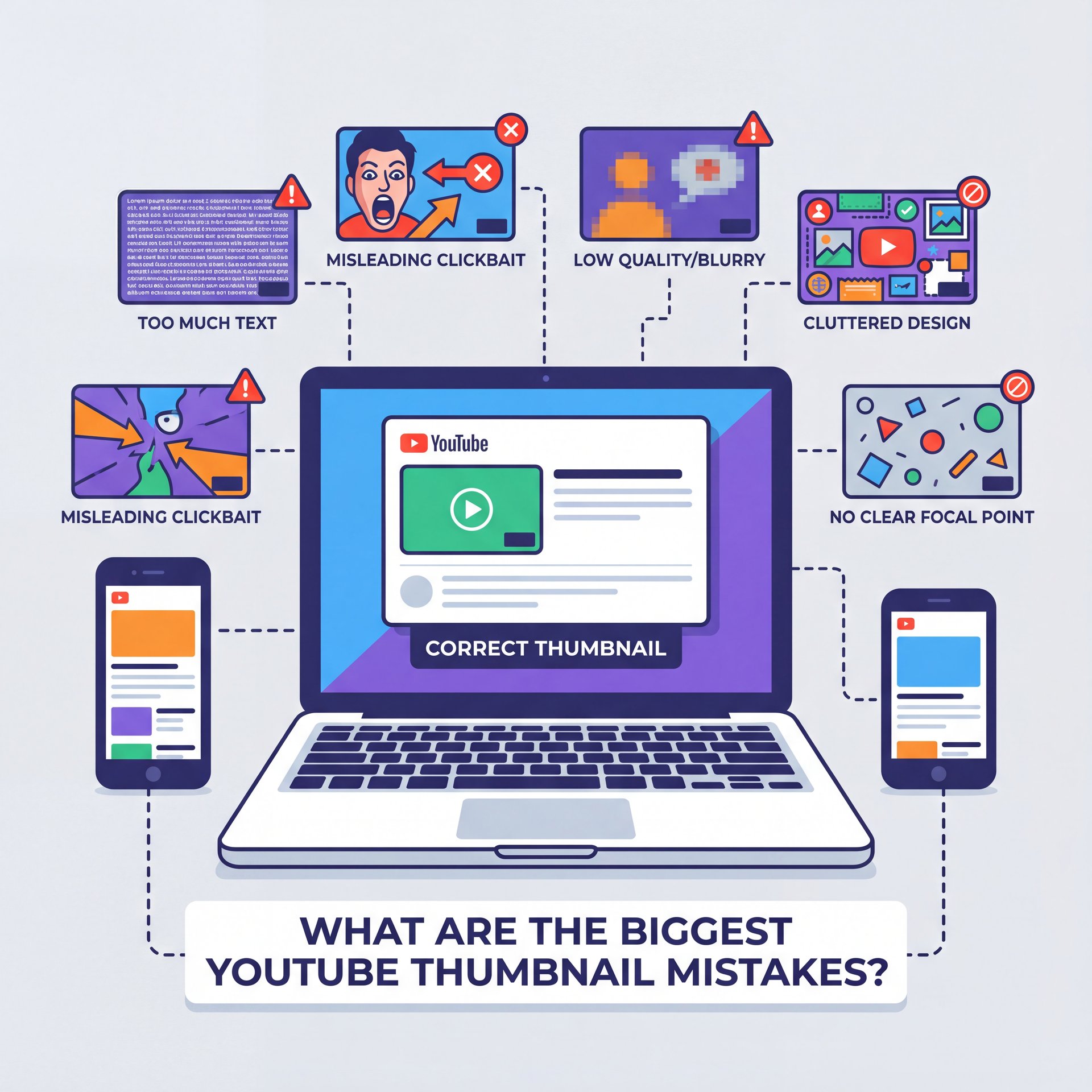
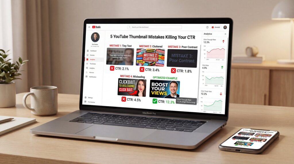
The first silent killer is visual clutter. We tend to cram in way too many things—multiple faces, product shots, emojis, five different fonts—and just hope something sticks. However, it totally backfires. Our brains can’t process the message fast enough when viewers make a click decision in roughly 0.3 seconds. If you remember one piece of advice, make it this: tell just one story per thumbnail.
Next comes illegible text on mobile. YouTube shows thumbnails around 280×157 pixels on phones, which is only 14.6% of the original 1920×1080 size. Thin fonts, long phrases, and low contrast basically disappear at that size, which is brutal because 70% of YouTube viewing happens on mobile devices. If you’re designing on a laptop at 100% zoom, it’s easy to miss this.
The Promise Mismatch Problem
Then there’s the issue of mismatched promises, where the thumbnail hints at content that the video doesn’t actually deliver. You might see an initial surge in clicks, but retention drops off sharply in the first 30 seconds. In 2025, YouTube’s algorithm is particularly tuned to this CTR-retention balance, penalizing videos with high clicks but low engagement by reducing their reach. Misleading thumbnails don’t just erode viewer trust—they directly limit how widely your content gets distributed.
Fourth, inconsistent branding. If your last 50 thumbnails all look different, the algorithm reads your channel like 50 micro-channels. You lose recognizable patterns that compound over time. MrBeast maintains over 450 million subscribers using systematic thumbnail consistency that creates instant recognition. That cumulative branding effect matters more now that collaborations route impressions through subscriber feeds across multiple channels.
Topic vs. Outcome
Finally, there’s a subtler mistake: selling the topic instead of the outcome. “How to Save on Taxes” is just information, but “I Cut $8,400 Off My Taxes” is a clear payoff. When your thumbnail shows the promised result, people immediately understand what they’ll gain if they click.
For example, a personal finance creator shifted from topic-focused to outcome-focused visuals and saw their CTR jump from 4.1% to 7.8%—a 90% improvement that translated into roughly 150,000 extra views and $1,200–$2,000 more revenue. That wasn’t a fancy, expensive rebrand. It was just a simple change in how they framed things.
If you want to explore more about avoiding these pitfalls and implementing fixes, this draws from ideas in our breakdown of low-click thumbnails.
Why Mobile Size Wrecks Thumbnail Text
It’s because it squishes everything you painstakingly designed into a tiny billboard. If your message relies on multiple lines of text or super thin fonts, most people viewing on their phones won’t even see it. Since roughly 63% of all YouTube viewing happens on mobile devices globally, that’s where your clicks are either happening or (lol) being lost.
Your main job is to make your idea clear at a glance: use fewer words, go for a heavier font weight, and make sure there’s ruthless contrast. For casual creators, this could be your quickest improvement. If you’ve relied on automatically generated frames or cropped busy screenshots in the past, you’re probably missing out on 70% of possible clicks due to readability issues on mobile.
Instead, try incorporating a surprisingly easy headshot, a single key prop, and a brief phrase highlighting the outcome. You’ll likely notice a real uptick in how impressions convert to actual views.
⚠️ Tiny Text Trap
If your thumbnail needs a whole sentence to make sense, it just won’t survive at 280×157 pixels. Keep your text under six words, use a stroke around it instead of a shadow, and always preview it at 25% zoom. For a guided setup that automatically optimizes text weights, check out our thumbnail workflows.
How AI Fixes These Design Errors Fast

Here’s how I frame it: you bring the idea and the outcome; AI handles the mechanics. Use AI to cut the subject cleanly, extract the key prop, pick two colors with strong contrast and mock a few variations with different crops and faces. Then you, the human, decide which one truly communicates the promise in under a second. That’s the creative part AI can’t do for you.
Creators who spend hours per thumbnail, this is your time win. You don’t need to build from an empty canvas every time. Start with a proven layout and swap in your new subject, new outcome number, and new color accent.
For professionals managing dozens of uploads weekly, AI also locks in consistent brand elements across teams—type styles, color tokens, and framing that stays on-message. However, AI can struggle with complex scenes involving hair, hands, and transparent objects. If the subject blends into the background, you may still need a quick manual touch-up for clean edges and contrast.
Extract Your Subject
Use background removal to isolate the face/prop and duplicate to test multiple crops and expressions.
Lock the Outcome Phrase
Write 3–5 punchy words that headline the payoff, then set a heavy weight with a tight outline.
Stress-Test at Phone Size
Preview at 25% zoom, convert to grayscale to check contrast and remove one extra element before exporting.
📊 Before/After: Clutter vs Clarity
Before: three faces, five props, two lines of text, resulting in a 1.1% CTR. Real talk.. After: one face, one prop, a 4-word outcome and a 3.2% CTR. This kind of shift is totally repeatable—templates in our AI thumbnail features are specifically built to help you achieve this clarity.
How to Test Thumbnails Without Guessing
We observed this in action with a tech review channel that addressed a 35% drop-off in the first 30 seconds by better matching their thumbnail to the video’s opening. While CTR decreased slightly, overall reach jumped by 79% because watch times improved. This shows how aligning expectations can turn potential penalties into strengths.
If you’re new to testing, focus on changing one element at a time, such as facial expression, cropping style, or text phrasing. Let the variations run for 24–48 hours, then select the top performer and apply it. However, if you notice CTR rising but retention plummeting, that’s a sign of a promise mismatch rather than a pure design flaw.
Set the Hypothesis
“Outcome phrasing with tight crop will increase CTR without dropping 30-second retention.”
Run a 48-Hour Split
Rotate only the element you’re testing. Keep title, description and posting time constant.
Choose the Right Winner
Prioritize CTR x 30-second retention x average view duration. If CTR wins but retention collapses, iterate the promise.
⭐ Creator Spotlight: From Topic to Outcome
A personal finance creator increased CTR from 4.1% to 7.8% by shifting to outcome-focused thumbnail design (“Cut $8,400 Off Taxes” vs. “Tax Savings Tips”), generating 150,000 additional views and $1,200–$2,000 extra revenue. The lesson: show the result, not just the subject.
If you’re curious about how thumbnails specifically influence CTR mechanics, we unpack that further in our CTR deep dive.
Best Practices for YouTube CTR Optimization
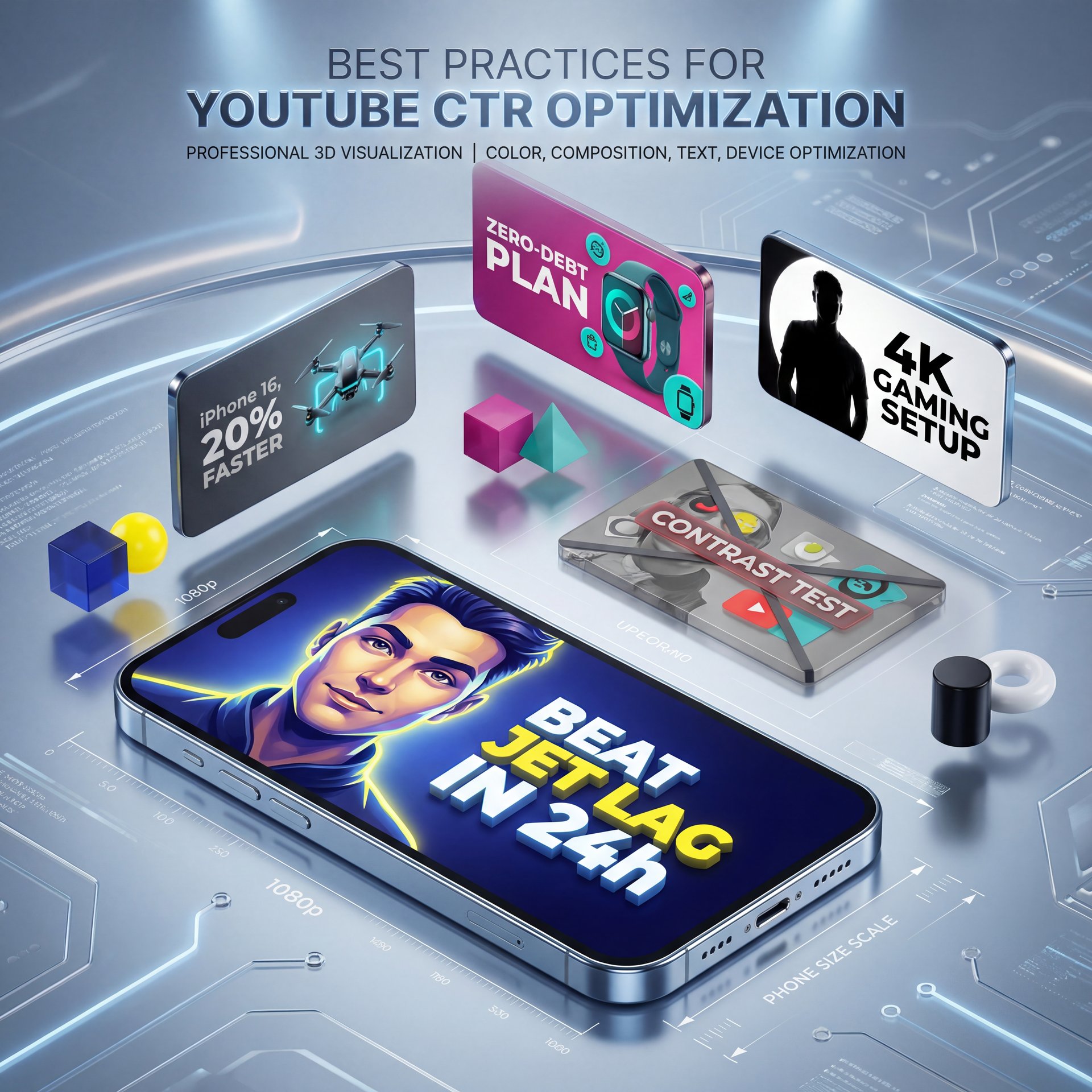
Start with a single focal point. Your subject’s face (or a strong, relevant prop) should be unmistakable at phone size. Use vibrant but limited color palettes: one background, one accent, one neutral. High-contrast pairs—deep blue and yellow, black and white, magenta and teal—often pass the grayscale test readily.
Keep text short, heavy, and high-contrast. Anchor the idea with an outcome: “Beat Jet Lag in 24h,” “iPhone 16, 20% Faster,” “Zero-Debt Plan.” For multi-audience discovery via collaborations, make sure both audiences can decode the visual. If you co-host with a tech channel, for example, let the device fill the frame while your face provides emotion.
Building Consistent Branding
Professionals, this is where consistency really pays off. If your team publishes dozens of videos every week, you need to LOCK down a system: define your hero area, text area, the angle of the face, and color rules for each category. Brands that keep their visuals consistent build those memory shortcuts; viewers learn “this look = your channel.”
Warm tones like yellow or red can convey energy and urgency, drawing the eye quickly, while cooler shades such as blue or teal suggest reliability and focus. However, it’s important to experiment within your specific niche, as what resonates in one area might not in another. Always run tests to confirm the choices align with your audience’s preferences.
💡 Quick Tip: 10-Minute Mobile Check
Export at 1280×720, then preview on your phone lock screen. If you can’t read the text or name the promise in one glance, it’s not ready. Try a template from our features library or follow the steps in our workflow guide.
(Back to the main point.)
Does Branding Consistency Really Boost Recognition?
Yes—because recognition compounds, and compounding drives impressions. Inconsistent thumbnails force the algorithm and your audience to re-learn who you are every upload. When the 2025 algorithm leans harder on subscriber feeds and collaboration discovery, that loss of pattern becomes more expensive. Channels with 50+ uploads that vary wildly in type, framing and color behave like separate micro-channels. You don’t get the cumulative win of “oh, that’s one of yours.”
While AI tools like Gemini’s Nano Banana, Canva’s Magic Design, and Adobe Firefly make professional designs more attainable, they still rely on your input for outcomes and authenticity. Leverage them to speed up the process without adding unnecessary complexity—if a template suggests too much text, trim it back, or if the colors feel overwhelming, simplify.
There’s one more nuance creators often miss. Mismatched thumbnails can create a mirage of success—a high CTR day that leads to a retention penalty and a sharp drop in reach the following week. Since only 25% of viewers complete videos to the end, that first 15 seconds becomes critical for retention.
Finally, a quick reality check. Video marketing keeps proving its ROI, and YouTube still commands 2.85 billion monthly users with 238 million viewers in the US alone. But you don’t need to chase every trend to win the click. Fix the fundamentals: one focal point, outcome phrasing, high contrast, phone-first legibility, and consistent branding. Your CTR—and your retention—will thank you.
Related Videos
FAQ
- **What are the best practices for creating YouTube thumbnails in 2025?**
Keep one clear focal point, use 3–five bold words, design everything so it’s visible at 280×157 pixels and make sure your thumbnail’s promise matches your video’s first 30 seconds.
- **What role does color psychology play in designing effective YouTube thumbnails?**
Warm colors tend to drive urgency and attention, while cool colors suggest clarity—so pick one dominant hue and test it out for your specific niche.
- **What are the common mistakes that can hurt the click-through rate of my YouTube thumbnails?**
Visual clutter, tiny or low-contrast text, making deceptive promises, inconsistent branding, and focusing on the topic instead of the outcome are the five big YouTube thumbnail mistakes to avoid.
- **How can I use AI tools to improve my YouTube thumbnails?**
Use AI to remove backgrounds, propose clean layouts, and stress-test contrast; then you pick the variant that communicates the outcome fastest.
- **How can I test different thumbnail designs to see which one performs best?**
Run YouTube’s A/B experiments for 24–48 hours and choose winners based on CTR plus 30-second retention and average view duration.
Related Content
• mistakes
• youtube
• youtube
For more on this topic, check out: mistakes
Listen to This Article
