Table of Contents
- Why Are Your YouTube Thumbnails Getting Ignored in 2025?
- What Actually Drives CTR on YouTube Thumbnails?
- How AI Fixes YouTube Thumbnails Getting Ignored
- How Do You A/B Test Thumbnails in 2025?
- What Design Principles Still Matter?
- What’s Next: Real-Time Personalization & Scaling
- 🎧 Listen to This Article
Be honest: when was the last time you clicked a video because of the title instead of the image? If your YouTube thumbnails are getting ignored, you’re definitely not alone. Think of your thumbnail as the cover of a book, or the sign outside a store. No matter how great the content inside, if that first impression doesn’t grab attention and clearly communicate value, people will just scroll right past it.
Here’s the thing: thumbnails can drive up to 90% of your click-through rate, and in 2025, the fix isn’t guesswork anymore—it’s smart data combined with AI. Plus, if your CTR is weak, the image almost always deserves the blame. However, you can absolutely turn that around without spending hours in a design rabbit hole.
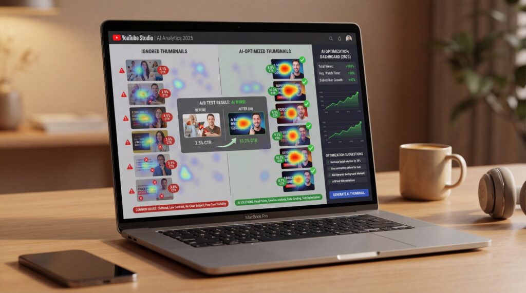
Why Are Your YouTube Thumbnails Getting Ignored in 2025?
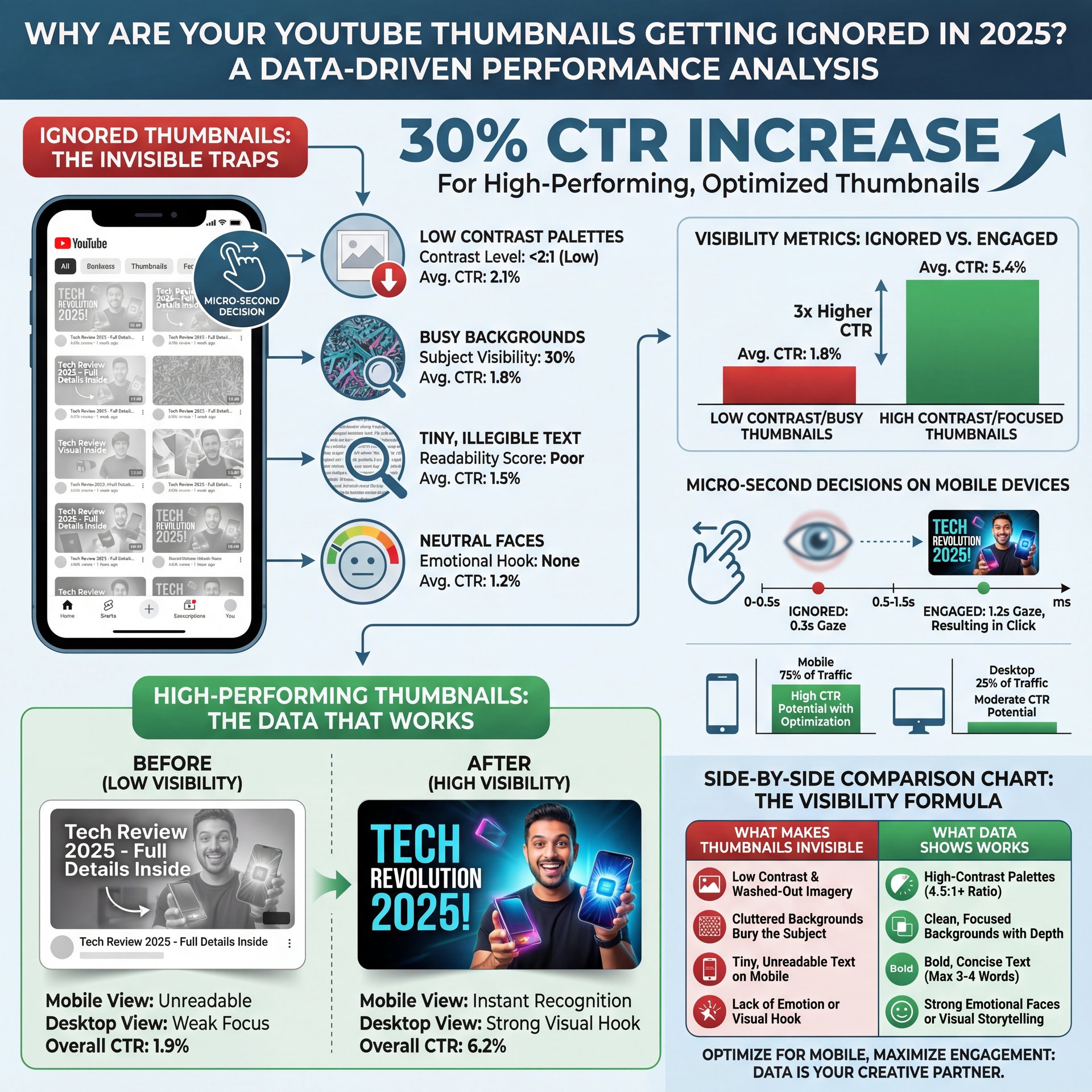
Most ignored thumbnails aren’t “bad.” They’re just invisible. So, they blend into a sea of sameness, especially on mobile, where microsecond decisions rule. Low contrast makes your image wash out. Meanwhile, a busy background can bury your subject. Tiny text blurs at small sizes. Neutral faces feel… neutral. That’s why the algorithm surfaces your video, but people’s eyes slide right past it.
Here’s what the data says in plain English: high-contrast palettes can actually increase CTR by up to 30% compared to low-contrast options. Similarly, bold, readable fonts can boost your clicks by 25%. Plus, using emotive facial expressions in your thumbnails generates over 35% more engagement compared to neutral or faceless images. These aren’t just theories; creators are seeing these improvements in practice, and tests from multiple sources back them up. When you sharpen these three dials—contrast, clarity, and emotion—your video performance really takes off.
What to Watch for in the First 48 Hours
Your first two days are a goldmine of feedback. So, if your CTR dips below 4% (or under 3% after 48 hours), treat that as a loud signal to iterate the thumbnail. Don’t wait a week to “see what happens.” For example, in 2025, the creators who win are the ones who swap fast, test variations, and let the best image rise.
What Actually Drives CTR on YouTube Thumbnails?
Let’s be real: CTR depends on emotion plus clarity in context. People click when they feel something and instantly understand what they’ll get. That’s why high-contrast edges, bold text, and human faces work so well. Essentially, you’re guiding attention while reducing cognitive load at the same time.
The Three-Second Scan Test
Open your thumbnail at phone size, glance for three seconds, and ask:
- What is this video about—really?
- Where should my eye go first?
- Can I read it without squinting?
If the answers aren’t obvious, your audience will keep scrolling. Here’s the thing: it’s not your fault—our brains are lazy by design. Strong thumbnails do the heavy lifting so viewers don’t have to.
🤔 Did You Know?
High-contrast colors can lift CTR by up to 30%, and bold typography can add another 25%—stack those gains and your “ignored” image becomes a magnet. Explore how AI evaluates these signals on Banana Thumbnail’s features page.
Emotion Isn’t Optional
Emotive expressions tell a story. Surprise, tension, and triumph signal payoff and drive clicks. Research shows emotive faces beat neutral faces by 35%. This pattern holds even for tutorials. For instance, “I finally fixed X” outperforms “How to fix X” nearly every time, especially when paired with a high-contrast crop showing your reaction to the result.
Pro Tip: If you’re not a fan of being on camera, try testing “hands + result” or strong object close-ups with bold text overlays. Then, let AI compare your “face vs. no face” versions to decide what works best, instead of just relying on your gut feeling.
How AI Fixes YouTube Thumbnails Getting Ignored
AI does more than generate pretty images—it analyzes the anatomy of attention. Modern thumbnail systems evaluate color contrast, text legibility, face clarity, emotion, subject isolation, and viewer focus areas. Additionally, they simulate how your thumbnail appears on different devices, screen sizes, and lighting conditions (dark vs. light modes).
The 2025 Playbook: Real-Time Optimization
Here’s where it gets interesting. AI tools can:
- Generate multiple design variants aligned to your title’s promise
- Predict which variant will perform better for specific audience segments
- Auto-run A/B tests and adopt winners once confidence passes a threshold
- Personalize thumbnails by region, language, or behavior. Facts.
That last one—personalized thumbnails—is the 2025 shift most worth watching. But here’s the thing: why show the same image to a binge-watcher and a casual scroller when they react to totally different signals?
Contrast Optimizer
Auto-adjusts foreground/background separation
- ✓ Stops low-contrast “wash-out” that kills CTR
Text Legibility Checker
Scores font weight, size, and stroke at mobile sizes
- ✓ Keeps words readable at a glance
Segment Personalizer
Tailors faces, colors, and props per viewer cohort
- ✓ Aligns emotion and style to each audience
Where the Gains Come From
Creators report 20–25% CTR lifts after iterating thumbnails with AI feedback and automated testing. Consider the impact: casual creators might see the difference between 200 views and 260–300 views on a single upload. For weekly uploaders, these gains compound quickly. For a deeper breakdown of the mechanics, see our detailed guide on YouTube CTR and how thumbnails impact click rates.
⚠️ Common Mistake
Swapping titles without changing the thumbnail (or vice versa) confuses viewers. Keep the promise consistent and iterate both together using workflow templates.
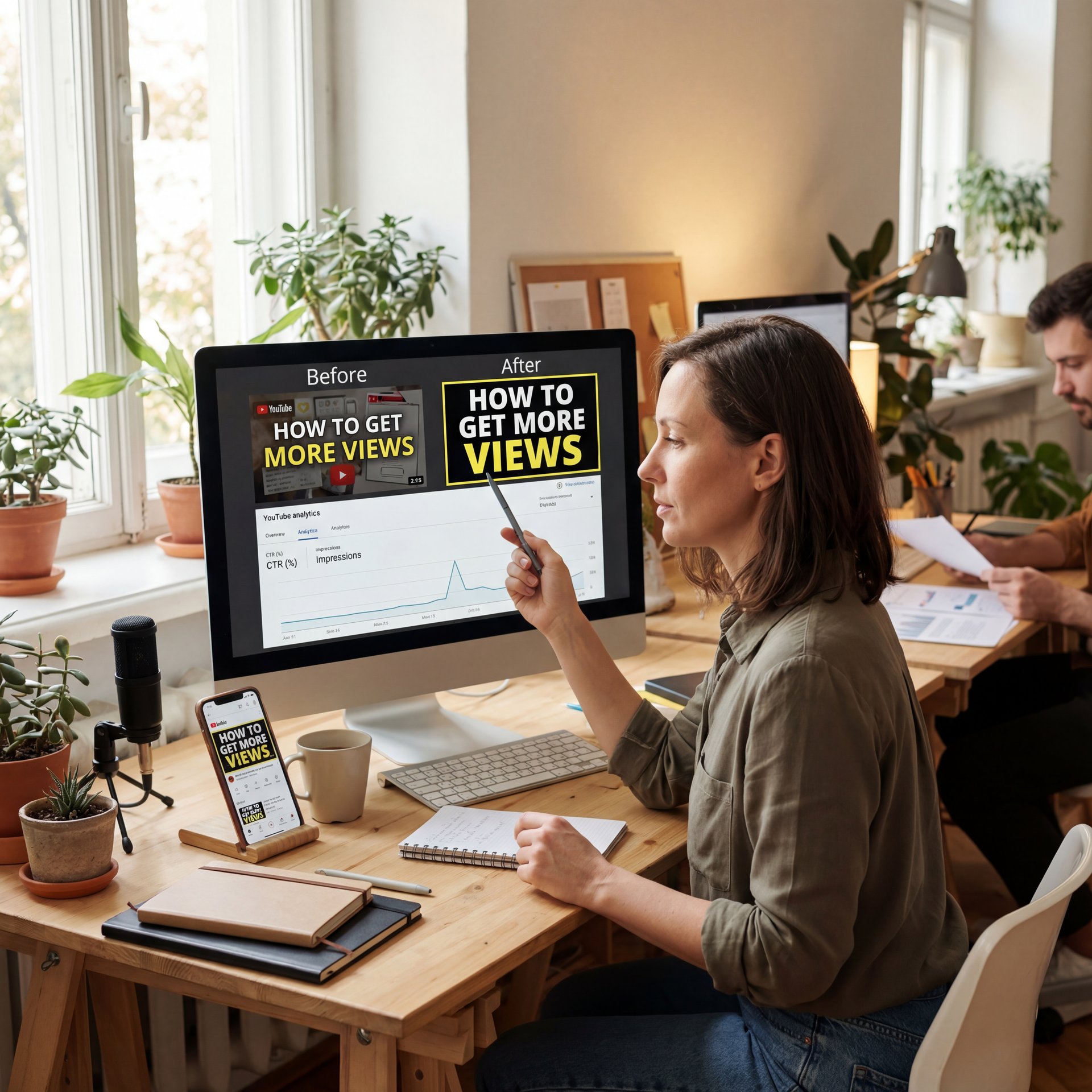
How Do You A/B Test Thumbnails in 2025?
A/B testing used to feel tedious. However, now the tools do the heavy lifting. You upload variants, define your success window, and let the system rotate images in real time. So, when the difference is statistically clear, it locks the winner or nudges you to try a new direction if both underperform.
What to Test First
Start with the biggest levers:
- Contrast: Background color and subject outline
- Face: Emotive vs. neutral vs. no-face object close-up
- Text: Shorter copy (2–4 words), thicker strokes, better placement
- Directional cues: Arrows, circles, or spotlight highlights
Here’s the thing: directional cues matter more than you’d think—they can bump CTR by up to 25% according to design studies like these thumbnail design tips.
📋 Quick Reference
A/B in this order: contrast, face, text size, directional cues, background cleanup. If CTR <4% after 48 hours, swap and retest. Here's a simple flow in our workflow guide.
When to Call It and Move On
If your CTR rises 20% with a new variant, keep it. However, if it flatters after two iterations, it’s probably time to reassess the entire title–thumbnail promise. Plus, it’s always a good idea to revisit the fundamentals with this tight thumbnail design checklist. Sometimes, the problem isn’t the color—it’s the story you’re trying to tell.
Pro Tip: Always screenshot your top 6 competing results for your target search query. Then, design your thumbnail to stand out in *that exact context*, not in isolation.
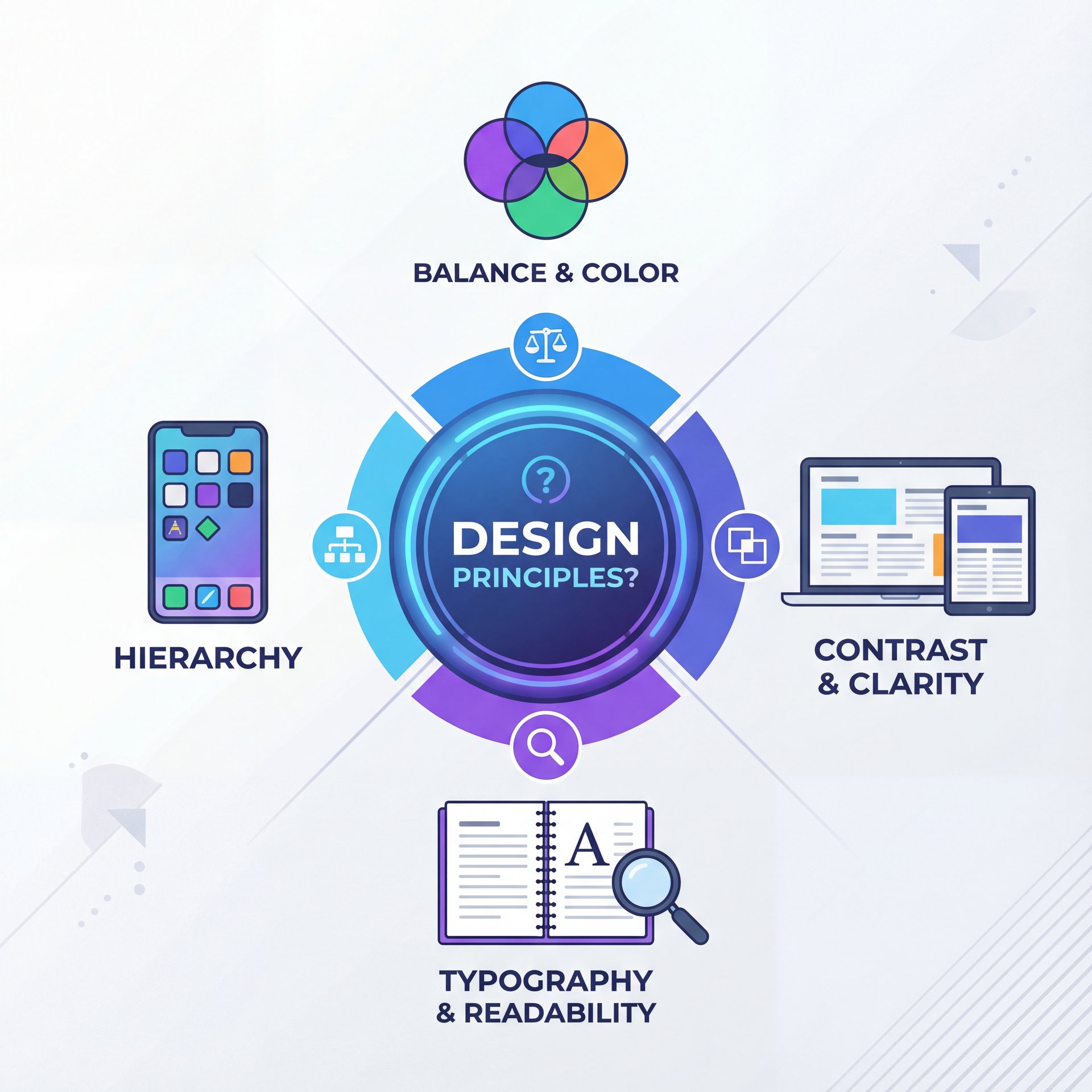
What Design Principles Still Matter?
(Anyway.)
Humans naturally like clarity, and algorithms reward engagement. So, the sweet spot where these two overlap is good design discipline. For example, bold edges really help separate your subject from the background, and limited color palettes keep things looking clean. Big, chunky fonts stay readable even on tiny 5-inch phone screens.
Make Text Earn Its Space
If a word doesn’t increase curiosity, cut it. Keep text to 2–4 words. Plus, use thick strokes & high contrast. Place text on clear, low-detail regions (top-left or bottom-right usually test well). And always test dark mode friendliness
⭐ Creator Spotlight
A small tech channel ran two versions of a “Fix Wi-Fi” video: one with neutral gear and tiny text and another with a frustrated face, bold “FIXED” text, and an arrow pointing to the router. The CTR jumped 28% in 24 hours and stabilized at +22%. You can see how similar blueprints are automated via AI thumbnail generation tools.
Faces, Direction, and Micro-Story
You don’t need a clownish expression, but you do need a story beat. For example, a face looking at the problem pulls the eye. A finger pointing or an arrow circling the key element tells viewers where to look. According to recent industry summaries, faces and clear cues make a measurable difference. Plus, emotive expressions deliver 35% more clicks, and arrows/circles push up to 25% gains as reported in design roundups like these tips.
Compression and Clarity
Remember to save your thumbnails at 1280×720 pixels, keeping the file size under 2MB. Then, check how YouTube compresses them at smaller sizes. It’s definitely worth revisiting YouTube’s thumbnail policies and recommendations to avoid any unpleasant surprises.
What’s Next: Real-Time Personalization & Scaling
This is – well, it’s the part that makes pros sit up. So, in 2025, AI systems are increasingly segment-aware. They’re not only proposing variants; they’re matching images to cohorts—first-time viewers get a broad, emotive hook; subscribers see a more specific, insider cue. When properly configured, some setups adapt thumbnails in near real time based on early engagement patterns by region.
For Casual Creators: Quick Wins
You don’t need a fancy studio to see results. You really just need a clear face, bold text, and strong contrast. Then, try two different variants for 24–48 hours and simply keep the one that gets more clicks. But, if you’re camera-shy, test hands and object close-ups against a bright background.
For Weekly Uploaders: Build a Test Habit
Set a simple rule: never publish a video with only one image. Start with three options: a big face, a small face and an object-only thumbnail. So, grabbed a system that rotates and records results. If your CTR is under 4%, never wait more than two days to swap it out.
For Teams and Brands: Systematize
If you’re managing multiple channels, template everything—palette, face crop sizes, text positions, and cue styles. Plus, let AI assist with per-channel personalization and permissioned workflows. Most importantly, tie thumbnail decisions to downstream metrics like watch time per impression. For ongoing benchmarks, keep an eye on analyses from vidIQ’s algorithm guides and Sprout Social’s YouTube metrics overview.
The biggest shift this year is speed. Here’s the thing: the best performers aren’t getting 100% of their thumbnails perfect – like, really perfect right away. Instead, they’re running faster loops, learning quickly and building patterns that fit their audience. That’s precisely why AI is so valuable now—it’s not there to replace your taste, but to compress the time between your idea and your next winning thumbnail.
Frequently Asked Questions
How can AI tools specifically improve YouTube thumbnail design?
AI tools analyze contrast, legibility, and facial emotion, then generate multiple variants and automatically A/B test them to pick winners super fast.
What are the latest trends in YouTube thumbnail design for 2025?
Personalized thumbnails by viewer segment, real-time optimization and automated split-testing are becoming standard.
Can you provide real-world examples of successful YouTube thumbnails?
Thumbnails featuring emotive faces, bold 2–4 word text, and clear directional cues routinely outperform neutral, low-contrast designs by double-digit CTR lifts.
How do high contrast colors, you know, and bold text impact click-through rates?
High-contrast palettes can raise CTR up to 30%, and bold, readable fonts can add another 25%, especially when viewers are on mobile.
What are the best practices for using facial expressions in YouTube thumbnails?
Use clear, emotive expressions that match the video’s promise; test face vs. no-face variants and let the data decide.
When should I change a thumbnail if CTR is low?
If CTR is under 4% (or below 3% after 48 hours), swap the thumbnail and retest immediately.
📋 Quick Reference
Before you publish, run a 3-second scan test, check mobile legibility and preview dark mode. If you need a structured flow, start with our workflows and scale from there.
Related Videos
Looking for more? Check out these helpful tutorials:
Related Content
• secret
• secret
For more on this topic, check out: secrets
- How to Go Viral on YouTube in 2026 Using AI (Step-by-Step Upload …
- How I Create My YouTube Thumbnails with Ai and Canva
- How To Use Grok for Beginners Youtube Thumbnail (Full Guide 2025)
- 5 YouTube Mistakes That Are Destroying Your Growth – Fix These & 4X Your Channel!