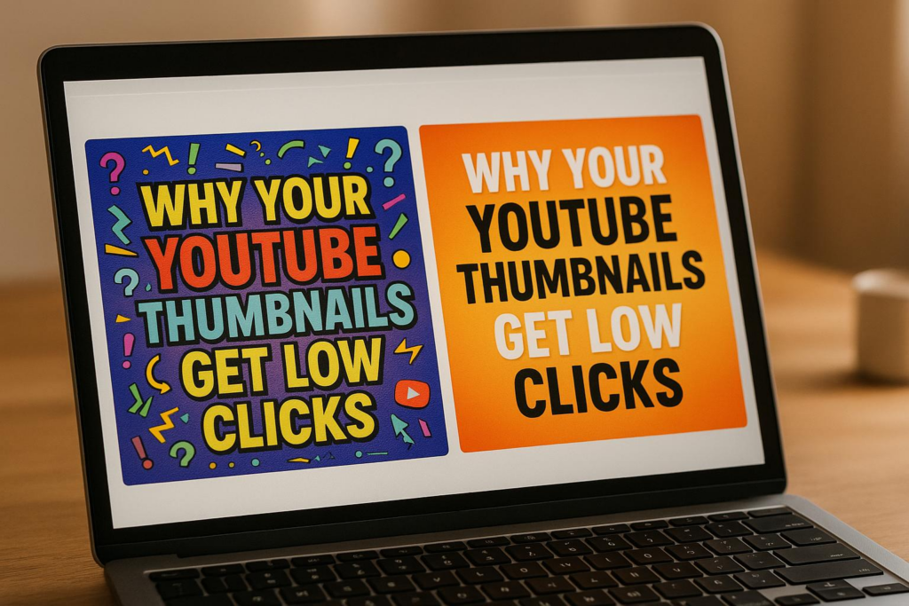
Your YouTube thumbnails might not be getting clicks because they fail to grab attention or communicate value instantly. Thumbnails are crucial for attracting viewers and directly impact your click-through rate (CTR), which affects YouTube’s algorithm and your video’s reach. Common mistakes include cluttered designs, poor image quality, unreadable text, lack of emotional appeal, and misleading visuals. Fixing these issues can significantly improve your CTR and channel growth.
Key Takeaways:
- Cluttered Layouts: Simplify designs and use negative space to make key elements stand out.
- Low-Quality Images: Use sharp, high-resolution images (1280 x 720 pixels) to convey professionalism.
- Unreadable Text: Opt for bold, high-contrast fonts that are legible on mobile devices.
- Missing Emotional Appeal: Include expressive faces or emotional cues to spark curiosity.
- Misleading Thumbnails: Accurately represent your video’s content to build trust with viewers.
Quick Fixes:
- Use vibrant, contrasting colors to make thumbnails pop.
- Focus on a single subject and avoid overloading with text or images.
- Test thumbnails on mobile devices to ensure clarity.
- Consider A/B testing to identify designs that perform better.
Tools like Banana Thumbnail can streamline design by using AI to create engaging thumbnails quickly and affordably. By addressing these issues and refining your approach, you can turn your thumbnails into a powerful tool for growing your channel.
How I consistently get 15%+ CTR on all my thumbnails (NO B*S GUIDE)
How Thumbnails Impact Click-Through Rates
Thumbnails are a powerful tool for grabbing attention and driving clicks. They serve as your first impression, often determining whether someone decides to watch your video or scroll past it. These split-second judgments directly affect your click-through rate (CTR).
How Thumbnails Influence Viewer Choices
Our brains process visuals much faster than text, which makes thumbnails a critical factor in decision-making. A well-designed thumbnail immediately conveys value, professionalism, and intrigue to potential viewers.
Color choices play a big role here. Bright contrasts and vibrant hues naturally catch the eye, while expressive faces can evoke curiosity or emotion. For example, a face showing surprise or excitement can create an emotional connection that encourages clicks.
Since so many users watch on mobile devices, it’s essential to ensure that your thumbnail and any text on it remain clear and legible on smaller screens. These quick visual assessments not only drive individual clicks but also send important signals to YouTube’s algorithm.
The Algorithm’s Relationship with Thumbnails
YouTube’s algorithm pays close attention to CTR, especially in the early hours after your video is uploaded. If your thumbnail draws viewers in and the content keeps them engaged, YouTube may promote your video to a wider audience. This could mean more appearances in search results, suggested videos, or even trending sections.
On the flip side, a poorly performing thumbnail – or one that misrepresents the video – can hurt your impression-to-click ratio, limiting your video’s reach. With so much competition on YouTube, your thumbnail is the key to standing out and capturing attention in a crowded space.
Common Mistakes That Reduce Thumbnail Clicks
Thumbnails that don’t perform well can seriously hurt your click-through rate (CTR). Even small design missteps can turn potential viewers away. Let’s break down some common mistakes that could be costing you clicks – and how to fix them.
Cluttered or Confusing Layouts
Packing too much into your thumbnail can backfire. Thumbnails with too many elements confuse viewers who decide in just a split second whether to click.
Take this example: A gaming channel used thumbnails overloaded with character portraits, game logos, episode numbers, and multiple text layers. The result? A cluttered mess that didn’t grab attention. When they switched to simpler designs featuring clear faces and bold colors, their CTR shot up by 65%, and their daily views skyrocketed from 10,000 to 35,000.
The secret lies in using negative space wisely. Leave some areas of your thumbnail empty so the main focus stands out. If viewers can’t instantly tell what your thumbnail is about, they’ll scroll right past it.
Next, ensure your images look sharp and professional.
Poor Image Quality and Resolution
Blurry or pixelated thumbnails scream low effort. A poor-quality thumbnail signals to viewers that the video might not be worth their time, leading them to skip it altogether.
YouTube suggests using thumbnails that are 1,280 x 720 pixels with a 16:9 aspect ratio and a minimum width of 640 pixels. The file size should be under 2MB, and formats like JPG, GIF, or PNG work best. Following these guidelines ensures your thumbnails look crisp on all devices, from desktop monitors to smartphones.
But high-resolution images do more than check technical boxes – they help build trust with your audience. A sharp, polished thumbnail makes viewers think the video itself is equally high-quality.
Missing Emotional Appeal
Thumbnails that don’t evoke emotion fail to stand out in YouTube’s crowded space. Faces, strong emotions, and curiosity triggers are powerful tools to grab attention.
Research reveals that thumbnails featuring faces with strong emotional expressions can boost CTR by up to 30%. This works because humans are naturally drawn to faces and emotional cues – it’s just how our brains are wired.
For instance, the "Learn With Me" channel saw their click rates double when they swapped generic stock images for thumbnails featuring the creator’s expressive face. Pairing this with bold, contrasting colors like red, orange, or yellow helps thumbnails pop against YouTube’s interface, making them even harder to ignore.
Mismatched or Misleading Images
Using a thumbnail that doesn’t match your video content is a quick way to lose trust. Misleading thumbnails might get clicks initially, but they’ll hurt you in the long run.
When viewers click expecting one thing but see something completely different, they feel tricked. This often leads to quick exits, which signals to YouTube that your content isn’t engaging. And since YouTube favors videos that hold attention, misleading thumbnails can hurt your rankings.
Instead, focus on thumbnails that accurately represent your video while still being visually appealing. This builds trust with your audience and encourages repeat views.
Unreadable Text for Mobile Users
With over 70% of YouTube watch time happening on mobile, thumbnails need to be legible on smaller screens. Text that’s too small, crowded, or low-contrast becomes unreadable on smartphones, making your thumbnail ineffective.
| Text Issue | Mobile Impact | Solution |
|---|---|---|
| Small font | Unreadable | Use large, bold fonts |
| Low contrast | Text blends into background | Use high-contrast colors |
| Too much text | Looks cluttered | Stick to minimal wording |
Stick to bold, high-contrast fonts and keep your text short and simple. Always test your thumbnails on a mobile device. If you can’t read the text without squinting or zooming, it’s time for a redesign.
Design Principles for Better Thumbnails
Now that we’ve covered what can hurt your thumbnail’s performance, let’s shift gears and talk about what actually works. These strategies directly address the common mistakes we discussed earlier.
Simplify Your Layout
Thumbnails need to grab attention in just three seconds – so keep them simple. Remove any clutter or unnecessary elements that might confuse the viewer.
Focus on a single main subject and let supporting elements stay in the background. Use the rule of thirds to guide your design. Imagine dividing your thumbnail into nine equal sections with two horizontal and two vertical lines. Placing key elements along these lines or at their intersections naturally draws the eye and creates a balanced look. A clean, straightforward layout not only catches attention but can also lead to higher click-through rates (CTR).
Use High Contrast and Bright Colors
Bold, contrasting colors are your best friend when designing thumbnails. Since YouTube’s interface is heavy on white and gray tones, vibrant colors can make your thumbnail pop.
Colors like red, orange, and yellow create urgency and grab attention quickly. Blue works well for educational or calming content, while green can represent success or financial themes. The trick is to choose colors that contrast sharply with each other and with YouTube’s background. This contrast ensures your thumbnail stands out in a crowded feed.
Include Faces and Emotional Expressions
Human faces are naturally eye-catching, making them a powerful tool for thumbnails. But it’s not just about including a face – it’s about what that face is expressing. Emotions like surprise, curiosity, or excitement can hint at engaging content and spark interest. On the other hand, neutral expressions tend to fall flat.
Position faces prominently in your design so they’re easy to spot, even on smaller screens. If you’re not on camera, consider using reaction images or other emotional cues that match the tone of your content. Just make sure not to overcrowd the design – keep it focused.
Optimize for YouTube’s Recommended Dimensions
YouTube suggests a resolution of 1,280 x 720 pixels with a 16:9 aspect ratio. Sticking to this ensures your thumbnail fits perfectly without awkward cropping or distortion.
Keep the file size under 2MB and save it in the right format – JPG works well for photos, while PNG is better for text-heavy designs. Even though higher-resolution files don’t necessarily look better on YouTube, they can slow down upload and processing times, so balance quality with efficiency.
Don’t forget to design with mobile users in mind. Double-check that your thumbnail looks good on smaller screens. Also, remember that YouTube crops thumbnails differently depending on where they appear – whether it’s in search results, suggested videos, or on the homepage. To avoid losing key elements, keep your most important visuals centered.
sbb-itb-2f70369
How AI Tools Like Banana Thumbnail Can Help

When it comes to designing thumbnails, the process can feel like a daunting task, especially when juggling content creation and editing. That’s where AI-powered tools like Banana Thumbnail step in to simplify things. This platform speeds up thumbnail creation by automating the process using strategies proven to engage viewers. With AI trained on millions of successful thumbnails, you can craft eye-catching designs in seconds.
Key Features of Banana Thumbnail
Banana Thumbnail leverages Google Gemini technology to analyze your content and generate thumbnails that follow patterns known to go viral. The process is simple: upload an image, pick a viral theme, and download your optimized thumbnail.
The platform offers five distinct viral themes, each designed to tap into different psychological triggers:
- Shock & Awe: Captures attention with surprising or dramatic visuals.
- Curiosity Gap: Sparks intrigue by leaving part of the story untold.
- Before/After: Highlights transformations, which naturally draw interest.
- Versus Battle: Creates compelling comparisons or rivalries.
- Breaking News: Capitalizes on urgency and timeliness.
For example, the Curiosity Gap theme plays on our desire to fill in missing details, while the Before/After theme appeals to our fascination with transformations.
Banana Thumbnail doesn’t just slap text on an image. It performs a channel DNA analysis, ensuring the design aligns with your brand’s style and resonates with your audience. Plus, its mobile-first approach guarantees your thumbnails look sharp, whether viewed on a smartphone during a commute or a desktop at home. By automating clarity and emotional impact, the platform delivers professional results quickly.
Pricing Plans and Benefits
Banana Thumbnail’s pricing is structured to accommodate creators at any level. At just $0.10 per thumbnail, it’s a fraction of the cost of hiring a professional designer, who might charge around $100 per thumbnail and take up to three days to deliver. With Banana Thumbnail, you’ll have your design ready in about 30 seconds.
The platform operates on a token system, where tokens act as credits for generating thumbnails.
| Plan | Price | Tokens | Key Benefits |
|---|---|---|---|
| Free Beta | $0.00 | 25 | Full AI quality, access to all 5 themes, small watermark included. |
| Starter Pack | $4.99 | 45 | No watermarks, commercial licensing, and tokens that never expire. |
| Pro Pack | $9.99 | 100 | Ideal for frequent creators, includes full commercial rights and best value. |
Tokens never expire, so you can buy them as needed without worrying about losing unused credits. The free beta plan offers 25 tokens to test the platform, though these thumbnails include a small watermark. Paid plans remove watermarks and include commercial licensing, giving you the freedom to use your thumbnails without restrictions or attribution requirements.
AI-Driven vs Manual Thumbnail Design
The choice between AI-driven and manual thumbnail creation isn’t just about speed or cost – it’s about efficiency and ease of use. While manual design offers full creative control, it demands significant time and design expertise, which many creators may lack.
| Aspect | AI-Driven (Banana Thumbnail) | Manual Design |
|---|---|---|
| Time Investment | 30 seconds per thumbnail | Up to 3 days per thumbnail |
| Cost | $0.10 per thumbnail | Around $100 per thumbnail |
| Design Expertise Required | None | Intermediate to advanced |
| Viral Psychology Integration | Built-in with 5 proven themes | Requires research and testing |
| Consistency | Automatically maintains brand alignment | Depends on the designer’s skill |
| Mobile Optimization | Optimized for all screen sizes | Manual testing required |
| A/B Testing | Quick and easy to generate variations | Time-intensive to create multiple options |
One standout advantage of Banana Thumbnail is its ability to generate multiple thumbnail variations for A/B testing. Instead of spending hours or days creating options manually, you can produce several designs in under five minutes at a much lower cost.
While Banana Thumbnail handles the technical side of things, it’s still up to you to provide the right images and select themes that align with your content. When paired with a solid content strategy, this tool can make thumbnail creation faster, easier, and more effective.
Testing and Improving Thumbnail Performance
Creating great thumbnails is just the beginning. To truly succeed, you need to test and refine them using performance data. Without testing, you’re essentially guessing – and that can lead to disappointing click-through rates (CTR). Testing takes your design efforts a step further by providing real insights to make your thumbnails more effective.
Why A/B Testing Matters
A/B testing for thumbnails involves comparing two different versions to see which one performs better with viewers. While YouTube doesn’t offer a built-in A/B testing tool for thumbnails, you can test manually. Start by uploading one version, monitor its performance for a set period, then switch to another version and compare the results.
Even small tweaks – like adjusting a facial expression, changing the color scheme, or repositioning text – can improve CTR. This, in turn, signals to YouTube that your content resonates with viewers, potentially boosting organic growth.
The key is to test one element at a time. If you change multiple things at once, it’s hard to pinpoint what made the difference. Focus on specific adjustments, like text placement, emotional cues, or color combinations, to get a clearer picture of what works.
Metrics to Track for Thumbnail Success
There are several important metrics to monitor when evaluating thumbnail performance:
- Click-through rate (CTR): This shows the percentage of viewers who click on your thumbnail after seeing it. A rising CTR usually means your thumbnail is grabbing attention.
- Average view duration: If viewers click but leave quickly, it might mean your thumbnail is misleading or doesn’t match the video’s content.
- Early audience retention: A sharp drop-off at the start of your video could indicate that your thumbnail’s promise doesn’t align with what the video delivers.
- Traffic sources: Knowing where your clicks come from – search results, suggested videos, or external links – can help you fine-tune your thumbnails for specific contexts.
- Demographics: Understanding how different audience segments respond to your thumbnails can uncover preferences tied to age, gender, or location.
How to Improve Thumbnails Based on Data
Once you’ve gathered test results, use the insights to refine your thumbnails. Start by analyzing your most successful thumbnails. Look for recurring patterns, like the use of bold colors, close-up facial expressions, or specific text styles. These elements can serve as a guide for future designs.
Also, consider seasonal trends. A thumbnail style that works well during the summer might not have the same impact in the winter. Keep an eye on how timing affects performance.
On the flip side, study underperforming thumbnails. Is the text too small? Are the images lacking emotion? Maybe the layout feels cluttered. Identifying these issues can help you avoid repeating the same mistakes.
Don’t forget about mobile optimization. With so many viewers watching on their phones, your thumbnails need to look sharp on smaller screens. Text and details that are clear on a desktop may not translate well to mobile devices.
When conducting tests, avoid periods of unusual viewer behavior, like holidays or major news events, as these can skew your results. Test each version long enough to collect reliable data, and compare similar types of videos instead of mixing formats.
Successful creators treat thumbnail optimization as an ongoing process. By regularly testing, analyzing trends, and refining your approach, you can create thumbnails that consistently attract and engage your audience.
Related Content
• youtube
• youtube
You might also find this helpful: thumbnails
Conclusion: Create Thumbnails That Drive Results
Your thumbnail is more than just an image – it’s your first opportunity to grab attention and invite viewers to click. Nail this, and your channel can thrive; miss the mark, and it may struggle to gain momentum. The journey to higher click-through rates begins with identifying why thumbnails sometimes fall short and taking intentional steps to fix those issues.
Start by steering clear of common pitfalls. Avoid cluttered designs, low-quality images that don’t meet YouTube’s recommended resolution (1,280 x 720 pixels), and text that’s hard to read on mobile screens. Thumbnails that evoke emotion – like faces showing authentic expressions – tend to outperform generic visuals because they connect with viewers on a deeper level.
Smart design choices can make a big difference. Use high-contrast colors, clean layouts, and expressive faces to ensure your thumbnails pop in a crowded feed. Tools like Banana Thumbnail can streamline this process, offering features like channel DNA analysis and a viral psychology engine to help you create eye-catching thumbnails in minutes. With plans starting at $4.99 for 45 tokens, it’s an affordable way to level up your design game.
Don’t forget to experiment with YouTube’s "Test & Compare" feature for A/B testing. This tool allows you to upload up to three different thumbnails for the same video, helping you determine which one performs best.
Consistent testing and refinement are key to long-term success. Creators who see sustained growth treat thumbnail optimization as an ongoing effort. They track click-through rates, analyze what resonates with their audience, and adjust based on real-world data. Start applying these strategies today to turn your thumbnails into powerful tools for growth.
FAQs
What’s the best way to test different YouTube thumbnail designs for better performance?
To experiment with different YouTube thumbnail designs, YouTube Studio offers the ‘Test & Compare’ feature. This handy tool lets you upload multiple thumbnail options and track their performance using metrics like click-through rate (CTR). By reviewing the data, you can pinpoint the design that connects best with your audience.
Additionally, A/B testing tools can provide deeper insights into how viewers interact with your thumbnails. These tools help you make smarter choices to improve your designs and boost clicks. Regular testing keeps your thumbnails performing at their best, ensuring they continue to grab attention and drive engagement.
What emotional cues can make my YouTube thumbnails more engaging?
When designing your YouTube thumbnails, aim to tap into emotional triggers that connect with viewers. Expressions that show joy, surprise, or excitement tend to grab attention and make people curious. Close-up shots with direct eye contact and animated facial expressions can create a strong emotional pull.
Using bright colors and dynamic poses adds energy and vibrancy to your thumbnails. A smiling face, in particular, can evoke positivity and warmth, making your video feel inviting. Together, these elements can make your thumbnails stand out and encourage more clicks.
How do thumbnail quality and design affect the visibility of my YouTube videos?
The design and quality of your YouTube thumbnail can make or break your video’s performance. A well-crafted thumbnail grabs attention, encourages clicks, and improves your video’s click-through rate (CTR). And here’s the thing: a higher CTR tells YouTube’s algorithm that your content is worth promoting, giving it a better shot at reaching more viewers.
But if your thumbnail is poorly designed or looks unprofessional, it can have the opposite effect – fewer clicks, less visibility in search results, and fewer recommendations. To make your thumbnails stand out, focus on clear visuals, bold, eye-catching colors, and emotional elements that connect with your audience. Taking the time to create thumbnails that pop can significantly boost your video’s reach and engagement.