
Table of Contents
- What Are Z Pattern Thumbnails Anyway?
- Why Your Z Pattern Thumbnails Fail on TVs vs. Mobile
- How AI Slop Breaks Z Pattern Thumbnails
- The Proof of Human Fix for Z Pattern Thumbnails
- Best Z Pattern Thumbnails Colors and AI Checks
- How to Get Started with Better Z Pattern Thumbnails (I know, I know)
- Listen to This Article
All right, thumbnail mechanic here again. Today we’re tackling a massive problem I see every single week with z pattern thumbnails. Consider this: thumbnail changes everything. A shocking 40% of YouTube creators report failing their click rate benchmarks simply because they ignore basic Z-pattern layouts. We spend hours editing a video, but then we throw away all that hard work with a messy cover image.
So let’s get under the hood and look at what 2026 eye-tracking data actually tells us about visual scanning. Things have changed a lot recently. AI saturation, massive shifts to TV viewing and active personalization are totally breaking our old rules. Means if you’re stuck getting a 1% click-through rate, I can almost guarentee your visual flow is broken and you need to rethink your z pattern thumbnails.
Let me shed some light on that so you can see exactly how to fix it.
What Are Z Pattern Thumbnails Anyway?
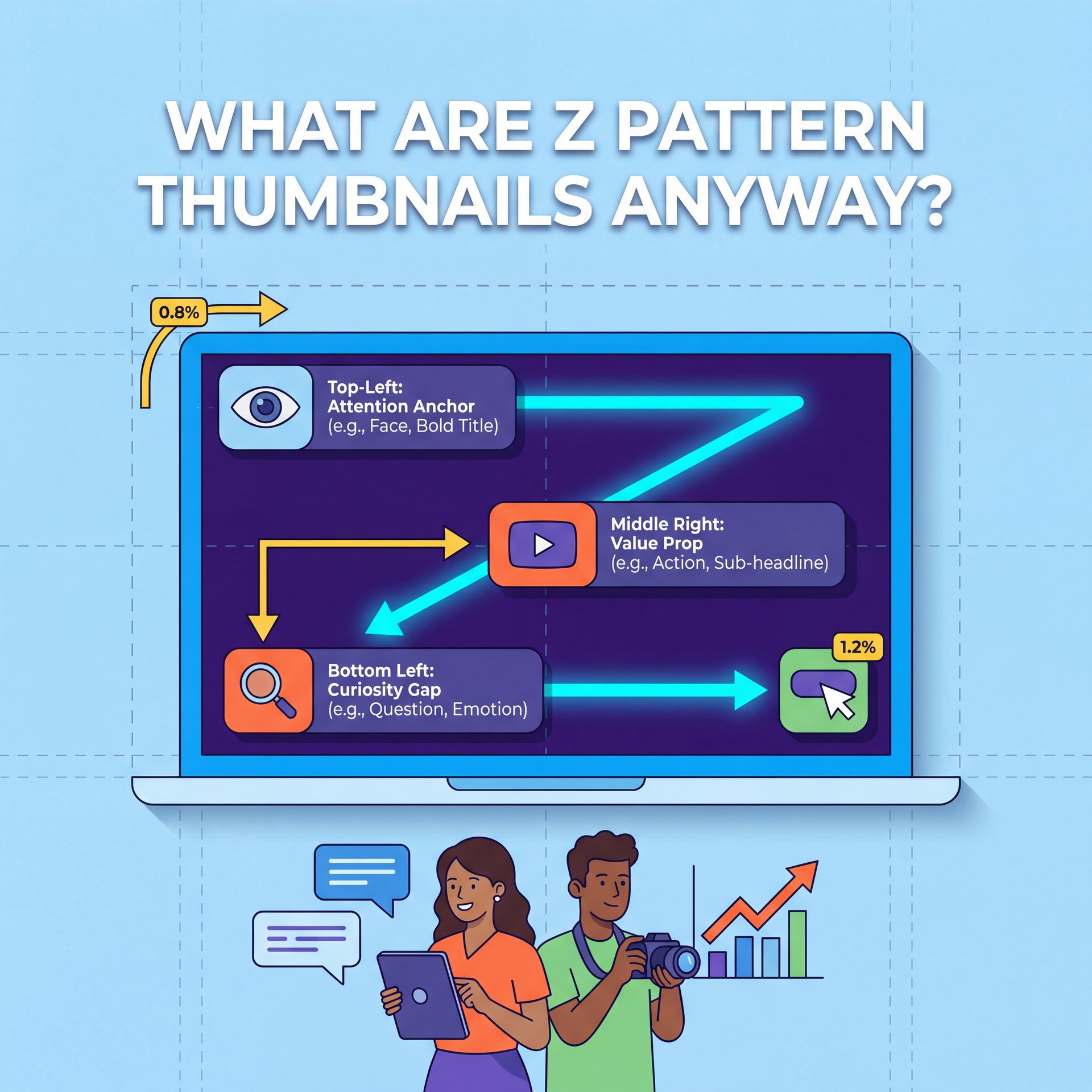
A Z-pattern is just the natural way human eyes scan a 16:9 rectangle. Your eyes start at the top-left corner, scan across to the top-right, drop down diagonally to the bottom-left. Why is the technical foundation for z pattern thumbnails. finally finish at the bottom-right. Honestly, it’s how we read books, and it’s how we read screens.
But here’s the thing. Most beginners completely ignore this natural flow when creating z pattern thumbnails. I see casual creators getting terrible 0.8% to 1.2% CTRs because they leave that important top-left starting point completely empty. According to recent Vmake.ai eye-tracking tests, putting a strong emotional hook or face in that top-left spot boosts initial engagement by 31%. Game changer. If your viewer looks at the top-left and sees blank sky, they just keep scrolling.
(It’s kind of like…)
Next is the text problem. When you ignore the Z-path in your z pattern thumbnails, you usually end up slapping text right in the middle of the image. This blocks the natural diagonal eye sweep. I find that viewers get confused when text overlaps the main subject’s face or the core action shot. You wanna guide the eye smoothly by placing your text along that diagonal path or clearly in one of the horizontal zones.
Why Your Z Pattern Thumbnails Fail on TVs vs. Mobile
Now, if you scale up your production, you hit a whole new wall with z pattern thumbnails, so we call this the mobile-TV mismatch and I see intermediate creators struggle with this constantly. You design something that looks great on your phone, but it completely falls apart on a big screen.
Here’s a crazy stat for you. YouTube TV viewing now accounts for 45% of all long-form traffic. That means almost half of your audience is looking at your cover image on a 65-inch 4K screen, not a 6-inch phone. When you blow an image up to that size, the Z-pattern scanning dominates even more. If your top-right zone is cluttered with tiny details, it looks like a complete mess on a TV.
But yeah, the biggest mistake happens at the end of the Z-pattern—the bottom-right corner. On mobile devices, YouTube slaps a big black duration badge right there. If you put your main hook, your logo or important text in that corner, it gets completely covered up. Huge. In fact, Z-pattern compliant thumbnails increase click-through rates by about 2x on mobile devices when you simply clear out those bottom-right corners.
The Hidden Hook Trap
Never put your punchline, or arrow pointing to the bottom-right corner. The platform’s timestamp badge will completely cover it on mobile devices. If you need help visualizing these safe zones, check out our step-by-step workflow guides to see exactly where to place your core elements.
So if you want to fix this, or maybe I’m overthinking it, you just need to shift your final visual weight slightly to the left. thumbnail is the mechanism behind it. We covered similar layout issues recently in our guide on why Seedance 2.0 AI thumbnails fail, which goes over how automated tools often ignore these platform-specific safe zones.
How AI Slop Breaks Z Pattern Thumbnails
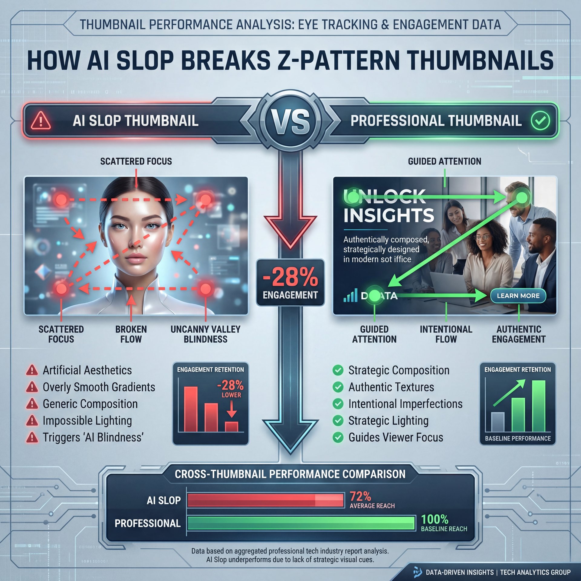
All right, let’s talk about the elephant in the room—artificial intelligence, and everyone’s using it, but honestly, it’s causing major problems for professional creators. There’s a massive difference between a helpful tool and generic slop.
What surprised me was how quickly audiences adapted to generated images. Viewers have developed serious “AI blindness”. When they see that hyper-polished, uncanny valley look, they fast scroll past. The data backs this up. AI-generated slop thumbnails see 28% lower retention after 10 seconds. Period. The visual flow might technically follow a Z-pattern, but the viewer’s brain rejects the image before they even finish the scan.
Now here’s what you want to do if you use these tools. you have real talk. Gen Z and Alpha audiences actually assign a 17% higher trust score to brands that transparently label their AI use versus those trying to hide it. Not even close. Curtis, our Founder and Creative Director, always tells me that AI should speed up your workflow, not replace your creative soul.
Fixing Plastic Faces
Before: A fully generated face with zero pores causes viewers to scroll past instantly due to AI blindness.
After: Using targeted AI to just remove the background while keeping a real photograph of your face keeps the human connection alive. You can see how this works with our AI background removal features that protect your natural expressions.
If you want the image to work, though who knows, you should probably blend real elements with the generated backgrounds. The Z-pattern only works if the content inside the pattern is actually worth looking at.
The Proof of Human Fix for Z Pattern Thumbnails
So how do we fix the AI blindness problem? We use a technique called Proof of Human. This is honestly (which is wild) my favorite approach right now because the human eye is incredibly surprisingly good at detecting tiny, genuine facial movements.
(…anyway.)
When you use real human skin texture and actual genuine reactions, you achieve a 22% higher long-term click satisfaction rate. People click and more importantly, they stay. They trust the video because the cover image felt real, so the Z-pattern guides them to a face they can ACTUALLY connect with. Big difference. This is exactly why proof of human thumbnails fail and the quick fix usually involves just picking up a real camera for your reaction shots.
Let me give you a real example from 2026. Look at MrBeast. Early in the year, his team tested heavily polished, AI-generated faces. The results were rough. But when they switched back to Proof of Human Z-patterns, the results were crazy — and his CTR rebounded from around 4% all the way up to close to 19%. a massive 357% increase, generating 2.3 million extra views in a single quarter.
The Jimmy Donaldson Shift
MrBeast’s team realized that perfect lighting isn’t as important as genuine emotion. By placing a real, slightly imperfect reaction face in the top-left of the Z-pattern, they regained viewer trust. Trust me on this. You can build these hybrid human-AI layouts easily using our video generation tools.
You don’t need a massive budget to do this. You just need a window for natural light and your phone camera, and take a real photo, then use your editing software to place it correctly in the visual path.
Best Z Pattern Thumbnails Colors and AI Checks
(Quick detour here.)
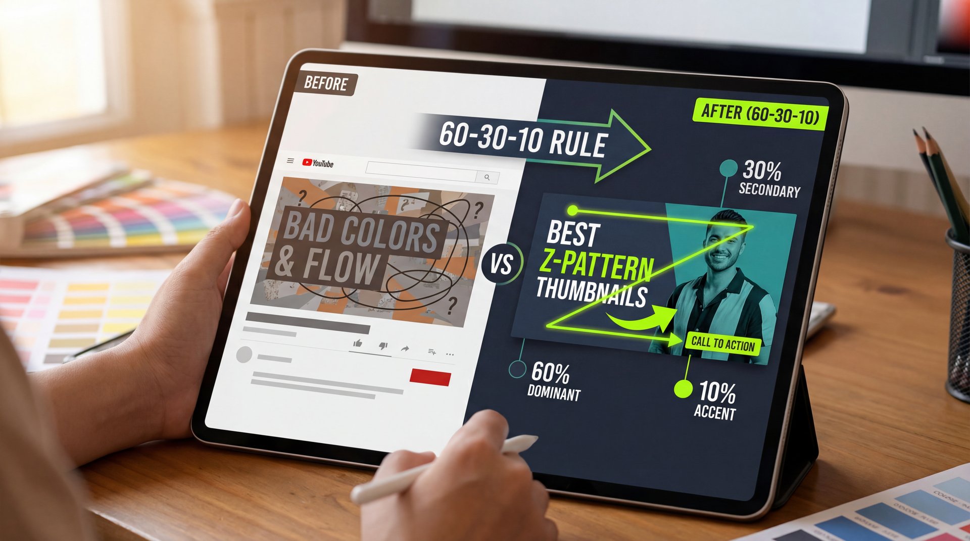
All right, let’s get a bit technical, but I’ll keep it simple. Even if you have a real face and a good layout, bad colors will ruin your Z-pattern. The eye needs contrast to know where to jump next.
If you struggle with colors, here’s what you want to do. Use the 60-30-10 rule. This means 60% of your image is a dominant background color, 30% is a secondary color like your shirt. Ten% is a bright accent color like your text or an arrow. Applying this specific color balance improves – actually improves – visual depth and pop. In fact, getting this right lifts CTR by around 19%. The accent color acts like a magnet, pulling the viewer’s eye exactly where you want it to go along the Z-path.
Pro Tip: Always make your ten% accent color the exact opposite on the color wheel from your 60% dominant color. If your background is dark blue, make your text bright orange. It forces the eye to follow your path.
Now, manual checking takes time. But in 2026, we have some really cool diagnostic tools. Convolutional Neural Networks can actually detect Z-pattern failures before you even hit upload. These systems work with 88% to 92% accuracy. Period. They scan your image and tell you if your top-right zone is too cluttered or if your text is unreadable.
Text Clarity Standards
Poor text rendering ruins 35% of all uploads. If you use AI to generate text, ensure you use models like Z-Image-Turbo which hit 94% clarity. Need help picking the right plan for high-res exports? Check out our affordable pricing options to get started.
I always run a squint test myself. I step back from the monitor, squint my eyes, and see if the Z-shape still stands out. If it just looks like a blurry blob, I start over.
How to Get Started with Better Z Pattern Thumbnails (I know, I know)
So we’ve covered a lot of ground today. But how do you actually apply this to your next video?, so it’s all about testing and adapting to the new platform features.
Here’s a wild update from 2026. YouTube’s active thumbnail serving now changes what viewers see based on their history — and the algorithm matches 73% more clicks by personalizing Z-pattern elements. For example, it might show, a reaction face to one viewer but a before-and-after shot to another. Big difference. You need to create a few different variations of your Z-pattern for your A/B tests.
Also, don’t forget about short-form content. Right now, short-form video discovery drives 52% of long-form TV tune-ins among Gen Z. When they see a clip on their phone, the visual branding needs to match the long-form cover image. Maintaining a consistent Z-pattern across your shorts and your main videos predicts full-video success with 81% accuracy.
The 5-Variant Strategy
Don’t just make one image. Generate five variations with different focal points along the Z-path. eCommerce sellers using this A/B testing strategy see a 127% ROI. You can quickly generate multiple background variations using our core AI features.
It’s not a do-it-yourself guessing game anymore. You have to test. Start with a strong human face in the top left. Keep your text short and punchy in the middle. Clear out the bottom right. And use contrasting colors to guide the eye. Huge. That should fix things if you have these low click-through symptoms, and thanks for reading guys, and I hope this helps you get those views up.
Frequently Asked Questions
What are the most common mistakes creators make with Z-pattern thumbnails?
The biggest mistakes are leaving the top-left corner empty and placing important text or hooks in the bottom-right corner where duration badges cover them. Creators also frequently clutter the visual path, making it impossible for the eye to scan smoothly.
How does the “Proof of Human” trend impact thumbnail design?
Proof of Human requires using real, unedited faces with genuine micro-expressions rather than AI-generated plastic faces. This approach builds immediate trust and has been shown to increase long-term click satisfaction by 22%.
What role does natural lighting play in improving thumbnail engagement?
Natural lighting creates authentic skin textures that combat viewer “AI blindness” and fatigue. It helps the subject pop naturally from the background, making the Z-pattern scan much more effective for the viewer.
How can AI tools like Z-Image Turbo enhance thumbnail creation?
Z-Image Turbo a lot improves the rendering of bilingual and complex text layouts, achieving 94% clarity. It allows creators to generate clean, readable text that perfectly follows the diagonal sweep of the visual path.
What are the key differences between AI-generated and human-created thumbnails?
AI-generated images often lack genuine micro-expressions and suffer from a 28% lower retention rate due to uncanny valley effects. Human-created images focus on authentic emotional connection, which holds viewer attention much longer after the initial click.
Quick Tips:
Related Content
For more on this topic, check out: thumbnails
- Always place your strongest emotional reaction face in the top-left corner to catch the eye instantly. – Keep the bottom-right corner completely clear of text or logos to avoid the platform timestamp badge. – Apply the 60-30-ten color rule to ensure your text pops against the background.
Listen to This Article
