
Table of Contents
- Why Viral Thumbnail Concepts Matter More in 2026
- What Are the Core Viral Thumbnail Concepts?
- How to Use the Shocking Reaction Face Concept
- Before After Thumbnails and Bold Numbers Thumbnails
- AI Tools for Creating Viral Thumbnail Concepts (I know, I know)
- Testing Your Viral Thumbnail Concepts Like a Pro
- Listen to This Article
Here’s the thing about getting people to click on your videos. You can spend forty hours editing an absolute masterpiece, but if your packaging is off, nobody is gonna watch it. I see this all the time. Today we’re going to go over 7 viral thumbnail concepts that actually work in 2026. Honestly, the field has changed a lot lately. We need to talk about what actually gets clicks right now, because the old methods just don’t work anymore.
Think of your YouTube channel like a car lot. You can have a perfectly rebuilt engine under the (for real) hood. Still, if the paint is peeling and the tires are flat, nobody is going to stop for a test drive. Think of viral thumbnail concepts as the key ingredient here. Your visual packaging is the curb appeal. So let’s go under the hood and look at the exact data and strategies it helps to fix your click rate.
Why Viral Thumbnail Concepts Matter More in 2026
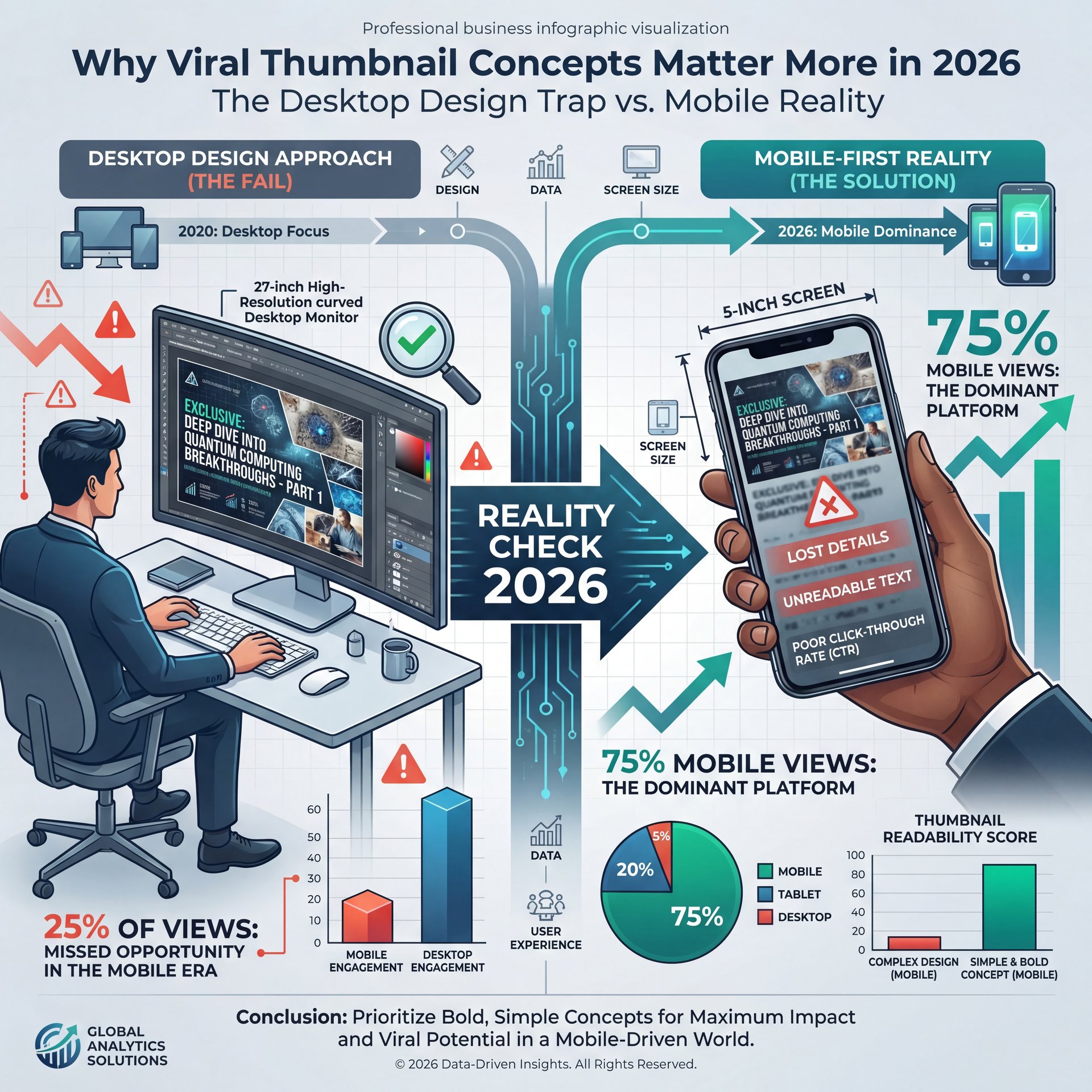
So let’s cover the reality of where we’re right now. Over 75 percent of YouTube views happen on mobile devices in 2026, according to recent data from [vmake.ai]. That means your viewers are looking at a tiny five-inch screen, which completely changes how viral thumbnail concepts need to be designed. If you design your graphics on a massive desktop monitor, you’re going to have a bad time.
Because of this shift, your entire strategy has to change. You can’t rely on tiny text or complex backgrounds anymore when creating viral thumbnail concepts. Plus, the algorithm has gotten incredibly strict. A solid click-through rate optimization strategy in 2026 sits above 5 percent — and meanwhile, channels sitting below 2 percent usually have fatal design mistakes. This 2.5x difference is literally what decides if the algorithm pushes your video or completely buries it.
Viral Thumbnail Concepts for Mobile-First Reality
What surprised me was how many professionals still miss this basic concept. They treat their social graphics like movie posters. But here’s what you wanna do instead. You need to treat them like highway billboards. People are scrolling past at a million miles an hour. Therefore, your message needs to be instant.
If your design takes more than a fraction of a second to understand, the viewer is already gone. I mean, think about your own scrolling habits. You don’t stop to study a tiny image. You glance, make a split-second judgment and move on.
The Mobile Screen Reality
Most creators still design for desktop, which ruins even the best viral thumbnail concepts and completely kills their click-through rate. If you want to see how your designs look on small screens, you can test them easily using the tools at Banana Thumbnail. Always zoom out to 10 percent before you hit publish.
What Are the Core Viral Thumbnail Concepts?
Now here’s the thing you really need to understand about thumbnail psychology and what makes viral thumbnail concepts actually work. The human brain processes only three visual chunks in about 0.5 seconds when someone is scrolling on their phone. Worth noting. That data comes straight from [vmake.ai] research. Because of this, you literally have half a second to make your pitch.
(What I meant was…)
So what you want to do is use the Rule of Three. You need one face, one object, and one short piece of text. That’s it. If you add more stuff, it just turns into visual noise. I see guys bringing their channels to me for advice. Their graphics look like a messy collage of ten different things. Nobody can read that on a phone.
You have to strip away everything that doesn’t directly sell the click. If a background element doesn’t add context, delete it. 7 is the secret sauce. If a word doesn’t create curiosity, remove it. Simplicity is your best friend here.
Pro Tip: Always use the “stamp test” before you upload anything. Shrink your image down to the size of a postage stamp on your screen. If you can’t tell what is happening right away, your viewers won’t be able to either.
How to Use the Shocking Reaction Face Concept
All right, so let’s talk about the big one. The shocking reaction face combined with a bold hero object is incredibly powerful. Honestly, I think this is probably the most reliable of all the viral thumbnail concepts out there. Faces trigger immediate emotional recognition in our brains.
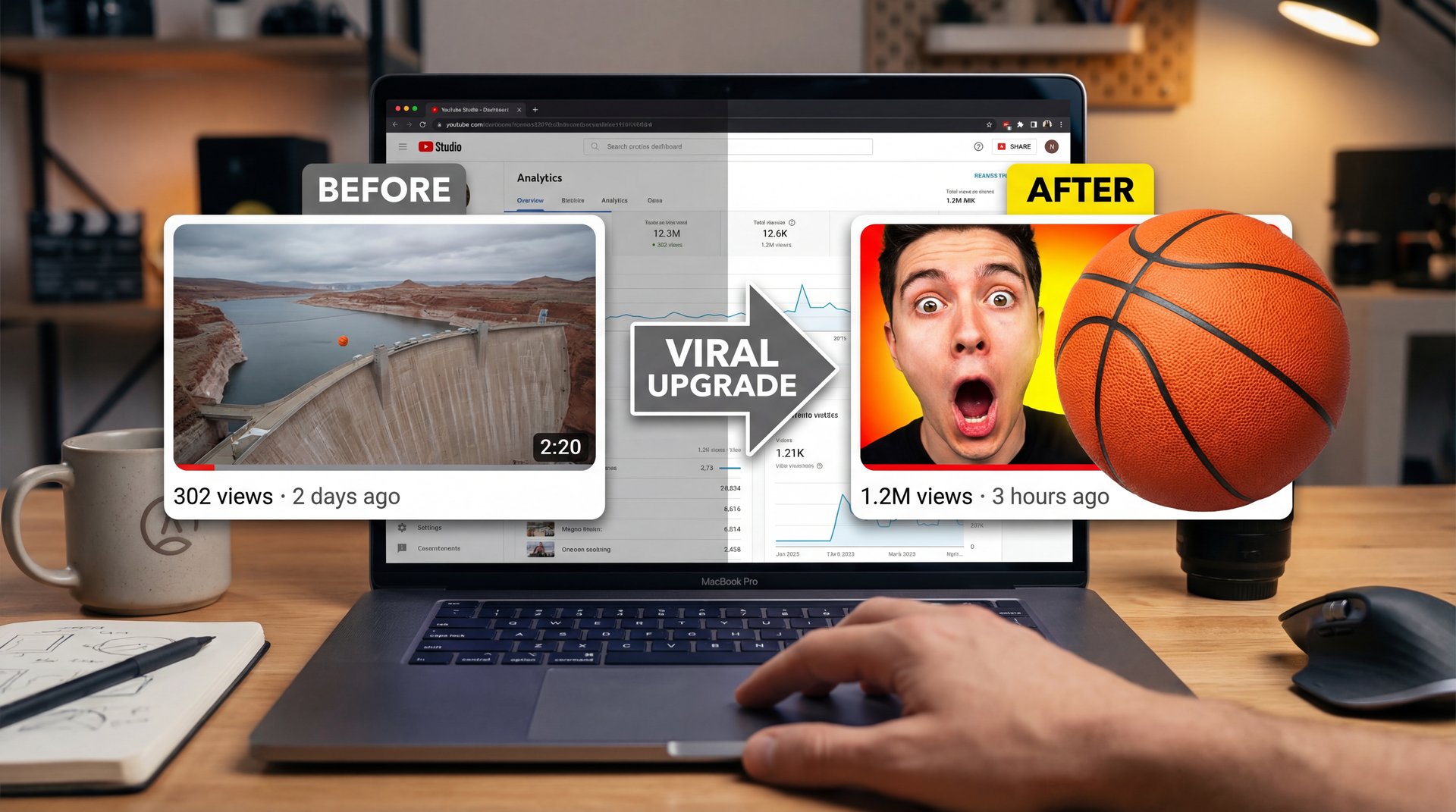
There is a famous case study about a basketball dam video that perfectly illustrates this. The creator originally used a wide-angle shot of a dam — and the basketball looked like a tiny speck in the background. so, it got almost zero views. So they changed the packaging. They zoomed in on a shocked face and put a bright, high-contrast basketball right in the middle. Boom. It jumped to 40 million views. The video content remained identical.
The Power of Emotion
You also have to look at the massive growth of MrBeast. Between 2019 and 2022, his channel grew from 14 million to 112 million subscribers. That’s an 8x increase, according to historical data from [The Ringer], which means his team used over-the-top faces constantly during that explosive run.
When you pair an intense emotion with an object that shows what the video is about, people just have to click. It creates an itch in the brain that requires a click to scratch. Period. If you want to dig deeper into why this specific formula works so well, I highly recommend reading about 9 Viral Thumbnail Psychology Secrets That Boost CTR.
The Power of High Contrast (I know, I know)
The basketball dam video proved that zooming in on a hero object changes everything. You can easily isolate your main subjects and boost their contrast using the background removal tools at Banana Thumbnail features. A simple background swap often doubles your engagement right away.
Real talk.
Before After Thumbnails and Bold Numbers Thumbnails
But here’s what you want to do if you don’t want to use crazy faces. Some people hate doing the shocked expression. I totally get it. Personally, I prefer using before after thumbnails. They provide instant visual proof of a transformation.
When you show a massive transformation, the viewer right away wants to know how you achieved it. However, you have to use integrity-based hooks. Clickbait might get you a 6 to 8 percent CTR initially, but your retention will drop to 20 percent. People click off fast when they realize you lied to them.
Think of it like a mechanic shop. Consider this: 7 changes everything. If you tell a customer they need a cheap part and then hand them a massive bill, they never come back. When you use honest visual proof, you might get a slightly lower 4 to 6 percent CTR, but your retention stays above 50 percent. That keeps the algorithm very happy.
(Anyone else?)
Using Specific Data
You can also use bold numbers thumbnails to grab attention. Humans naturally gravitate toward lists, rankings, and specific data points — and if you put a massive “7” or “$ten,000” on the screen, it creates immediate curiosity. Just make sure the numbers are huge and a breeze to read.
For more on platform rules regarding text and misleading metadata, you can ALWAYS check out the official YouTube Creator Academy to see what they recommend. They have very specific guidelines about what constitutes clickbait versus an honest hook.
Pro Tip: When using numbers, odd numbers tend to perform slightly better than even numbers. A list of 7 or 9 items feels more organic and less manufactured to the viewer than a perfect list of 10.
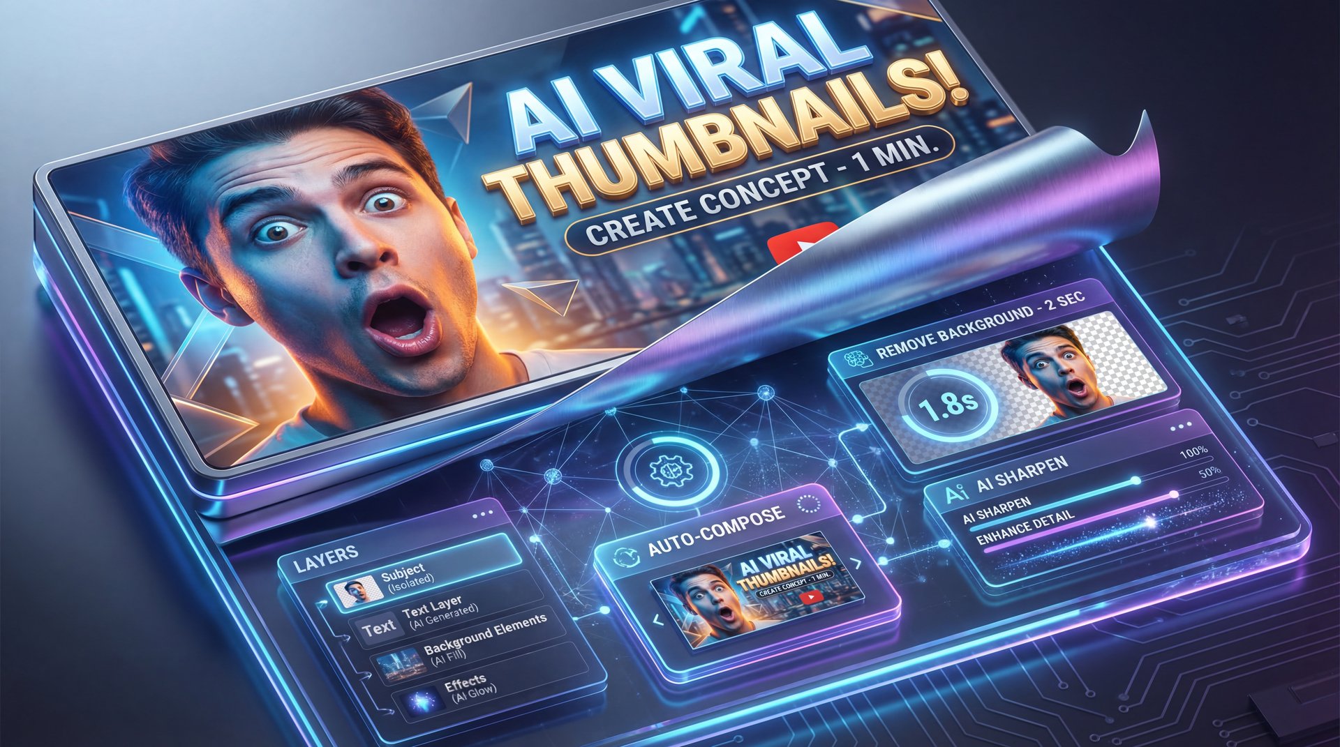
AI Tools for Creating Viral Thumbnail Concepts (I know, I know)
Let’s go under the hood and talk about how we actually build these things. In the past, you needed to be a hardcore graphic design expert. You had to spend hours cutting out backgrounds manually. I remember doing that years ago, and it was absolutely miserable.
Today, AI-powered tools handle all the heavy lifting for you. You can remove a background and sharpen a blurry image in about two seconds. Curtis, the Founder and Creative Director of Banana Thumbnail, always talks about this specific shift. He built the platform specifically so creators could focus on the psychology of the click instead of fighting with complicated software.
When you don’t have to worry about the technical execution, you can test way more ideas. You can try out different viral thumbnail concepts in minutes instead of hours. Plus, it levels the playing field for casual creators who can’t afford to hire an expensive agency.
If you’re curious about the software side of things, take a look at these AI Thumbnail Generators That Boost YouTube CTR. It honestly makes the whole creation process so much less stressful.
Speed Up Your Workflow
You don’t need a degree in graphic design to make clickable packaging anymore. The background removal and sharpening tools inside Banana Thumbnail video generation handle the technical steps quickly. Huge. This lets you focus entirely on your core concept and emotional hook.
Testing Your Viral Thumbnail Concepts Like a Pro
All right, so from there you need to know if your design actually works in the real world. Even the biggest creators on the platform rarely get it right on the first try. You have to test your stuff constantly.
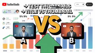
Channels that use systematic A/B testing see massive results. We’re talking about CTR improvements of 15 to 25 percent within 30 days. Within 90 days, that jumps to 40 to 60 percent, according to data from [vmake.ai]. Huge. You can use the native Test & Compare feature to run these experiments directly on your channel.
You just upload three different versions and let the audience decide. Maybe one uses a shocked face. Maybe another uses bold numbers. The data will tell you exactly what your specific audience prefers. It completely removes the guesswork from the equation.
You can read more about broad marketing data on sites like Statista to see how systematic testing impacts overall conversion rates across different industries. The psychology of a click is universal, whether you’re selling a car or a video view.
Pro Tip: Always test completely different concepts first. Don’t just change the background color from blue to red. Test a face against an object. Once you find the winning concept, then you can tweak the small details.
Building Visual Authority
Finally, you need to build a consistent brand kit. Pick two primary fonts and two action colors. Then, stick with them for at least ten videos. This builds visual authority in the suggested feed. When a viewer sees your specific shade of yellow and your specific font, they should instantly know it’s your video.
Consistency breeds familiarity. And familiarity breeds clicks — Actually, scratch that —. So find your winning formula, test it ruthlessly and stick to your branding. That’s how you win the click in 2026.
The One and Done Trap (yes, really)
The biggest mistake creators make is uploading one design and never looking at it again. You should usually have a backup ready to go. You can easily build multiple variations using Banana Thumbnail workflows so you’re ready to swap them out if a video tanks in the first hour.
Frequently Asked Questions
What are the most common mistakes creators make with YouTube thumbnails?
The biggest mistake is designing for massive desktop screens instead of modest mobile phones. Creators also clutter the image with too much text and too many visual elements.
How can AI tools improve the design of YouTube thumbnails?
AI instantly handles tedious tasks like background removal and image sharpening. This lets you focus entirely on the emotional hook and layout instead of technical editing. (Life, man.)
What role does mobile viewing play in thumbnail design for YouTube?
With over 75 percent of views happening on mobile in 2026, your designs must be readable on a five-inch screen. If your text and subjects are too small, mobile users will scroll right past.
How do over-the-top thumbnail faces influence viewer engagement?
Faces trigger immediate emotional recognition in the human brain. When paired with a relevant object, an exaggerated expression creates intense curiosity that drives people to click.
What are some successful case studies of thumbnail redesigns?
A famous basketball dam video jumped from average views to 40 million simply by changing it’s wide-angle shot to a shocked face with a high-contrast basketball. MrBeast also used exaggerated faces to grow his channel by 8x in three years.
Related Videos


Related Content
For more on this topic, check out: thumbnail
Listen to This Article
