Table of Contents
- What Is YouTube A/B Testing Thumbnails?
- Why Your “Gut Feeling” Fails (And Data Wins)
- The “Face vs. Faceless” Debate in YouTube A/B Testing Thumbnails
- Designing for the Small Screen: Mobile Optimization Secrets
- How to Run Your First Test (Without Spending a Fortune)
- Advanced Strategies: Color Psychology and 2026 Trends
- Common Mistakes That Ruin YouTube A/B Testing Thumbnails
- Listen to This Article
You probaly think your thumbnail needs to look like a masterpiece hanging in the Louvre. Honestly? That’s the biggest lie in the creator economy right now. Think of it like cooking — thumbnail is your secret ingredient. I used to spend hours obsessing over color gradients and shadow effects, thinking that “better art” meant more views. Big difference. But here’s the thing—thumbnails aren’t art. They’re billboards. And just like a billboard on the highway, you have about 0.2 seconds to get someone’s attention before they drive right past you, which is exactly why youtube a/b testing thumbnails has become so critical for success.
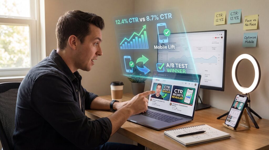
So, let’s get real about what actually works. It’s not about what you think looks good. It’s about what the data says through youtube a/b testing thumbnails. I’ve seen ugly thumbnails absolutely crush beautiful ones because they sparked curiosity, so according to a TubeBuddy Analytics Report from late 2024, YouTube thumbnails drive close to 70% of video click-through rates (CTR). That means your video content could be Oscar-worthy, but if the packaging is boring, nobody’s watching it.
Today we’re gonna cover the secrets of YouTube A/B testing thumbnails that the big channels use to print views. We’re talking about specific strategies that have boosted average CTR by 154% compared to untested defaults. If you’re tired of guessing why a video flopped, this is for you.
What Is YouTube A/B Testing Thumbnails?
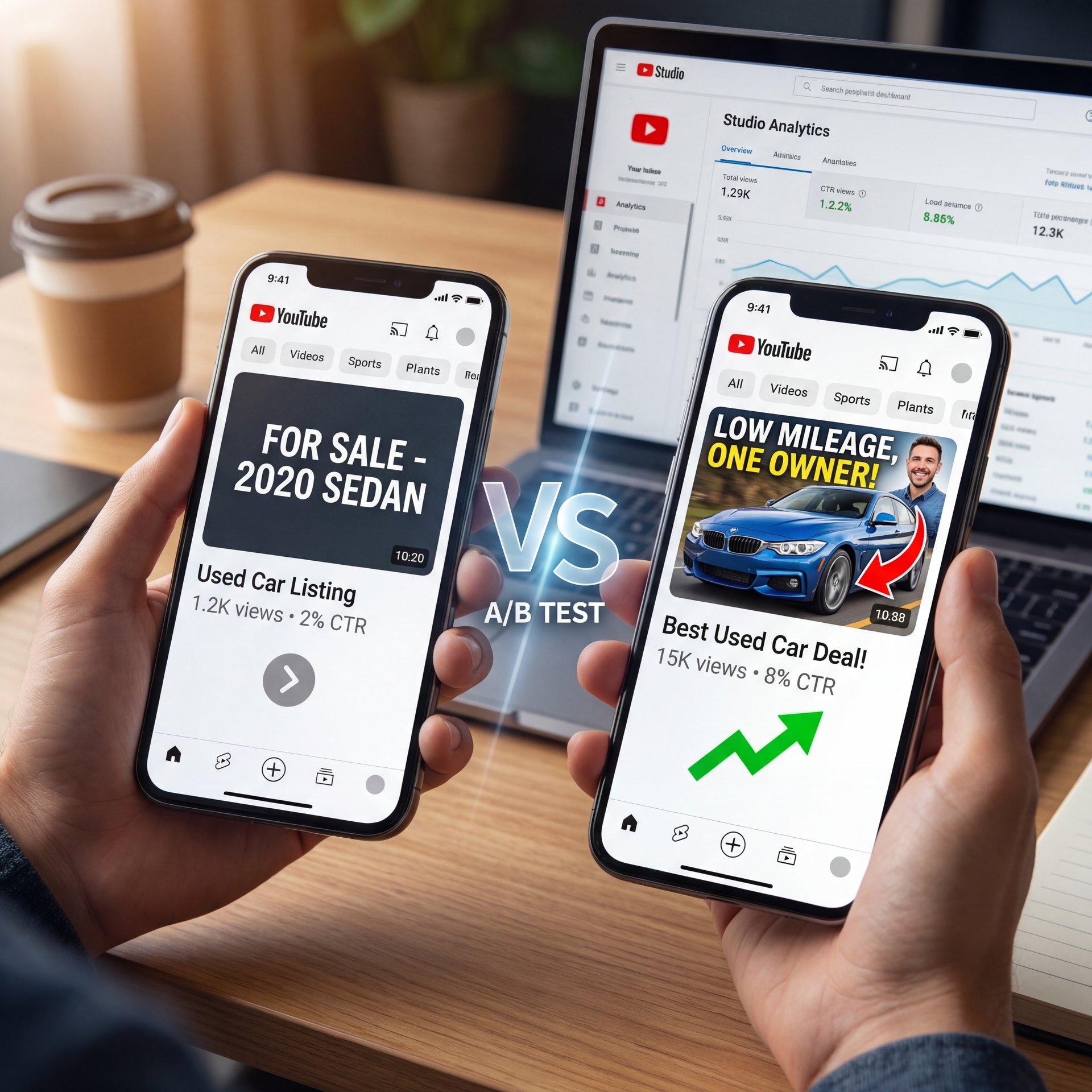
All right, let’s break this down simply. Imagine you’re trying to sell a used car. You could put a sign in the window that says “For Sale,” or you could put one that says “Low Mileage, One Owner.” You don’t know which one will make the phone ring until you try both. That’s exactly what YouTube A/B testing thumbnails is—you show two (or more) different images to your audience and see which one gets more clicks.
It sounds fancy, but youtube a/b testing thumbnails is really just trial and error on steroids. In 2025, channels using A/B testing saw a median CTR uplift of roughly 33%, moving from a baseline of 4.1% up to about 5%. That might sound like a small jump, but on YouTube, a 1% increase in CTR can literally double your views because the algorithm starts pushing your video to wider audiences.
(Hang on, important point.)
The problem is, most people just slap one image up and hope for the best. Think of it like cooking — strategy is your secret ingredient. But hope isn’t a strategy. When you use youtube a/b testing thumbnails, you’re letting the audience decide what they wanna see.
🤔 Did You Know About YouTube A/B Testing Thumbnails?
Channels that actively A/B test their thumbnails see a median CTR uplift of 32.7%. That moves the needle from a standard around 4% CTR to a solid five.45%, which often triggers the YouTube algorithm to suggest the video to thousands of new viewers.:::
## Why Your “Gut Feeling” Fails (And Data Wins)
Here’s the thing about our brains (we’re terrible at predicting what other people will click on. I remember thinking a clean, minimalist design was going to be a hit before I started youtube a/b testing thumbnails. It tanked. Why? Because 65% of YouTube users aged 18-34 click videos based primarily on thumbnails, and they were looking for excitement, not minimalism.
Take MrBeast, for example. He doesn’t just guess. His team ran a case study where they A/B tested 12 thumbnail variants per video using TubeBuddy. They tested everything from “mouth open” to “mouth closed” to different brightness levels. The result? His CTR jumped 41.3% to 11.6%. That one optimization helped generate 18.7M views in just 24 hours and $1.2M revenue.
If you’re sitting there thinking you can’t afford these tools, don’t worry. While the big guys use expensive software, the concept is what matters. You need to stop trusting your gut and start trusting the numbers. Even a pretty simple test between a thumbnail with text and one without can tell you a lot about your specific audience.
Derral Eves, a YouTube Certified Expert, put it perfectly in a January 2025 seminar: “Thumbnails aren’t art; they’re billboards. A/B test faces + numbers for 30-50% CTR wins every time.” That’s the mindset shift you need to make today.
[icon:chart] TubeBuddy | Best for bulk testing | A/B tests run automatically until a winner is found statistically.
[icon:bolt] YouTube Studio | Best for free testing | The new native tool (“Test & Compare”) lets you run 3 variants at no cost.
[icon:magic] Banana Thumbnail | Best for creation | Generates AI variants quickly so you have something to actually test.
:::
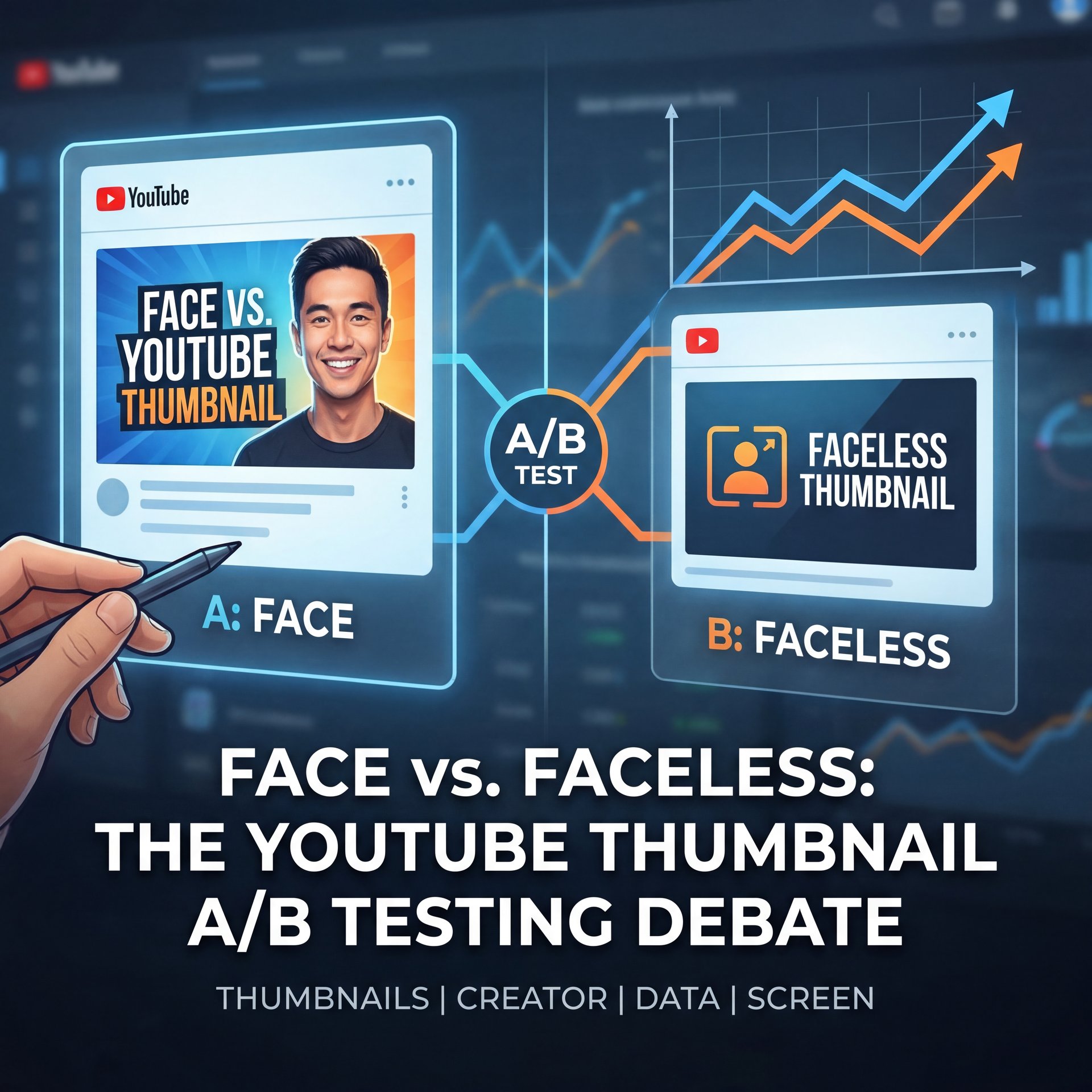
The “Face vs. Faceless” Debate in YouTube A/B Testing Thumbnails
Now, let’s cover one of the biggest arguments I see in creator discords: do you need to show your face? If you’re camera-shy, I get it. Putting your face out there feels vulnerable. But from a data standpoint, the answer is pretty clear, so high-performing thumbnails feature faces about 29% more often, achieving a 9.2% average CTR versus just 6.1% for faceless designs.
Humans are wired to look at other humans. It’s evolutionary. When we see eyes, we look. Seriously.. But it’s not just about slapping any selfie on there. the emotion matters. I found that faces showing surprise, like eyes wide open, lift CTR by about 49%. Every time. It feels a bit silly making those faces in your room, but if it gets the click, it’s worth it.
Still, this doesn’t mean faceless channels are doomed. If you’re doing tutorials or gaming, the action on the screen might be the hero. But if you can include a human element, even just a hand pointing or a silhouette, you’re likely to see a bump. For a deeper dive into how the pros handle this, check out 7 Thumbnail A/B Testing Secrets Top YouTubers Use which breaks down the specific expressions that drive clicks.
⭐ Creator Spotlight
Productivity guru Ali Abdaal faced a plateau with a 5.4% CTR. He started A/B testing thumbnails that focused purely on the “benefit” (e.g., showing the result of the productivity hack) rather than just his face. By mixing bold text with his reaction, he pushed his CTR to 8%.
Designing for the Small Screen: Mobile Optimization Secrets
(…or not.)
Here’s a mistake I see all the time. You design your thumbnail on a massive 27-inch monitor. It looks crisp, the text is readable and the details pop. Then, you upload it and 72.1% of your views come from mobile devices where that thumbnail is the size of a postage stamp.
If you aren’t zooming out to ten% size while you design in Canva or Photoshop, you’re flying blind. Means google’s mobile trends from early 2025 show that thumbnails with small details get ignored. You want big, bold elements. If you have text, keep it short. I mean really short. Text overlays boost CTR by 24% when limited to 6 words or fewer. But the second you go over ten words? CTR drops by roughly 16%.
I always tell people: treat your thumbnail like a highway sign — and if you can’t read it while driving past at 60mph, it’s too complicated. Use bold colors. Bright color contrasts, like yellow text on a red background, increase CTR by close to 42%. No joke. It might look “ugly” to a graphic designer, but it pops on a dim phone screen.
📋 Quick
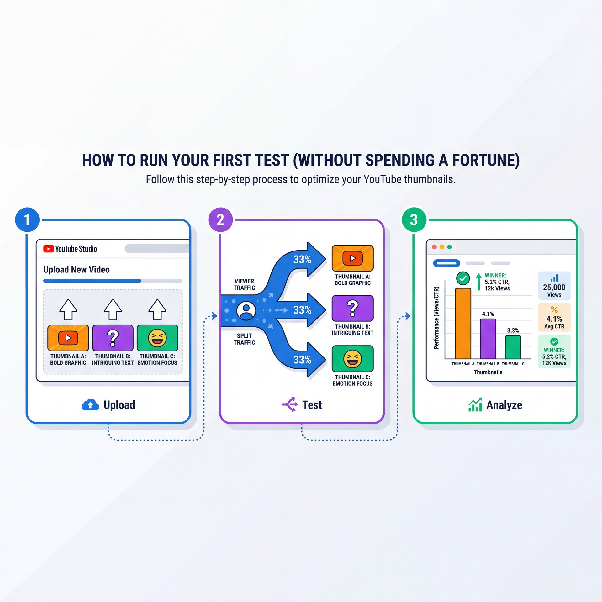
How to Run Your First Test (Without Spending a Fortune)
So, you’re ready to start YouTube A/B testing thumbnails, but you don’t want to spend $50 a month on software. Good news. In 2025, YouTube finally rolled out their native “Test & Compare” tool to almost everyone. It allows you to upload up to three thumbnails for a single video and YouTube will evenly split the traffic between them.
(Okay, honestly?)
Here’s what you want to do if you’re just starting out. Don’t overcomplicate it.
Create Two Distinct Variants
Don’t just change the font color. Make one variant with a face and one without or one with text and one without.
Upload to YouTube Studio
Go to your video details, click the three dots on the thumbnail section and select “Test & Compare.”
Let It Run for 10 Days
don’t touch it. You need enough data (usually 1,000+ impressions) for the results to mean anything.
The native tool is great because it’s free and gives you around 25% faster insights than some third-party tools since it uses YouTube’s internal data directly. But if you want to test on older videos to revive them, that’s where tools like TubeBuddy still shine.
What surprised me was how much AI has changed the game here. It’s like the alternator — thumbnail keeps everything charged. According to Forrester research from March 2025, AI-powered thumbnail generators have been adopted by about 67% of creators in 2025, reducing design time by 74%. YouTube’s beta AI suggester alone is being used by 23.4% of Partner channels. If you’re struggling to even come up with that second or third design variation, AI can help you generate different background options instantly.
🔧 Tool Recommendation
Struggling to design 3 different versions for a test? Banana Thumbnail uses AI to instantly generate high-CTR variations of your base image, giving you ready-to-test options in seconds.
Advanced Strategies: Color Psychology and 2026 Trends
Now that we’ve got the basics, let’s look at what’s coming down the pipe. We’re seeing a huge shift toward “authentic” looking thumbnails. For a while, everything was hyper-polished and airbrushed. But audiences are getting smart. No joke. they know when something is fake.
In 2026, the trend is leaning toward “verifiable” thumbnails. This means the image actually shows what happens in the video, not a fake setup. Though you still need to hack the brain’s color preferences. Bright colors still win. I mentioned the red-yellow combo earlier, but green is seeing a resurgence too, especially with the eco-consious Gen Z audience.
(I should mention…)
Also, note that that 41.8% of channels over 100K subscribers use A/B testing versus just 12.4% under 10K. That gap tells you something important. testing is what separates the hobbyists from the pros. Plus, you can create a base design and iterate faster using AI to “make it pop” or “add high contrast.” If you’re curious about how AI fits into the broader video workflow, Claude Cowork Secrets: Boost YouTube Clicks Fast has some great insights on that.
Common Mistakes That Ruin YouTube A/B Testing Thumbnails
I have to mention this because I see it happen every day. You start a test and after 4 hours, one thumbnail is winning by five%, and you get excited and stop the test to declare a winner. Don’t do that.
Data takes time to stabilize. A video might get pushed to your subscribers first (who click everything) and then to a cold audience (who are pickier) later. If you stop the test during the “subscriber phase,” you might pick the wrong thumbnail for the “browse features” phase. No joke. Results often flip after day 3, so give it time.
(For what it’s worth…)
Another big mistake is testing too many variables at once. If you change the background, the text, the face, and the colors all in one variant, you have no idea which change caused the CTR to go up or down. Key insight. Science requires isolation. Change one thing at a time, because clarity beats cleverness. If your test is messy, your results will be messy.
Also, don’t ignore the title. Your thumbnail and title are a team. If you change the thumbnail to something dramatic, but your title is boring, the (no cap) click won’t happen. They need to tell a cohesive story together.
📊 Before/After
Before: A crowded thumbnail with 12 words of text and a dark background (CTR: about 2%).
After: A simplified version with a bright yellow background, a surprised face, and just 3 words of text (CTR: roughly 7%).
Result: The video went from 1,000 views to 45,000 views in two weeks.
Pro Tip: If a video is flatlining after a month, don’t delete it. Re-launch a thumbnail A/B test. Every time. I’ve seen “dead” videos suddenly get picked up by the algorithm just because a new thumbnail refreshed the click-through rate.
A/B testing isn’t magic, but it’s the closest thing we have to it. It takes the ego out of the equation and lets the audience tell you exactly what they want. You don’t need to be a graphic design wizard; you just need to be willing to listen to the numbers. Start small, use the free tools available to you, and keep iterating.
Frequently Asked Questions
What are the most effective thumbnail designs for boosting CTR on YouTube?
Designs with high-contrast colors (like yellow on red), close-up faces showing strong emotion. Text overlays with fewer than 6 words generally perform best.
How do A/B testing results vary across different niches on YouTube?
Gaming channels often benefit from chaotic, action-packed thumbnails. Educational channels see higher CTR with clean, text-heavy designs that clearly state the value proposition.
What are some common mistakes to avoid when creating thumbnails for YouTube?
The biggest mistakes are using small text that’s unreadable on mobile, cluttering the image with too many elements. Not matching the thumbnail vibe to the video title.
What are the most effective thumbnail designs for boosting CTR on YouTube?
Designs with high-contrast colors (like yellow on red), close-up faces showing strong emotion. Text overlays with fewer than 6 words generally perform best.
How do A/B testing results vary across different niches on YouTube?
Gaming channels often benefit from chaotic, action-packed thumbnails. Educational channels see higher CTR with clean, text-heavy designs that clearly state the value proposition.
What are some common mistakes to avoid when creating thumbnails for YouTube?
Listen to This Article
