
Table of Contents
- What Is Thumbnail A/B Testing and Why Do Most Get It Wrong?
- The “Kitchen Sink” Mistake in Thumbnail A/B Testing
- How Long Should You Run a Thumbnail A/B Test?
- Is CTR the Only Metric That Matters? – quick version
- The AI Advantage: Manual vs. Automated Testing
- Common Design Mistakes in Thumbnail A/B Testing
- Interpreting the Data: Watch Out for False Positives – quick version
- Ignoring the Niche Benchmarks
- The “Set It and Forget It” Trap
- Listen to This Article
All right, let’s get under the hood of your channel analytics and thumbnail a/b testing. thumbnail is the glue that holds it together. I was talking to Curtis, the founder here at Banana Thumbnail, just the other day about this. We were looking at a video that we swore was gonna take off. The thumbnail looked solid on our 27-inch monitors—high contrast, great lighting, the works, and but when we looked at the data a week later? It was flatlining.
Here’s the thing: we made the classic mistake of designing for ourselves instead of the data when it comes to thumbnail a/b testing. And honestly, I see creators make the same errors over and over again. It’s frustrating because you put all this work into the video, but if that little image doesn’t click, nobody sees it.
Today we’re going to go over the 9 biggest thumbnail A/B testing mistakes I see people making in 2026. Whether you’re just starting out or you’re managing a massive channel, these are the traps that kill your CTR (CTR). Let’s go ahead and fix that.
What Is Thumbnail A/B Testing and Why Do Most Get It Wrong?
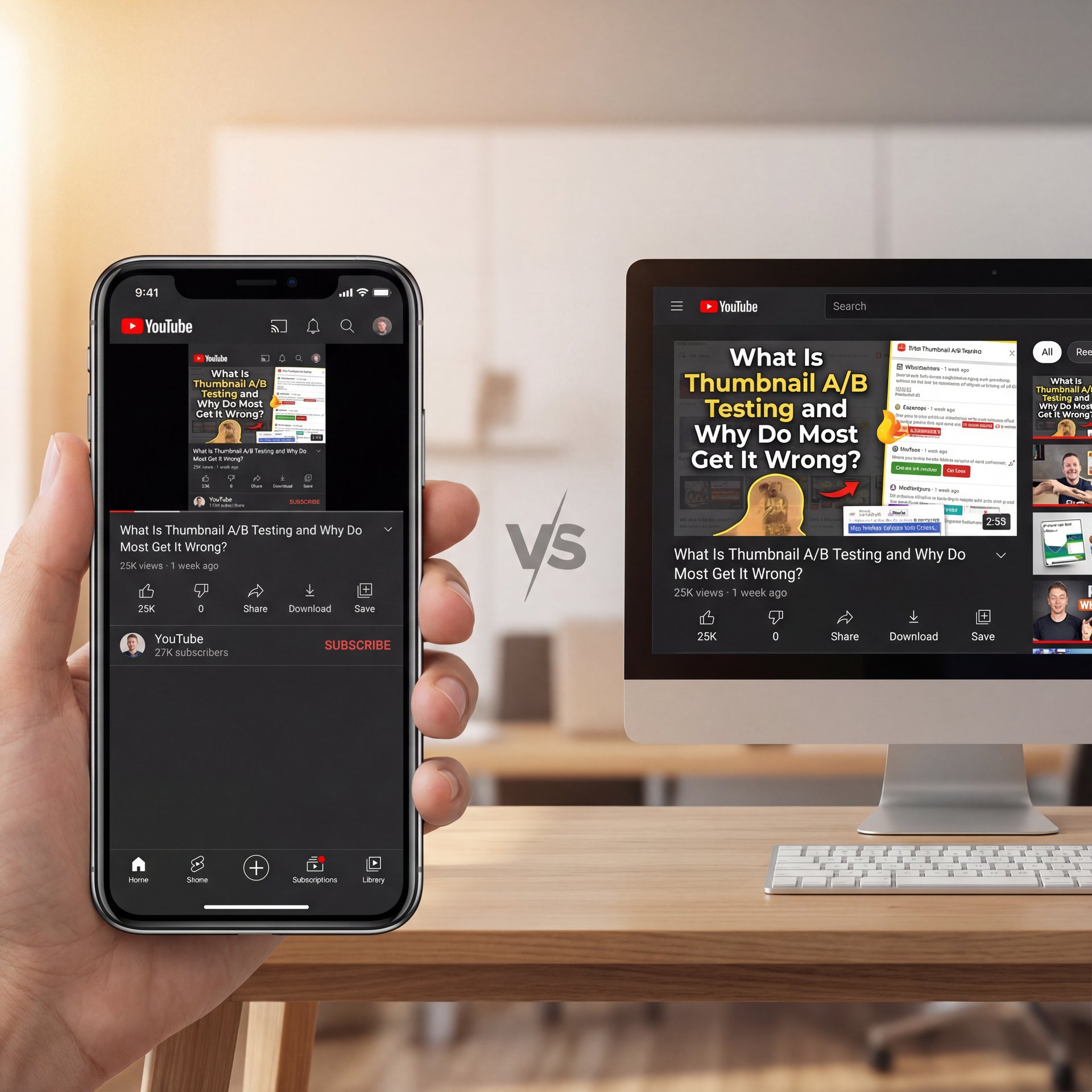
So, first off, let’s cover what we’re actually doing here — and thumbnail A/B testing isn’t just throwing two pictures up and seeing which one looks cooler. It’s a systematic way to figure out what makes a human being stop scrolling and actually tap.
The biggest issue I see with thumbnail a/b testing? People test the wrong things because they don’t understand the environment their thumbnail lives in. you should probably realize that over 70% of YouTube views happen on mobile devices where thumbnails display at around one inch wide.
(More on that in a sec.)
If you’re designing on a desktop and not checking what that image looks like when it’s the size of a postage stamp, you’re already losing at thumbnail a/b testing. I mean, if I can’t read your text or make out the emotion on your face from three feet away on a phone screen, the test is invalid before it even starts.
I think a lot of us get caught up in the “art” of it. Consider 9 the foundation. But really, we need to look at the “science.” Thumbnail a/b testing is about isolating variables. If you change the background color, the text, and your facial expression all at once in Variant B, and it performs better… well, you learned nothing. Was it the color? The text? You don’t know. And that brings me to the first major mistake.
The “Kitchen Sink” Mistake in Thumbnail A/B Testing
(For what it’s worth…)
I call this the “Kitchen Sink” approach because creators try to change everything at once. You take your original thumbnail and for the B-side, you change the font, the (no cap) background, the shirt you’re wearing, and the saturation.
Testing multiple variables simultaneously prevents isolating which design element actually improved CTR from 4% to 6%, creating false confidence in ineffective changes. Here’s what you want to do instead: change one thing. Just one.
If you want to test if a surprised face works better than a serious face, keep the background and the text exactly the same. If you want to test if red text works better than yellow, don’t change the picture.
I found that when I isolate variables, I get practical data. For example, recent industry research shows that thumbnails with faces showing clear emotion achieve 23-50% higher CTR than those without. But you only know that if you test the face specifically.
💡 Isolate Your Variables in Thumbnail A/B Testing
Don’t change the text, color, and image all at once. Test one element at a time (like text color vs. text color) to know exactly what triggered the CTR boost.
(Side thought:)
How Long Should You Run a Thumbnail A/B Test?
Now, here’s a big one. Impatience. I get it—you upload a video, you want it to go viral now. So you launch a test, and 4 hours later, Variant B is winning by 1%, so you declare a winner and stop the test.
Bad move.
First 24-hour data is heavily skewed by subscriber notifications and direct traffic, making early CTR readings unreliable for decision-making til cold audience traffic dominates. You need to let the test run until the algorithm starts pushing your video to people who don’t know you. That’s where the real battle for clicks happens.
According to Growth OS data from February 2026, tests ending before 1,000 impressions per variant or ten-14 days minimum produce statistically unreliable results that regress when traffic normalizes. Anything less is just noise. It’s like flipping a coin three times, getting heads twice and deciding coins always land on heads.
I personally prefer to let my tests run for two full weeks. This covers two weekends and 😬 two sets of weekdays, smoothing out any wierd daily fluctuations.
Is CTR the Only Metric That Matters? – quick version
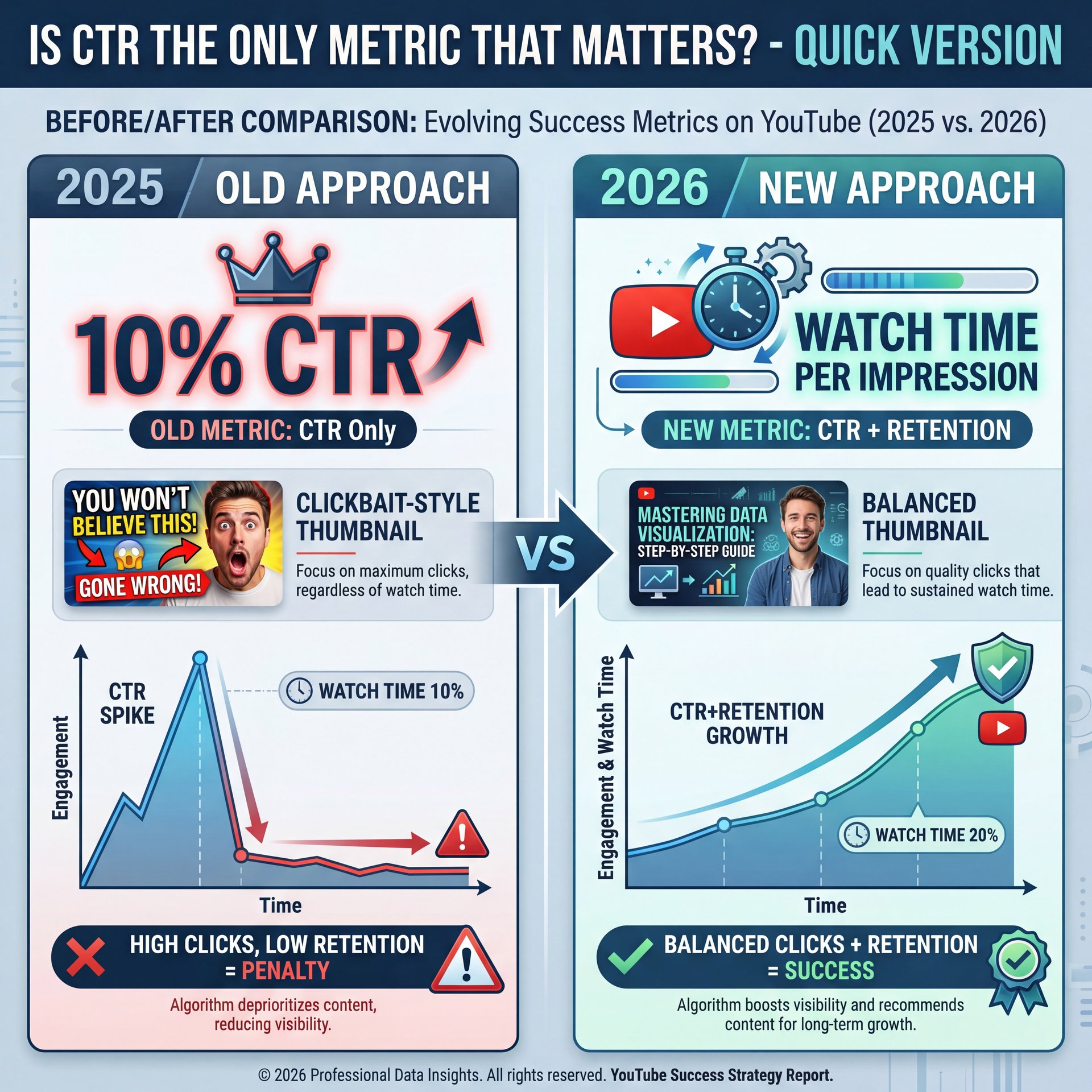
This is where things get tricky in 2026. We used to obsess over Click-Through Rate (CTR). If a thumbnail got a 10% CTR, it was the king. But here’s the thing (YouTube got smarter).
If you use a “clickbaity” thumbnail that gets a ton of clicks but people drop off after ten seconds because the video doesn’t deliver on the promise, YouTube will punish you. Seriously. The algorithm cares about Watch Time Per Impression.
Optimizing CTR without tracking retention can trigger YouTube’s clickbait penalties, thumbnails achieving 4.8% CTR with 42% retention perform worse than 4.6% CTR with 51% retention in watch time per impression. Let’s break that down.
- **Thumbnail A:** 6% CTR, but people only watch 2 minutes.
- **Thumbnail B:** 4% CTR, but people watch five minutes.
Thumbnail B is actually better for your channel health. I’ve seen creators boost their CTR to 8% using misleading AI images, only to watch their channel flatline because retention tanked.
I think it’s important to look at the whole picture, and when you’re reviewing your A/B test results, don’t just look at clicks. Cross-reference it with Average View Duration (AVD). If clicks go up but AVD goes down significantly, that thumbnail is a failure.
(Let me rephrase that.)
For a deeper dive on how this balance works, check out our guide to AI thumbnail mistakes.
The AI Advantage: Manual vs. Automated Testing
Now, let’s talk about the tools. Back in the day, we had to do this manually or use basic plugins. But in 2025, AI thumbnail software captured 92.4% of the market for a reason. Game changer. It’s just faster and more accurate.
I’ve used tools like Pikzels and VidIQ, and they handle things differently. Pikzels is honestly impressive because it generates high-quality variants in about 60 seconds. VidIQ is solid for the analytics side. Big difference. But relying solely on manual Photoshop edits for testing is a bottleneck.
At Banana Thumbnail, we focus on helping you generate those variations instantly so you can start testing sooner. If it takes you an hour to make a variant, you’re not going to test enough, so if it takes 15 minutes, you can test five different angles.
(Anyway, moving on.)
What surprised me was how much better the AI tools are getting at understanding context. They don’t just swap backgrounds; they analyze what’s working in your niche, and plus, Pikzels users report CTR improvements from close to 4% to 4.2%, representing a 20% relative boosted in performance.
Common Design Mistakes in Thumbnail A/B Testing
Let’s go under the hood of the actual design. I see SO many people trying to be “clever” with complex designs. But the data says simple wins.Thumbnails with simple designs, faces showing emotion. Under 4 words achieve 23-50% higher CTR than complex alternatives. Why? Because on a phone, nobody is reading a paragraph. You have a split second to grab attention.
Another mistake is font readability. I see fancy cursive fonts or thin text that disappears against the background. You want big, bold, sans-serif fonts. Think impact. Think billboards, not books.
And let’s talk about color. High contrast is key. If your background is dark, your text needs to be bright. It sounds basic, but I see professionals messing this up because it “looks artistic.” Artistic doesn’t always pay the bills.
⭐ Creator Spotlight: Gaming Channel Win
A gaming channel we tracked increased CTR from five.2% to 7.8% just by removing text and zooming in on the character’s face. Sometimes less really is more.
Interpreting the Data: Watch Out for False Positives – quick version

So you ran the test, you got the data. Now what?
One of the biggest mistakes is ignoring external variables. Consider video the foundation. Let’s say you run a test on a video about “Best Tech Gifts” during Black Friday week. Game changer. Your CTR is going to be higher naturally because everyone is searching for gifts.
If you attribute that sucess solely to your thumbnail change, you’re going to be disappointed when you try that same style in July and it flops. I always try to document what else is happening. Was there a trending topic? Did a big creator shout you out? These things mess with your A/B test data.
Also, be careful with third-party tools. Sometimes the data in a tool like TubeBuddy or VidIQ might look slightly different than your YouTube Studio data. Always treat YouTube Studio as the source of truth — Actually, scratch that —. If there’s a discrepancy, trust YouTube.
Ignoring the Niche Benchmarks
You can’t compare apples to oranges. I see gaming channels freaking out because they aren’t getting the same CTR as a MrBeast video. Or a finance channel wondering why they aren’t hitting ten%.
You have to know your lane. Gaming and entertainment channels achieve 7-ten% CTR while education and tutorial content achieves 3-6% CTR. Finance and B2B content typically lands between 4-7%. The average YouTube CTR sits at 4-6% for most channels, with around half falling between 2-10%.
If you’re an educational channel and you’re getting 5% CTR, don’t tear your hair out trying to hit 12%. You’re doing fine. Focus on retention instead.
I’ve found that setting realistic expectations prevents you from making drastic changes that actually hurt your brand. If you try to force a “gaming style” thumbnail on a serious finance video, you might get the click, but you’ll lose the trust.
The “Set It and Forget It” Trap
Finally, the last mistake is thinking you’re done. “Oh, I found the winning thumbnail, I’m solid forever.” nope. Trends change fast. What worked in 2024 looks dated in 2026. The “shocked face” meta changes. The “red arrow” meta changes. You need to be constantly testing.
I try to revisit my top-performing evergreen videos every 3-6 months. I’ll throw a new challenger thumbnail into the ring just to see if I can beat the champion. Often, a fresh look on an old video can revitalize it and trigger the algorithm to start pushing it again.
It’s like maintenance on a car. You don’t just change the oil once and hope it runs forever. You gotta keep checking it.
📊 Before/After: The Refresh Effect
We saw a creator update thumbnails on year-old videos using our AI tools. Result? A 20% lift in traffic on “dead” content within two weeks.
The creator had five evergreen videos that were getting maybe 10 views per day. After refreshing the thumbnails with variants generated through our platform, those same videos started averaging 50 views per day. Seriously. That’s money left on the table that you’re just picking up with better visuals.
Here’s Why This Works (seriously)
Old thumbnails signal to the algorithm that the content is dated. Fresh thumbnails, however, can trigger a re-evaluation. Plus, viewers scrolling through search results see something new and are more likely to click. It’s not magic. it’s just understanding how the system works.
So What Does This Mean for You?
The refresh strategy works because YouTube’s algorithm constantly re-evaluates content. A new thumbnail provides a signal that the video has been updated or improved, which can boost its visibility in search and suggested videos.
For more on the psychology behind why certain images work better, take a look at our article on thumbnail psychology.
So, that’s the breakdown. Avoid these mistakes, use the tools available to you, and keep testing. Every time. It’s not about being perfect every time; it’s about getting a little bit better with every upload.
Frequently Asked Questions
What are the most common mistakes in A/B testing YouTube thumbnails?
The biggest mistakes are testing too many variables at once (the “kitchen sink” approach), stopping tests too early before getting statistically significant data, and optimizing for CTR while ignoring viewer retention.
How do AI tools compare about thumbnail quality and speed?
AI tools like Pikzels and Banana Thumbnail can generate high-quality variants in about 60 seconds, but manual creation takes 15-45 minutes. In 2026, AI tools dominate 92.4% of the market because they allow for faster, volume-based testing without sacrificing quality.
What are the best practices for designing effective YouTube thumbnails?
Keep it simple with high contrast, use legible sans-serif fonts with under 4 words of text, and ensure faces show clear emotion. Most important: design for mobile screens first since 70% of views come from mobile devices. Better Thumbnails in Adobe Express (2026 Tutorial) – YouTube
How does CTR impact overall video performance on YouTube?
CTR is the gatekeeper. if people don’t click, they can’t watch (but YouTube’s algorithm prioritizes “Watch Time Per Impression.” A high CTR with low retention can actually hurt your video’s reach, so you need a balance of both.
What are the key differences between Pikzels, VidIQ, and Thumbler?
Pikzels focuses on high-speed, credit-based AI generation (approx 60s); VidIQ offers unlimited generation with strong analytics integration but slightly lower creative control; Thumbler sits in the middle with ~30s generation times.
Related Content
• mistakes
For more on this topic, check out: thumbnail
Listen to This Article
