Table of Contents
- Why Repeating Your Title is one of the better YouTube Thumbnail Mistake
- YouTube Thumbnail Mistakes: Are Color Choices Killing CTR?
- How Text Density Turns Into a Major YouTube Thumbnail Mistake
- Can AI Tools Fix Your Thumbnail Mistakes Before You Publish?
- The 24-Hour Rule: Avoiding Timing Mistakes
- Faceless Channel Mistakes You Can’t Afford to Make
- Emotional Tension vs. Direct Ranking
- Listen to This Article
Here’s the thing about YouTube: you can spend forty hours editing a masterpiece, dialing in the audio and perfecting the color grade, but if you mess up a 1280×720 pixel image, nobody sees it. I mean, it’s painful to watch a great video flatline just because of a few common youtube thumbnail mistakes.
(Speaking of which…)
So we’ve got a situation where creators are still guessing, throwing spaghetti at the wall to see what sticks. But in 2026, that’s just burning money and views. I’ve been digging into the latest data and what I found is that fixing just one or two specific YouTube thumbnail mistakes can double your CTR (CTR). thumbnail is the glue that holds it together.
Today we’re gonna go over exactly what those youtube thumbnail mistakes are, backed by some pretty wild numbers from this year and how AI tools are finally making it easier to predict a winner before you even hit publish. Let’s go ahead and get into it.
Why Repeating Your Title is one of the better YouTube Thumbnail Mistake
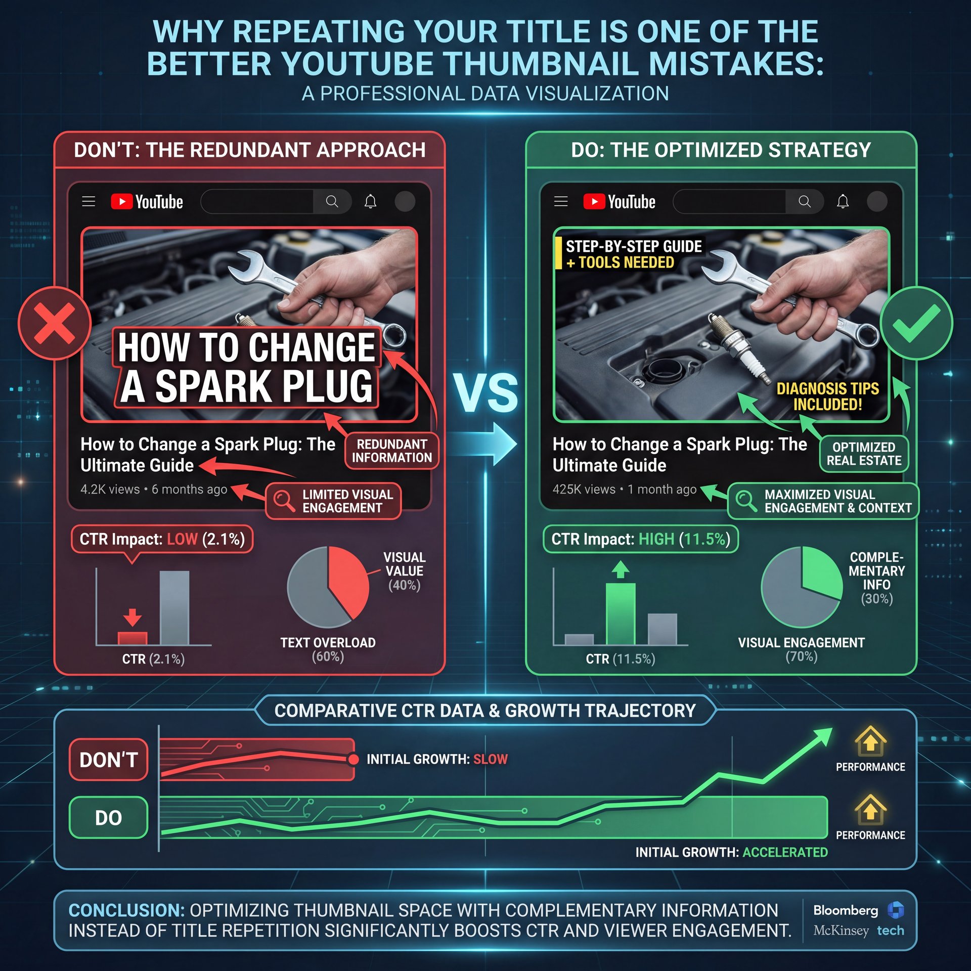
All right, so let’s cover the biggest offender first. I see this constantly, and honestly, it’s the number one reason videos underperform. You write a title like “How to Change a Spark Plug,” and then you put “How to Change a Spark Plug” in big text on the thumbnail. You might also find 5 YouTube Thumbnail Mistakes Killing Your CTR helpful.
Now here’s the thing: you’re wasting prime real estate. According to 2026 data from My Amazon Guy, repeating the title in the thumbnail is the top youtube thumbnail mistake cited by 73% of creators. When you do this, your CTR often drops below 5%. Why? Because there’s no curiosity. You’ve already told them what the video is, so you haven’t given them a reason to click to find out more.
YouTube Thumbnail Mistakes: Ignoring the Curiosity Gap
Instead, you wanna use what we call a “gap strategy” to avoid common youtube thumbnail mistakes. The text on the thumbnail should complement the title, not echo it. If your title is “How to Change a Spark Plug,” your thumbnail text should be something like “Don’t Do THIS!” or “3 Minute Fix.” thumbnail is the technical foundation.
I found that thumbnails using this gap-based pairing to avoid youtube thumbnail mistakes achieve a 5.83% CTR on average. That might sound like a small jump from five%, but in YouTube terms, that’s nearly a 20% increase in traffic. That’s huge.
⚠️ YouTube Thumbnail Mistake: The Echo Chamber Effect
Don’t copy-paste your title onto your image. This redundancy kills curiosity and drops CTR below 5%. Instead, use the text to tease a result or a warning. For help generating curiosity-based text, check out our workflow guides.:::
I recall talking to Curtis, the Founder & Creative Director here, about this. It Means he always says that the thumbnail should open a LOOP that the video closes. If the thumbnail closes the loop right away, they keep scrolling. Consider thumbnail the foundation.
## YouTube Thumbnail Mistakes: Are Color Choices Killing CTR?
So let’s go under the hood of color psychology. You might think, “I like blue, so I’ll use blue.” But the algorithm—and human psychology—doesn’t really care what you like. It cares about what grabs attention.
What surprised me in the recent data is just how iffy low-contrast colors perform. We’re talking about beige, light blue, orange, and purple. Thumbnails relying on these palettes consistently keep CTR under about 5% because they just blend into the white or dark mode background of the YouTube app.
YouTube Thumbnail Mistakes: Misusing The “Red” Effect
On the flip side, red-colored thumbnails are performing at a massive about 7% CTR according to recent split-testing data. Real talk.. It creates a sense of urgency and screams “stop and look.” Consider thumbnail the foundation.
Personally, I prefer the high-contrast look. If you look at the top performers, black and yellow combinations are hitting 7% CTR. It’s that construction zone, “danger ahead” vibe that our brains are hardwired to notice.
🤔 Did You Know?Red thumbnails average a about 7% CTR. “calm” colors like blue and beige struggle to break about 5%. High contrast isn’t just an artistic choice; it’s a mathematical advantage. Learn more about optimizing your visuals on our [features page](https://bananathumbnail.com/features).
:::
If you’re struggling with this, I’d recommend checking out our article on five YouTube Thumbnail Mistakes Killing Your CTR which goes deeper into color theory specifically for creators.
(Here’s the thing though.)
How Text Density Turns Into a Major YouTube Thumbnail Mistake
(Who knew?)
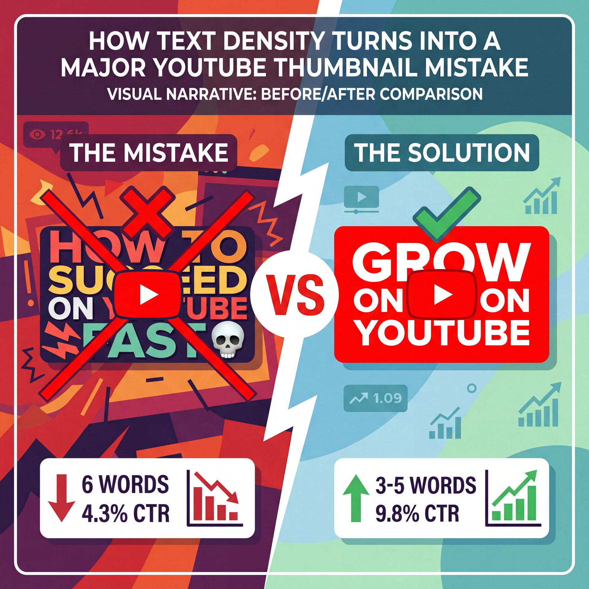
Now, if you have a lot to say, you 💀 might be tempted to put it all on the image. But yeah, don’t do that.
There’s a “valley of death” about word count. The data backs this up that using exactly 6 words on your thumbnail drops CTR to 4.3%. It’s too long to read at a glance, but not long enough to tell a full story, so it’s just clutter.
The 3-5 Word Sweet Spot (yes, really)
You’re going to want to stick to 3-five words because that serves as the baseline for high performence. It’s punchy and digestible.
However, there’s a wierd exception. If you go super long. like 12 words, but it’s a high-tension story (think of those text message bubbles or a list of “Rules”), CTR can actually reach about 7%. But that’s a risky play, so for 90% of us, keeping it short is the safer bet.
:::quick_reference{type=”quick_reference”}
📋 Quick Reference: Text Count Rules
- **0-2 Words:** Good for visual-heavy niches.
- **3-5 Words:** The “Sweet Spot” for most creators.
- **6-10 Words:** The “Valley of Death” (Avoid!).
- **11+ Words:** Only works for high-tension storytelling.
Need help shortening your copy? Our AI tools can suggest punchier alternatives.
:::
Can AI Tools Fix Your Thumbnail Mistakes Before You Publish?
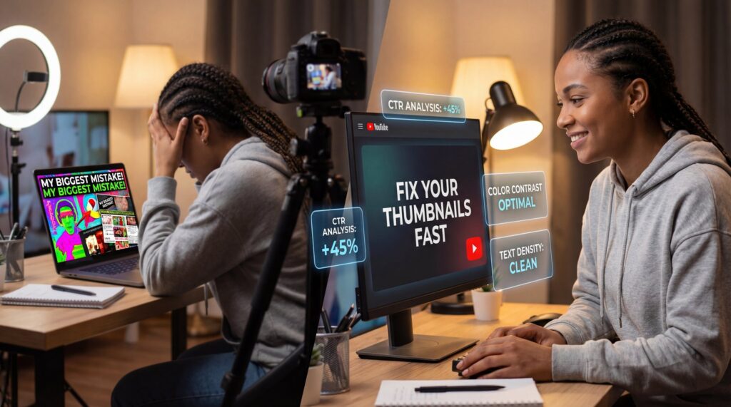
This is – well, it’s where things get really interesting in 2026. Back in the day, we had to upload and pray, but now we have tools that can actually see what the algorithm sees.
I’ve been testing some of these AI thumbnail analyzers and the accuracy is getting scary honestly impressive. We’re seeing AI tools predict CTR with 87.2% accuracy, which means before you even waste a view, you know if your design is a dud.
Reducing the Guesswork
Using these tools reduces trial-and-error by about 65%.Instead of making five versions and guessing, you run them through the system. This Analyzes the focal point, the text readability, and the emotional impact.
Here’s the thing: Faceless YouTube channels are seeing the biggest benefit here because they’re reporting 47% higher CTR using AI-optimized thumbnails versus manual designs. Since they don’t have a famous face to rely on, the design has to be perfect.
**Analyze Competitors**
Use AI to scan the top 10 videos in your niche. Look for color patterns (usually red/yellow) and text gaps.
**Pre-Test Designs**
Run your draft through a predictive AI tool. If the predicted CTR is under 5%, scrap it. Look for low contrast or confusing focal points.
**improve Emotion**
Ensure the AI detects “High Tension” or “Curiosity.” If it detects “Calm” or “Neutral,” add contrast or change the facial expression.
If you want to read more about why your current designs might be failing despite your best efforts, take a look at YouTube Thumbnails Flop? Proven Secrets to Increase CTR 2025.
The 24-Hour Rule: Avoiding Timing Mistakes
So from there, it helps to know about the “golden window.” A massive YouTube thumbnail mistake is thinking you can fix it later. I mean, you can, but the damage might already be done.
The first 24 hours determine 80% of the algorithmic push your video will get. If your thumbnail flops in hour one, YouTube stops suggesting it, and it’s that simple.
(…in most cases.)
The Power of A/B Testing
This is where A/B testing comes in, but you have to do it right away. Channels that A/B test their thumbnails in that first window see 2.3 times higher view growth because you put up two variations, let the data decide, and switch to the winner automatically.
:::creator_spotlight{type=”creator_spotlight”}
⭐ Creator Spotlight: My Amazon Guy
This channel was stuck at a 4.3-4.8% CTR. By implementing gap/curiosity templates and switching to red/black-yellow color schemes, they increased their peak CTR to 6.9%. It wasn’t better videos. it was better packaging. See how you can replicate this with our video generation tools.
:::
Faceless Channel Mistakes You Can’t Afford to Make

Now, if you’re running a faceless channel, you don’t have the luxury of personality because your thumbnail is literally the only hook.
One specific mistake I see here is using “calm” visuals (you know, stock photos of people smiling or generic landscapes. This creates a scroll-past rate of 91% because people are looking for dopamine, not relaxation.
You need to inject emotion, even without a face. Use arrows, extreme contrast or objects that imply a story because The data doesn’t lie that thumbnails evoking anger generate a about 6% CTR, while shock/fear yields about 6%. “Happy” thumbnails? They usually sit at the bottom of the pile.
:::before_after{type=”before_after”}
📊 Before & After: The Emotion Shift – quick version
Before: A calm, blue-toned stock photo with “How to Invest” text. (CTR: close to 2%)
After: A high-contrast red/black image featuring a crashing graph and the text “Portfolio WIPED out?” (CTR: 6.4%).
Small emotional shifts create massive results. Check our pricing to start optimizing today.
:::
Emotional Tension vs. Direct Ranking
Let’s be real about “SEO” thumbnails. You might think making a thumbnail that perfectly describes the video is smart for search, but direct ranking strategy thumbnails (the ones that look like encyclopedia entries, fail hard with an average around 4% CTR.
Why? Because they lack tension.
You want to create a “curiosity gap” because a 0.85% CTR swing might not sound like much, but on 100,000 impressions, that’s 850 extra viewers.And those viewers signal to the algorithm that your video is hot. This Leads to more impressions. Seriously. It’s a flywheel effect.
I found that even “informational” videos perform better when framed as a mystery or a mistake to avoid. Every time. Instead of “How to Code Python,” try “Stop Coding Python Like This” because it creates that necesary tension.
Also, consider the device. 62% of YouTube users aged 18-34 decide to click based on visuals alone, so they aren’t even reading your title half the time. If your image doesn’t convey the tension on a tiny phone screen, you’re toast. Your is the glue that holds it together.
Pro Tip: Always zoom out on your thumbnail until it’s the size of a postage stamp. Can you still tell what’s happening? If not, simplify the background and boost the contrast. If you can’t see the emotion at ten%, niether will your audience.
Pro Tip: Use the “squint test.” squint your eyes at your thumbnail. The most important element (usually the face or the subject) should still be the brightest or most colorful part of the image. If the background is competing for attention, darken it.
In the end, fixing these YouTube thumbnail mistakes isn’t about being a professional artist, so it’s about understanding human behavior and using the tools available in 2026, like Canva or advanced AI platforms. to give yourself a fighting chance.
Frequently Asked Questions
What are the most common mistakes creators make with YouTube thumbnails?
The most common mistake, cited by 73% of creators, is repeating the video title verbatim on the thumbnail, which kills curiosity. Other major errors include using low-contrast colors like blue or beige and using too much text (specifically around 6 words).
How does Clickly AI compare to other thumbnail optimization tools?
Clickly AI and similar 2026 tools offer an 87% predictive accuracy for CTR, which is seriously higher than older manual A/B testing methods. These tools analyze metadata, image composition, and emotional tension simultaneously to predict performence before upload.
What specific design elements significantly impact YouTube CTR?
Color choice and text length are massive factors; red thumbnails average a 7% CTR compared to under five% for low-contrast colors. Also, using a “gap strategy” for text (3-five words that tease rather than describe) can boost CTR to nearly 6%.
Related Videos


Related Content
For more on this topic, check out: secret
Listen to This Article
