Table of Contents
- Why Does Thumbnail Psychology Reject “Studio Perfect” Looks?
- Thumbnail Psychology: Are You Ignoring Mobile Truncation?
- How Does Face Focus Impact Thumbnail Psychology?
- Is Your Visual Hierarchy Confusing the Brain?
- The Curiosity Gap: Are You Boring or Confusing?
- Future-Proofing Your Strategy for 2026
- Listen to This Article
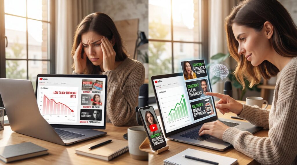
Here’s the thing about thumbnails—most people treat them like a fresh coat of paint on a car, thinking that if it looks shiny, it’ll run surprisingly good. But I’ve been looking under the hood of YouTube analytics for a long time, and I can tell you that thumbnail psychology is the engine that actually drives clicks—not just the shiny paint job. You can have the highest resolution image, the brightest colors, and the boldest text, but if you ignore the basic psychology of why people click, you’re just spinning your wheels. Simple as that.
I see it all the time. A creator spends ten hours editing a video, then five minutes slapping together a thumbnail. Then they wonder why nobody is watching. It’s frustrating, I know. But usually, it’s not the video that’s the problem. It’s a diagnostic issue with how the thumbnail speaks to the viewer’s brain—basic thumbnail psychology.
So today, we’re gonna go over the five biggest thumbnail psychology mistakes I see people making. We’re going to break down EXACTLY why these mistakes kill your click rate (CTR) and, more importantly, how to fix them so you can get back on the road.
Why Does Thumbnail Psychology Reject “Studio Perfect” Looks?

Now, here’s a surprise for a lot of you when it comes to thumbnail psychology. You might think you need a studio-quality, glossy image to get clicks. You look at the big channels and think, “I need to look exactly like that.” But honestly, that’s often the wrong move, especially if you’re just starting out or trying to build a loyal connection.
I’ve found that audiences in 2026 are getting tired of the fake, over-processed look. It feels like a commercial. And nobody hops on YouTube because they wanna watch a commercial. They want to connect with a person—that’s thumbnail psychology 101.
:::did-you-know
Thumbnail Psychology: Why Authenticity Wins
Shoppers and viewers are tired of the gloss. In fact, 77% of people prefer to see authentic, user-generated visuals rather than professional, staged shots. If your thumbnail looks too perfect, it might actually push people away.
:::
When you use an image that looks too manufactured, you create a psychological distance—thumbnail psychology working against you. It signals “marketing,” not “content.” I prefer to use shots that look high-quality but still feel real. Seriously. It’s okay if the lighting isn’t 100% perfect if the emotion is genuine.
Think about it like buying a used car. Do you trust the ad with the stock photo from the manufacturer, or the one where the guy took a picture of the actual car in his driveway? You trust the driveway photo. thumbnail is the secret sauce. It’s the same with thumbnails. If you look too polished, viewers might think you’re hiding something or that the content is going to be soulless.
So, instead of spending hours airbrushing every pore on your face, focus on the expression. Is it real? Does it match the video? That’s what counts.
Thumbnail Psychology: Are You Ignoring Mobile Truncation?
All right, so let’s talk about a mechanical failure I see constantly. You design this beautiful thumbnail on your 27-inch monitor (spoiler alert). It looks massive. You can see every detail. But here’s what you want to do: look at it on your phone.
Most of your viewers are watching on mobile devices. And depending on the platform or where the video is suggested, parts of your image are going to get cut off or covered up. We call this the “Truncation Zone.” It’s video that drives results.
If you put critical text or key visual elements in the bottom right corner, you’re in trouble. That’s where the timestamp goes. If you put them too close to the edges, different screen sizes might crop them out.
I’ve seen data suggesting that 50-80% of viewers never see all the elements in a thumbnail because of how it’s cropped or covered by UI elements. Big difference. That means if your main hook is in that danger zone, half your potential audience doesn’t even know what the video is about.
:::common-mistake
The Thumbnail Psychology of Timestamps (I know, I know)
Don’t put your hook or key text in the bottom right corner. That’s where the video duration timestamp sits. It covers everything. Keep your text and main subjects centered or to the left to avoid the “Truncation Zone.”
:::
Testing Across Devices
You need to check your aspect ratios. I use tools that simulate how the thumbnail looks on different devices. It’s like checking your blind spots before you merge. You wouldn’t drive without mirrors, so don’t publish without checking the crop.
(Okay, honestly?)
This seems why multi-aspect ratio support is so critical. In 2026, we aren’t just making thumbnails for wide screens. We have to think about how that image adapts. If you aren’t checking this, you’re driving with a flat tire.
Even basic tools like Canva offer preview modes, but the real big deal is using AI that understands how different platforms crop and display your image. Don’t leave clicks on the table because you only checked on desktop.
How Does Face Focus Impact Thumbnail Psychology?
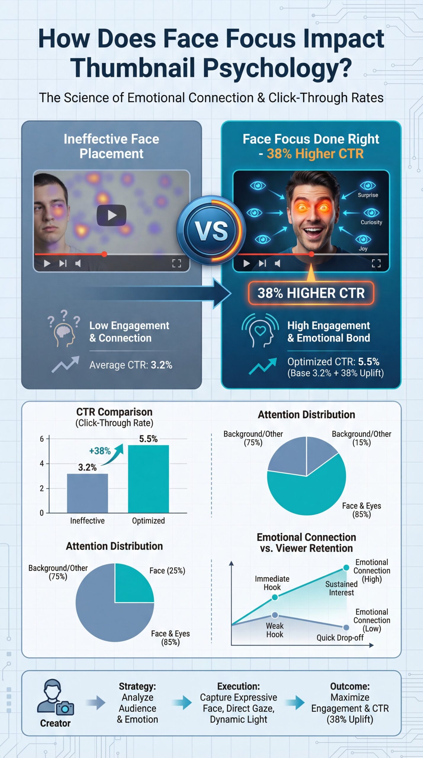
Let’s get into the engine of emotional connection. We are hardwired to look at faces. It is biology. When we see eyes, we look at them to gauge intent and emotion.
Research backs this up. Thumbnails with faces generally perform better. But—and this is a big “but”. you can’t just slap any face on there and expect it to work.
Face Focus thumbnails drive 38% higher CTR, but creators often use faces with wrong emotional expressions or poor positioning. , ThumbMagic
The mistake I see is what I call the “Disconnect.” This happens when the face in the thumbnail is showing an emotion that has nothing to do with the video title. If your title is “How to Fix a Leaking Gasket” and your face looks like you just won the lottery, the viewer gets confused. Confusion kills clicks.
Or, I see the “Soy Face” problem (that exaggerated, mouth-open shock expression). It worked in 2018. Now? It’s a meme. It feels fake.
(I could be off base here.)
Matching Emotion to Content
You want to match the micro-expression to the content. If the video is serious, look concerned. If it’s exciting, look happy. But make it genuine.
:::quick_tip
Match, the Emotion – and why it matters
Take a selfie specifically for the thumbnail while you’re in the mindset of the video topic. Don’t reuse a generic “happy” photo for a serious topic. The disconnect confuses the viewer’s brain and lowers CTR.
:::
Also, eye contact matters. If you’re looking at the camera, you’re looking at the viewer. That creates a challenge or an invitation. If you’re looking at an object in the thumbnail, the viewer will look at that object too. It’s a directional cue. Use it to guide their eyes to the most important part of the image.
For more on how AI is changing this area, check out our post on 5 Thumbnail Creator AI Mistakes Killing Your CTR.
Is Your Visual Hierarchy Confusing the Brain?
Now, let’s cover visual hierarchy. This is basically (trust me on this) the order in which the human brain notices things. If everything in your thumbnail is screaming for attention. big text, bright background, exploding car, crying face. then nothing stands out. It’s just noise.
When there’s too much noise, the brain gets overwhelmed and scrolls past.It’s like trying to listen to a rattle in an engine. The radio is blasting at full volume. You can’t diagnose the problem.
You need a clear focal point. What is the one thing you want them to see first? Is it the text? The face? The object?
The Squint Test
Sit back from your monitor and squint your eyes until the image is blurry. What stands out? If you can’t tell what the main subject is, you’re hierarchy is broken.
Contrast Check
Ensure your text contrasts heavily with the background. If you have a light background, use dark text (or text with a heavy shadow). Don’t make the brain work to read.
Rule of Three
Limit you’re thumbnail to three main elements maximum. For example: Face, Text, Object. Anything more is usually clutter.
The 3-Second Test
I usually recommend the “3-Second Rule.” Show your thumbnail to a friend for three seconds, then hide it. Ask them what it was about. If they can’t tell you, your hierarchy is off.
This seems where AI analysis comes in handy. The new tech we’re seeing in 2026, like the AI Creative Director features, can actually scan your image and tell you where the eye is going to land first. It takes the guesswork out of it.
(Call me crazy but…)
:::quick-reference
Hierarchy Checklist
Before you export, check these three things: 1. Is the main subject the biggest element? 2. Is the text under 5 words? 3. Does the background contrast with the foreground? If yes, you’re good to go.
:::
Curtis, the founder of Banana Thumbnail, usually talks about how “manual guesswork is the enemy of efficiency.” i agree. Period. Why guess where people are looking when you can know?
The Curiosity Gap: Are You Boring or Confusing?
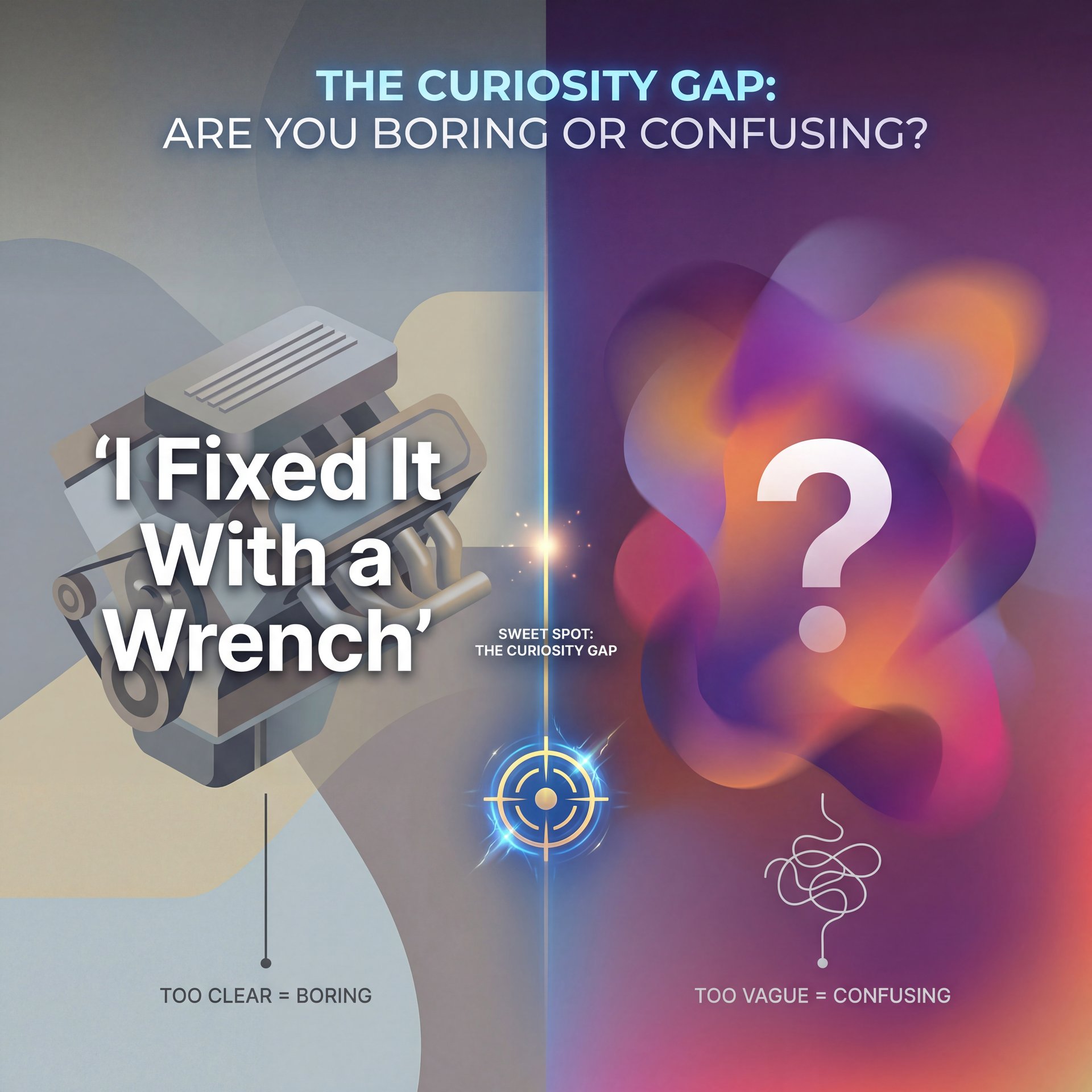
Here’s a tricky one. We call it the “Curiosity Gap.” This seems the space between what the viewer knows and what they want to know.
If your thumbnail reveals everything, there’s no reason to click. If I show a picture of a fixed engine with the text “I Fixed It With a Wrench,” well, story over. No click.
But if you go too far the other way (if the thumbnail is just a blurry shape and a question mark. that’s not curiosity. That’s confusion. And as I said earlier, confusion pretty much is a click-killer.
Finding the Balance (yes, really)
The mistake is failing to bridge that gap. You need to give them a clue, but not the answer.
For example, instead of showing the fixed engine, show the broken part with the text “This Cost Me $five,000.” Now the viewer has a question: Why did it cost that much? Could that happen to me?
:::creator_spotlight
The “Partial Reveal” Strategy
Top creators don’t show the result; they show the reaction to the result. Instead of showing the finished house, they show the messy demolition with a shocked face. It creates a narrative question: “How did they fix this mess?”
:::
I find that a lot of people try to use “Shock and Awe” visuals, explosions, red arrows, big circles (to create curiosity). But without a clear context, it just looks like clickbait. And audiences are getting smart. They can smell cheap clickbait a mile away.
You want to create intrigue, not just noise. It’s a balance. If you are struggling with the tools to create this balance, you might want to read about 9 AI Thumbnail Mistakes Killing Your Views.
Future-Proofing Your Strategy for 2026
So, where do we go from here? The field is changing fast. We’ve got AI tools now that can analyze background, overlays, text, and metadata all at once.
In the past, you had to guess. You had to A/B test everything manually, which takes weeks. Now, with tools like Banana Thumbnail, you can simulate how a human brain will react before you even upload.
Visual attention prediction is no longer sci-fi. It’s the standard for 2026. If you aren’t using data to design, you’re guessing with your livelihood. . arXiv Research
I personally love using the AI Creative Director mode. It’s like having a master mechanic looking over you’re shoulder, pointing out that your text is hard to read or your face is too dark. It catches, the psychological mistakes we miss because we’ve been staring at the screen for too long.
But remember, the tool is only as good as the mechanic using it. You still need to understand these principles. You need to value authenticity, check your crop, manage your hierarchy, and spark curiosity. If you handle those basics, the tools will just help you get there faster.
Frequently Asked Questions
What are the most common psychological mistakes in thumnail design?
The biggest mistakes are cluttering the image with too many elements, using inauthentic or mismatched emotions on faces, and failing to create a curiosity gap that invites the click.
How do visual attention principles impact thumbnail performance?
Visual attention principles dictate where a viewer looks first; if your hierarchy is unclear or your focal point is weak, viewers will scroll past your video in less than a second.
What role does color play in thumbnail psychology?
Color creates contrast and sets the emotional tone.High contrast (like yellow on black) grabs attention. Big difference. Specific colors can signal the “vibe” of the video, helping the viewer decide if it’s relevant to them.
Related Videos


Related Content
• mistakes
For more on this topic, check out: thumbnail
Listen to This Article
