Table of Contents
- What Is YouTube Thumbnail Design Actually About?
- Why Does MrBeast’s YouTube Thumbnail Design Work?
- Best YouTube Thumbnail Design Strategies for 2025
- Common YouTube Thumbnail Design Mistakes We See
- How to Get Started with YouTube Thumbnail Design Workflows
- YouTube Thumbnail Design vs. Auto-Generated: Which Wins?
- Listen to This Article
All right, Riley Santos here again. So, we got a situation where you’ve spent ten, maybe twenty hours editing a video, you upload it, and… crickets. The engine is running, but the car isn’t moving. Why? Usually, it’s not the engine—it’s the paint job. Or in YouTube terms, your thumbnail.
You know, I see this all the time in the shop. People worry about the deep internal mechanics of the algorithm, but they ignore the first thing people actually see. So today we’re going over how the big dogs—MrBeast, MKBHD and top creators. handle their YouTube thumbnail design. Because honestly, if you can’t get them to open the hood, it doesn’t matter how much horsepower you have inside.
Let’s break down exactly what they’re doing differently in 2025 and how you can steal their strategies without needing a Hollywood budget.
What Is YouTube Thumbnail Design Actually About?
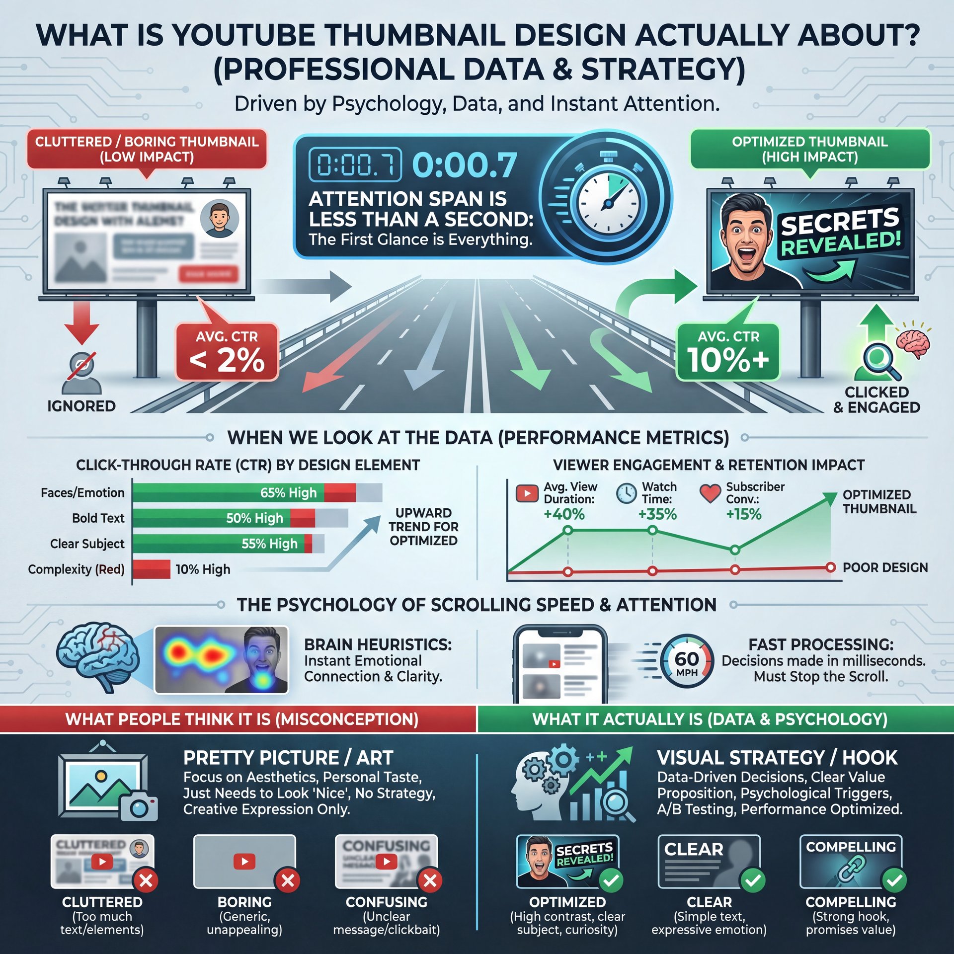
Here’s the thing. Alot of people think YouTube thumbnail design is just about making a pretty picture. It’s not. It’s about psychology. It’s about making a promise to the viewer that your video is worth their time.
I mean, think about it like a billboard on the highway. You have literally less than a second to grab someone’s attention while they’re scrolling at 60 miles per hour. If your sign is cluttered, boring or confusing, they’re just gonna keep driving.
When we look at the data, it’s pretty clear. Visual content statistics show that viewers form click decisions within 1-2 seconds. That’s it. That’s all the time you have. So if your design isn’t punching them in the face (metaphorically, of course) with curiosity or emotion immediatly, you’ve already lost the race.
(You’ll see why in a second.)
Top creators aren’t just throwing random elements onto a canvas. They are engineering a specific reaction. Whether it’s “Wait, what is that?” or “Wow, that’s impossible,” the design has to spark an immediate question in the viewer’s brain. That initial hook is everything.
🤔 Did You Know?
Over 70% of YouTube viewing happens on mobile devices. That means your YouTube thumbnail design needs to be legible on a screen the size of a playing card. If you can’t read it from arm’s length on your phone, it’s not going to work.
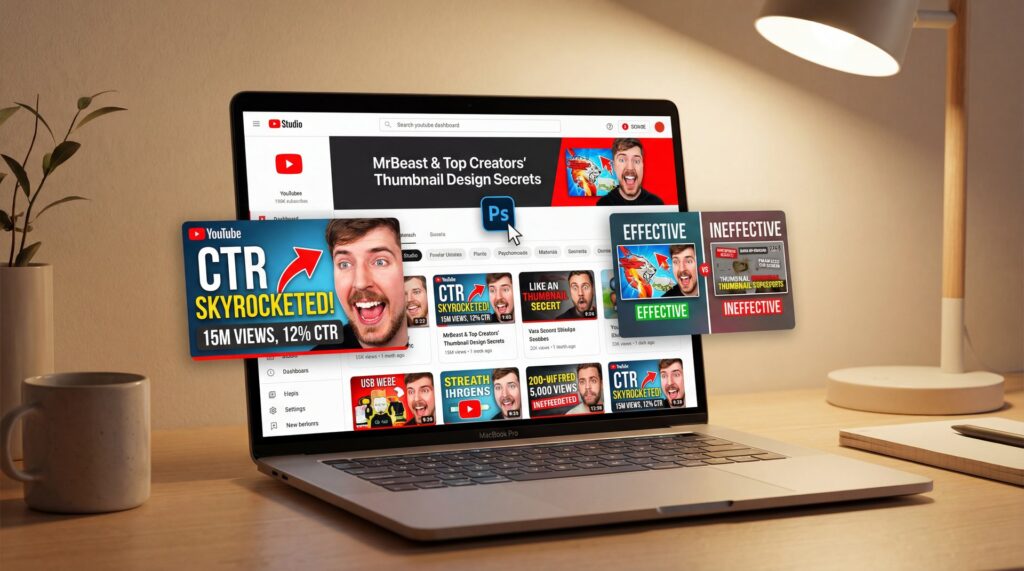
Why Does MrBeast’s YouTube Thumbnail Design Work?
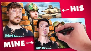
So let’s go under the hood of the biggest channel on the platform. MrBeast didn’t get there by accident. His team treats YouTube thumbnail design like a science. They don’t just make one thumbnail; they make ten, twenty variants and test them rigorously because they consider a video ‘dead’ without a strong thumbnail that captures attention in under 1 second.
What strikes me about his style is the “Shock & Awe” factor. High contrast, saturation turned up to eleven, and usually a face showing extreme emotion. Now, you might think, “I don’t wanna look like a cartoon.” And I get that. But here’s what you need to understand: he’s selling scale.
His thumbnails usually feature a clear subject where you know exactly what the video is about instantly. Plus, they show high stakes (piles of money, dangerous situations or massive objects. And almost always, there’s eye contact with the camera looking directly at you.
Custom thumbnails with prominent human faces deliver 38% higher CTR compared to thumbnails without faces. , Unkoa Design Study
But it’s not just about screaming. Look at MKBHD (Marques Brownlee). His approach to YouTube thumbnail design honestly is totally different but just as effective. He uses the “Tech Minimalist” style with super clean lighting where the product is the hero and usually just a subtle facial expression of skepticism or amazement.
It works because it matches his brand authority. If you’re doing tech reviews, you don’t need explosions. You need crisp, 4K clarity that says “I know what I’m talking about.” The thumbnail sets, you know, the expectation, so if your thumbnail promises high energy and your video is a slow-paced vlog, the viewer is going to bounce.
Best YouTube Thumbnail Design Strategies for 2025
Now, things have changed, you know, a bit this year. We’re seeing new tools and trends that are making high-end YouTube thumbnail design accessible to regular folks like us. You don’t need to hire a $500-per-thumbnail designer anymore.
One massive shift in 2025 is the use of AI to speed up the workflow. I’m not talking about letting a robot do everything, but using tools to handle the heavy lifting. For example, getting a clean cutout of your face used to take me twenty minutes with the pen tool. Now? It takes seconds with AI-assisted thumbnail generation that analyzes video metadata, past performance, and psychological triggers to suggest optimized layouts.
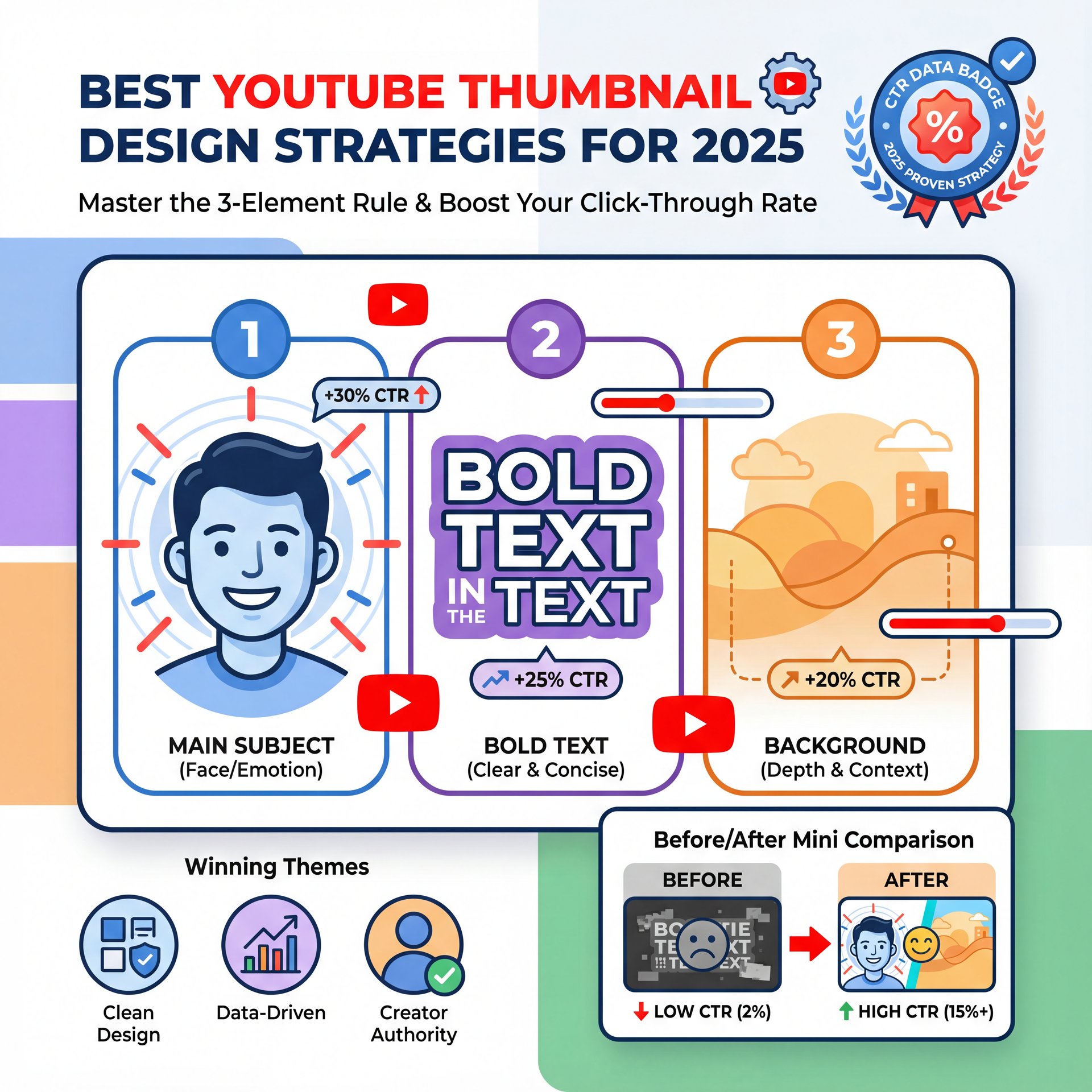
The 5 Viral Thumbnail Themes That Actually Work
Here are the themes winning RIGHT now based on proven CTR data:
Shock & Awe uses dramatic visuals with extreme contrast and bold imagery that stops the scroll right away. Curiosity Gap creates intrigue by showing something strange but hiding the result just enough to make you click. Face Focus leverages emotional expressions since humans are naturally drawn to eyes and faces. Big Text delivers instant messaging with just 3-4 words maximum that you can read at a glance. And finally, Before/After transformations tap into our love of seeing change and progress.
(Quick tangent.)
📋 Quick Reference
Struggling to come up with ideas? Use the “3-Element Rule” for your YouTube thumbnail design. Limit yourself to:
1. One main subject (Face/Object)
2 — Wait, no —. One background context
3. Max 3-4 words of text
This keeps things clean and readable. You can speed this up using Banana Thumbnail templates.
I’ve found that the creators who are growing the fastest right now are the ones combining these psychological triggers with consistent branding. You want people to recognize your video before they even read your channel name. That brand consistency builds trust over time.
If you’re looking for tools to help with this, you can check out our guide to content creator tools which breaks down some solid options including Canva and specialized platforms.
Common YouTube Thumbnail Design Mistakes We See
All right, so let’s talk about where people mess up. I see a lot of creators bringing their cars into the shop with the same problems. They’re trying too hard or they’re focusing on the wrong things.
The biggest mistake? Clutter. You try to fit the whole video into the thumbnail with text over here, an arrow over there, three different emojis and an explosion background. It’s a mess. When everything is important, nothing is important.
Another issue is text legibility. You pick a cool font, maybe something that looks like handwriting or has a heavy metal vibe. But on a mobile screen? It looks like a smudge. You have to stick to bold, sans-serif fonts if you want people to actually read your hook.
And honestly, a lot of people ignore the “safe zones.” YouTube puts timestamps and buttons over the corners of your thumbnail. If you put your main text in the bottom right corner, guess what? The timestamp covers it up. That’s a rookie mistake that kills your CTR.
(Where was I?)
Pro Tip: Always zoom out on your canvas to 10% size while you’re designing. If you can’t understand what’s happening in the image at that size, neither will your potential viewers on their smartphones.
Also, don’t bait and switch. I mean, clickbait is one thing (exaggerating slightly to build hype is standard). But if you put a Ferrari in the thumbnail and the video is about a Honda Civic, people are going to click off in five seconds. That destroys your Average View Duration, and YouTube will stop promoting your video fast.
For more on avoiding these pitfalls, take a look at our article on how to make click-worthy thumbnails without crossing the line into deceptive clickbait.
How to Get Started with YouTube Thumbnail Design Workflows
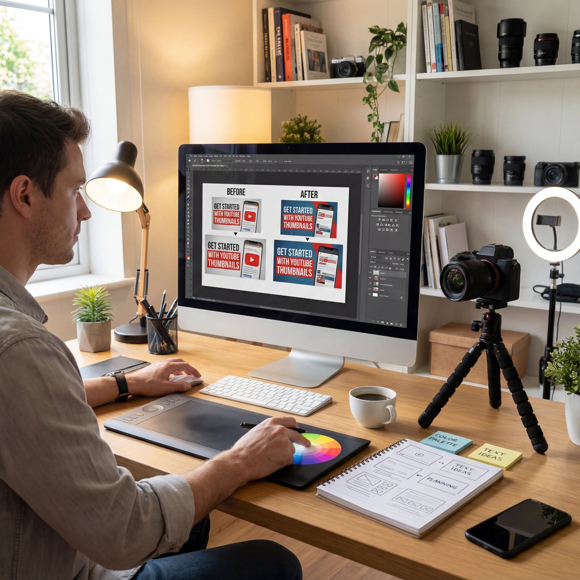
So, how do we actually do this? You don’t need to be a Photoshop wizard. Let’s break down a simple workflow that gets results without requiring years of design experience.
First, you need a concept. Don’t wait until the video is done to think about the thumbnail. I prefer to think of the title and thumbnail before I even hit record because this helps structure the video to deliver on that promise.
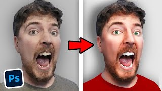
Next, take photos specifically for the thumbnail. Don’t just try to grab a screenshot from the video footage because it’s always blurry, the lighting is wierd, and you usually have a goofy look on your face. Take five minutes after filming to pose, point at nothing, look surprised, hold up the product. Trust me, the quality difference is huge.
The Technical Steps
Then, you bring it into your editor. You want to seperate the foreground from the background because this adds depth. You can add a slight drop shadow or a rim light (that glowing outline) to pop the subject off the background.
Tools like Canva make this process incredibly 🤷 simple, even for beginners. You can drag and drop elements, use templates and export in the exact dimensions YouTube requires. But don’t just use the default color settings since most raw photos look flat.
⚠️ Common Mistake
Don’t just use the default color settings. Most raw photos look flat. Boost the contrast and saturation slightly in your YouTube thumbnail design. You want the colors to “pop” against YouTube’s white or dark mode background. Check out Banana Thumbnail features for tools that help with this.
Finally, test it. Show it to a friend and ask them, “What do you think this video is about?” If they can’t tell you instantly, you need to go back to the drawing board. That immediate clarity is non-negotiable.
YouTube Thumbnail Design vs. Auto-Generated: Which Wins?
Now, you might be thinking, “Can’t I just let YouTube pick a frame?” No. Absolutely not.
I mean, you can, but you’re leaving money on the table. The data is overwhelming here. Custom thumbnails deliver significantly higher click-through rates compared to auto-generated frames, with top creators reporting CTR improvements of 38% when using prominent human faces with genuine emotion. It’s like trying to sell a house without cleaning up the front yard, sure, the house is good, but nobody is coming inside.
In 2025, the algorithm heavily weights Click-Through Rate (CTR). If your video has a 2% CTR because you used a random frame, YouTube stops showing it. But if you have a custom design that bumps that to 6% or 8%, your views can skyrocket dramatically.
YouTube’s recommendation algorithm uses CTR as a primary signal. If people click, YouTube thinks, “Hey, this is good,” and shows it to more people. It’s a snowball effect and the push that starts that snowball is your thumbnail. The YouTube thumbnail design market is expanding rapidly, with global creator design services experiencing significant CAGR as more creators recognize thumbnails as, you know, the primary decision factor for viewer clicks.
⭐ Creator Spotlight
Top creators don’t just guess. they use data. Many pros grabbed A/B testing tools to swap thumbnails and see which one gets more clicks. Even a 1% increase in CTR can mean thousands of extra views over a month. You can learn more about optimization at Banana Thumbnail.
So, don’t be lazy with this part. You’ve done the hard work of making the video, so finish the job and give it the packaging it deserves.
For more deep dives into platform mechanics, you should check out resources like the YouTube Creator Academy or recent industry marketing reports to stay updated on what’s working right now.
Frequently Asked Questions
How has the use of A/B testing evolved in YouTube thumbnail design?
Creators are now testing thumbnails straight away upon upload to maximize the initial “velocity” of views, rather than waiting days to switch, using tools that automatically swap images based on real-time CTR data. Think about it.
If you want to see exactly how to put these layers together in real-time, check out this tutorial below. That should fix your low CTR symptoms if you follow the steps.
Related Videos

Related Content
• creators
For more on this topic, check out: creators
Listen to This Article
